
-
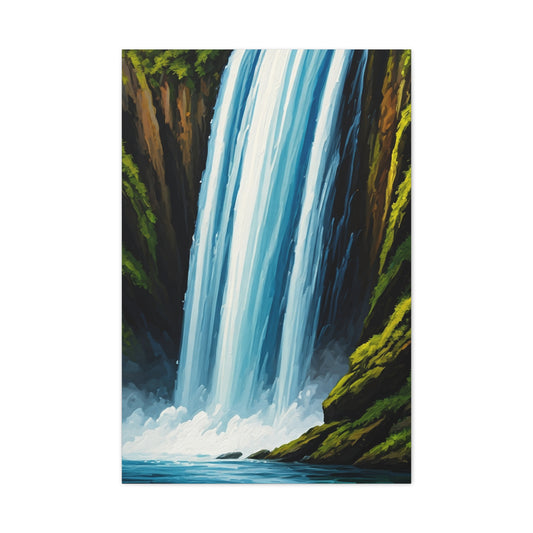
Tall Cascading Waterfall Wall Art & Canvas Prints
Regular price $141.23Regular price -
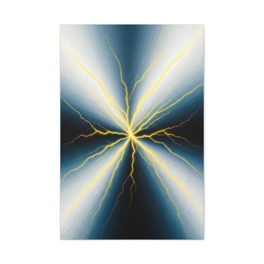
Electric Nexus Wall Art & Canvas Prints
Regular price $141.23Regular price -
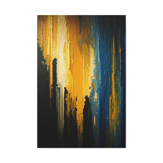
Vertical Gold and Blue Abstract Wall Art & Canvas Prints
Regular price $141.23Regular price -
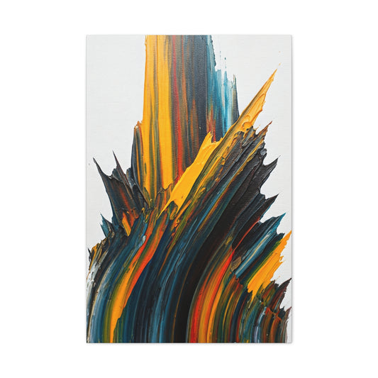
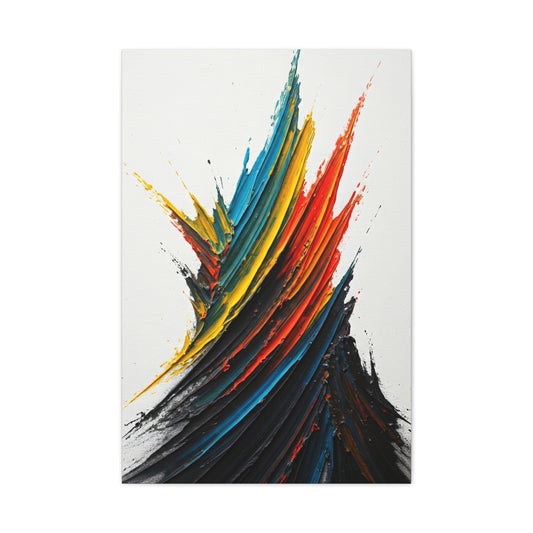
Forged Peaks Abstract Wall Art & Canvas Prints
Regular price $141.23Regular price -
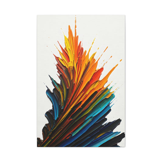
Ascension Blaze Wall Art & Canvas Prints
Regular price $141.23Regular price -
Rising Ember Flame Wall Art & Canvas Prints
Regular price $141.23Regular price


The Ultimate Guide to Vertical Wall Art: Transforming Spaces with Sophisticated Design
Vertical wall art represents one of the most sophisticated and versatile approaches to interior decoration, offering homeowners and designers an exceptional opportunity to maximize visual impact while making efficient use of available wall space. This comprehensive exploration delves into every aspect of vertical artwork, from understanding its fundamental principles to mastering the intricate details of selection, placement, and styling that can transform any environment into a visually stunning sanctuary.
The contemporary world of interior design has witnessed a remarkable renaissance in the appreciation for vertical compositions, driven by evolving architectural trends that favor clean lines, maximized natural light, and the creative utilization of every square inch of living space. Modern homes and offices increasingly feature soaring ceilings, narrow alcoves, and elongated wall segments that practically beg for the dynamic visual interest that only carefully selected vertical pieces can provide.
The Science Behind Vertical Visual Impact
The human eye naturally follows vertical lines upward, creating an unconscious sense of elevation and grandeur that can dramatically alter the perceived dimensions of any room. This physiological response to vertical orientation stems from our evolutionary connection to towering trees, mountain peaks, and other natural vertical elements that have historically represented strength, stability, and aspiration. When we incorporate vertical artwork into our living spaces, we tap into these deep-seated psychological associations, creating environments that feel both grander and more harmonious.
Vertical compositions possess an inherent ability to draw the gaze upward, effectively making ceilings appear higher and rooms feel more spacious than their actual measurements would suggest. This optical illusion proves particularly valuable in contemporary living situations where square footage comes at a premium, and every design choice must contribute to the overall sense of openness and flow. Professional interior designers have long recognized this principle, strategically employing tall, narrow pieces to counteract the cramped feeling that can plague smaller spaces.
The mathematical proportions inherent in vertical artwork often align with the golden ratio, that mystical numerical relationship that appears throughout nature and has guided artists and architects for millennia. When a piece maintains these harmonious proportions, it creates a subconscious sense of rightness and balance that makes viewers feel comfortable and at ease within the space. This mathematical foundation explains why certain vertical pieces seem to resonate so deeply with observers, even when they cannot articulate exactly why a particular artwork feels so perfectly suited to its environment.
Research in environmental psychology has demonstrated that vertical elements in interior design can significantly impact mood and productivity. Rooms featuring strategically placed vertical artwork tend to promote feelings of optimism, ambition, and forward momentum, making them particularly suitable for office spaces, study areas, and other environments where focus and motivation are paramount. The upward direction implied by vertical compositions seems to encourage similar upward movement in human thoughts and aspirations.
Historical Evolution of Vertical Artistic Expression
The tradition of vertical artistic expression traces its roots back to ancient civilizations, where towering obelisks, soaring columns, and elongated tapestries served both decorative and symbolic purposes. Egyptian hieroglyphic arrangements often followed vertical patterns, creating narrative sequences that guided viewers' eyes from bottom to top in a deliberate storytelling progression. These early examples established vertical orientation as a powerful tool for communication and aesthetic impact that continues to influence contemporary design.
Medieval Gothic cathedrals elevated vertical design to unprecedented heights, literally and figuratively, with their soaring spires, elongated windows, and vertically oriented artwork that seemed to reach toward the heavens. The stained glass windows of this period, often arranged in tall, narrow panels, created some of history's most breathtaking examples of vertical artistic composition. These masterpieces demonstrated how vertical orientation could serve spiritual and emotional purposes, creating spaces that inspired awe and contemplation.
The Renaissance period saw artists like El Greco pioneering the use of vertical format in easel paintings, creating compositions that emphasized the spiritual and emotional height of their subjects. These works broke away from the traditional horizontal landscape format, establishing vertical painting as a legitimate and powerful artistic choice. The elongated figures and upward-reaching compositions of this period continue to influence contemporary vertical artwork, demonstrating the timeless appeal of this orientation.
Asian artistic traditions have long celebrated vertical compositions, particularly in the form of hanging scrolls and screen paintings that were designed to be viewed from bottom to top in a meditative progression. Japanese and Chinese artists developed sophisticated techniques for creating vertical narratives that unfolded gradually as the viewer's eye traveled upward, often incorporating elements of seasonal change, spiritual journey, or natural growth patterns. These traditions emphasized the temporal aspect of vertical viewing, treating the artwork as an experience rather than a static image.
The modern art movement of the twentieth century saw vertical format gain new relevance as artists explored abstract expressionism, minimalism, and other styles that benefited from the dramatic impact of vertical orientation. Artists like Barnett Newman created towering canvases that seemed to stretch infinitely upward, while Mark Rothko's vertical color field paintings demonstrated how this format could create profound emotional resonance. These pioneers established vertical artwork as a cornerstone of contemporary artistic expression.
Architectural Harmony and Spatial Relationships
The relationship between vertical artwork and architectural elements represents one of the most critical aspects of successful interior design, requiring careful consideration of proportions, scale, and visual weight. Vertical pieces must complement rather than compete with existing architectural features, creating a harmonious dialogue between the built environment and the artistic elements within it. This relationship extends beyond mere size considerations to encompass color relationships, textural contrasts, and stylistic coherence.
Ceiling height plays a crucial role in determining the appropriate scale and proportion of vertical artwork, with higher ceilings generally accommodating larger and more dramatic pieces. However, the relationship is not simply linear; rooms with moderate ceiling heights can often benefit from smaller vertical pieces that create intimate focal points without overwhelming the space. The key lies in understanding how the artwork will interact with the existing architectural framework to enhance rather than dominate the overall composition.
Window placement and natural light patterns significantly influence how vertical artwork is perceived throughout the day, with changing light conditions creating dynamic relationships between the piece and its surroundings. Artwork positioned opposite windows may appear dramatically different in morning versus afternoon light, while pieces placed perpendicular to light sources may create interesting shadow patterns that become part of the overall visual experience. Understanding these relationships allows for strategic placement that maximizes the artwork's impact across various lighting conditions.
Doorways, archways, and other architectural openings create natural frames that can enhance or detract from vertical artwork, depending on their positioning and proportions. A tall, narrow piece placed adjacent to a doorway can create an elegant transition between spaces, while artwork positioned directly across from an opening may benefit from the visual breathing room created by the architectural void. These spatial relationships require careful consideration to ensure that the artwork enhances rather than conflicts with the natural flow of the space.
The materials and finishes present in the architectural environment must be considered when selecting vertical artwork, as these elements create the contextual backdrop against which the piece will be viewed. Rough stone walls may call for artwork with bold, dramatic presence, while smooth plaster surfaces might be better suited to more delicate, refined pieces. The interplay between architectural textures and artistic surfaces creates layers of visual interest that contribute to the overall sophistication of the space.
Color Theory in Vertical Compositions
Color relationships in vertical artwork operate according to unique principles that differ from those governing horizontal compositions, with the vertical orientation creating opportunities for gradient effects, color progression, and dynamic contrast that can dramatically enhance the visual impact of any piece. The eye's natural tendency to scan vertical compositions from bottom to top allows artists and designers to create deliberate color journeys that guide viewers through carefully orchestrated emotional and aesthetic experiences.
Warm colors positioned at the bottom of a vertical composition tend to create a sense of grounding and stability, while cooler tones at the top can suggest openness, sky, and infinite space. This natural color hierarchy aligns with our environmental experiences, where earth tones dominate the ground level while sky blues and cloud whites occupy the upper reaches of our visual field. Artwork that follows this natural color progression often feels inherently balanced and harmonious, even when viewed by individuals who cannot consciously articulate why the piece feels so right.
Monochromatic vertical pieces offer unique opportunities to explore tonal variations and subtle gradations that might be lost in more complex color schemes. These compositions can create sophisticated visual journeys through slight variations in saturation, value, and temperature while maintaining an overall sense of unity and coherence. The vertical format allows for extended exploration of a single color family, creating pieces that are both visually striking and emotionally resonant.
Complementary color relationships take on new dimensions in vertical compositions, where contrasting hues can be arranged in vertical bands, gradual transitions, or strategic accent points that create visual tension and release. The height of vertical pieces allows for more complex color relationships than might be possible in smaller horizontal formats, enabling artists to explore sophisticated chromatic interactions that unfold gradually as the viewer's eye travels upward.
The psychological impact of color in vertical artwork is amplified by the orientation's inherent sense of movement and progression. Colors that might feel static in horizontal compositions become dynamic and evolving when arranged vertically, creating pieces that seem to pulse with energy and life. This psychological dimension of color in vertical artwork makes it particularly effective for spaces where emotional impact and visual interest are paramount.
Texture and Surface Treatment Considerations
The vertical orientation of artwork creates unique opportunities for textural exploration and surface treatment that can add extraordinary depth and visual interest to any piece. Unlike horizontal compositions, which are typically viewed from a consistent angle, vertical pieces are often seen from multiple viewpoints as people move through the space, creating changing patterns of light and shadow across textured surfaces that bring the artwork to life throughout the day.
Brushwork in vertical paintings can follow the natural upward movement of the composition, creating energetic strokes that seem to lift the viewer's gaze and spirits along with them. These directional brushstrokes can vary in intensity and character from bottom to top, creating pieces that tell visual stories through the physical movement of the artist's hand. Thick impasto applications at key focal points can create dramatic textural contrasts that cast shadows and catch light in ways that enhance the overall visual impact of the piece.
Mixed media applications in vertical artwork allow for the incorporation of various materials and textures that can create complex visual and tactile experiences. Fabric elements, natural materials, and found objects can be integrated into vertical compositions in ways that would be impractical in horizontal formats, taking advantage of gravity and the vertical viewing pattern to create pieces that engage multiple senses. These textural combinations can create artwork that changes dramatically under different lighting conditions, ensuring that the piece remains visually engaging throughout various times of day.
Canvas preparation and surface treatment play crucial roles in determining how vertical artwork will interact with light and shadow throughout its lifetime. Textured grounds can create subtle surface variations that enhance the overall visual complexity of the piece, while smooth surfaces may allow for more precise detail work and color clarity. The choice of surface treatment should align with the artistic intent and the intended viewing environment to ensure that the finished piece achieves its maximum visual impact.
The aging characteristics of different surface treatments and materials must be considered when creating or selecting vertical artwork intended for long-term display. Some textural elements may change over time, developing patina or weathering patterns that become part of the piece's evolving character. Understanding these temporal aspects allows for informed decisions about materials and treatments that will enhance rather than detract from the artwork's appearance over time.
Lighting Strategies for Vertical Displays
Proper illumination represents one of the most critical factors in successfully showcasing vertical artwork, with lighting strategies that differ significantly from those used for horizontal pieces due to the unique challenges and opportunities presented by the vertical format. The height and proportions of vertical artwork require carefully planned lighting solutions that provide even illumination across the entire surface while avoiding shadows, hot spots, and color distortion that can detract from the viewing experience.
Track lighting systems offer exceptional flexibility for illuminating vertical artwork, allowing for precise positioning of individual fixtures that can be adjusted to accommodate pieces of various heights and proportions. The ability to position multiple fixtures at different heights along a vertical piece ensures even illumination from top to bottom, while adjustable beam angles allow for fine-tuning that eliminates shadows and provides optimal color rendering. Professional-grade LED fixtures with high color rendering indices ensure that the artwork's colors appear true and vibrant under artificial illumination.
Natural light integration requires careful consideration of window placement, seasonal variations, and daily light cycles that can dramatically affect how vertical artwork appears throughout the day. Pieces positioned to receive indirect natural light often display their colors most accurately, while direct sunlight can cause fading, color shifts, and harsh shadows that detract from the viewing experience. Strategic placement relative to natural light sources can create dynamic displays that change character throughout the day, adding temporal interest to the artistic experience.
Accent lighting techniques can create dramatic focal points within vertical compositions, highlighting specific areas or details that might otherwise be overlooked. Small, precisely positioned spotlights can draw attention to signature elements, textural details, or color transitions that define the piece's character. These accent lights must be carefully calibrated to enhance rather than overwhelm the primary lighting scheme, creating subtle emphasis that guides the viewer's eye without creating distracting hot spots.
The relationship between ambient room lighting and artwork-specific illumination requires careful balancing to ensure that vertical pieces integrate harmoniously with their surroundings while still commanding appropriate attention. Dimming systems allow for dynamic control of lighting levels that can adapt to different activities and times of day, ensuring that the artwork remains visible and engaging under various conditions. Professional lighting design for vertical artwork often incorporates multiple layers of illumination that work together to create optimal viewing conditions.
Material Selection and Durability Factors
The materials used in vertical artwork must withstand unique stresses and environmental conditions that differ from those affecting horizontal pieces, with gravitational forces, humidity variations, and thermal expansion creating specific challenges that require careful consideration during the selection and creation process. Understanding these material requirements ensures that vertical artwork maintains its structural integrity and visual appeal throughout years of display.
Canvas selection for vertical paintings requires attention to weave patterns, fiber composition, and stretching techniques that can accommodate the gravitational stress placed on tall, narrow formats. Heavy-duty canvas materials and reinforced stretcher systems help prevent sagging and distortion that can develop over time in vertical pieces. The orientation of canvas weave relative to the vertical format can affect how the material responds to environmental changes, making proper preparation crucial for long-term stability.
Frame construction for vertical artwork must account for the different stress patterns created by the vertical orientation, with structural reinforcements and mounting systems designed to distribute weight evenly and prevent warping or separation over time. Traditional frame joinery techniques may require modification to accommodate the unique stress patterns of vertical pieces, while modern materials and construction methods offer new possibilities for creating lightweight yet durable support systems.
Mounting hardware and wall attachment systems for vertical artwork require careful engineering to ensure safe and secure installation, particularly for larger pieces that may be subject to air currents, vibrations, and other environmental factors. Professional mounting systems distribute weight across multiple points and include security features that prevent accidental displacement while allowing for easy adjustment and maintenance. The selection of appropriate mounting hardware depends on wall construction, artwork weight, and environmental conditions.
Conservation considerations for vertical artwork include protection from dust accumulation, moisture damage, and ultraviolet light exposure that can cause fading and degradation over time. Preventive measures such as appropriate framing, climate control, and regular maintenance help ensure that vertical pieces retain their original appearance and structural integrity throughout their display lifetime. Understanding these conservation requirements allows for informed decisions about placement, handling, and care procedures.
Proportion and Scale in Vertical Arrangements
The mathematical relationships that govern proportion and scale in vertical artwork operate according to sophisticated principles that extend far beyond simple height-to-width ratios, encompassing complex interactions between the artwork's dimensions, its surrounding environment, and the psychological impact created by these relationships. Understanding these proportional dynamics allows for the creation and selection of vertical pieces that achieve optimal visual harmony within their intended spaces.
The golden ratio, approximately 1.618 to 1, appears frequently in nature and has guided artistic composition for centuries, offering a mathematical foundation for creating vertical artwork that feels inherently balanced and pleasing to the human eye. When applied to vertical compositions, this ratio can determine not only the overall dimensions of the piece but also the internal divisions and focal points that create visual interest and guide the viewer's eye through the composition. Artwork that incorporates these proportional relationships often achieves a timeless quality that transcends temporary design trends.
Scale relationships between vertical artwork and architectural elements require careful calibration to ensure that pieces enhance rather than overwhelm their surroundings. A towering piece in a room with low ceilings may feel oppressive and out of place, while a small vertical work in a grand space may appear lost and insignificant. The key lies in understanding how the artwork will interact with existing architectural proportions to create harmonious relationships that enhance the overall spatial experience.
Multiple vertical pieces arranged together create complex proportional relationships that must be carefully orchestrated to maintain visual coherence while providing sufficient variety to sustain interest. These groupings can follow mathematical progressions, rhythmic patterns, or organic arrangements that reflect natural growth patterns. The spacing between pieces becomes as important as their individual proportions, with negative space serving as a crucial element in the overall composition.
The viewing distance and angle significantly influence how proportional relationships are perceived, with pieces intended for close inspection requiring different proportional considerations than those designed to be viewed from across a room. Vertical artwork in hallways, for example, may be viewed primarily in passing, requiring bold proportional statements that can be appreciated quickly, while pieces in intimate seating areas may benefit from more subtle proportional relationships that reward extended contemplation.
Visual Weight and Balance Dynamics
Visual weight in vertical compositions operates through complex interactions of color, texture, size, and positioning that create dynamic balance systems fundamentally different from those found in horizontal artwork. The vertical orientation introduces gravitational metaphors that influence how viewers perceive the stability and movement within the composition, making an understanding of visual weight distribution crucial for creating successful vertical pieces.
Darker colors and denser textures naturally carry more visual weight, and their placement within a vertical composition can create sensations of groundedness when positioned lower in the piece or feelings of top-heaviness when concentrated in upper areas. Strategic distribution of visual weight can create compositions that feel dynamically balanced, with heavier elements at the bottom providing stability while lighter elements above suggest openness and possibility. This weight distribution often mirrors natural patterns found in landscapes and organic growth.
The concept of visual gravity in vertical artwork allows artists and designers to create compositions that appear to defy physical laws while maintaining aesthetic balance. Light elements positioned at the bottom of a composition can create feelings of buoyancy and lift, while strategic placement of heavier visual elements throughout the vertical space can create rhythmic patterns that guide the eye upward in a controlled progression. These effects can make vertical artwork appear to pulse with energy and movement.
Asymmetrical balance in vertical compositions offers opportunities for creating dynamic tension and visual interest that might be difficult to achieve in horizontal formats. The height of vertical pieces allows for complex balance systems that can incorporate multiple focal points, transitional areas, and rest spaces that create sophisticated visual journeys. These asymmetrical arrangements often feel more natural and organic than rigidly symmetrical compositions, reflecting the irregular patterns found in nature.
The relationship between positive and negative space becomes particularly important in vertical compositions, where empty areas can create breathing room that prevents the piece from feeling cramped or overwhelming. Strategic use of negative space can create implied vertical movement, suggest depth and dimensionality, and provide areas of visual rest that enhance the impact of more complex or detailed sections. Understanding how to balance filled and empty areas is crucial for creating vertical artwork that feels complete and satisfying.
Rhythm and Movement in Vertical Design
Vertical artwork possesses unique capabilities for creating visual rhythm and movement that take advantage of the eye's natural tendency to scan upward, allowing for the development of complex temporal experiences that unfold gradually as viewers explore the composition. This rhythmic quality transforms static artwork into dynamic visual experiences that can significantly enhance the energy and character of any space.
Repetitive elements arranged vertically can create rhythmic patterns that suggest music, dance, or natural phenomena such as falling water or swaying grass. These rhythmic compositions can vary in intensity and character throughout their height, creating pieces that build to crescendos, fade to quiet conclusions, or maintain steady beats that provide visual stability. The vertical format allows for extended rhythmic development that would be impossible in more compact horizontal arrangements.
Transitional elements that guide the eye smoothly from one section of a vertical composition to another help create coherent visual journeys that maintain viewer engagement throughout the piece's full height. These transitions can be subtle color gradations, flowing line work, or recurring motifs that provide continuity while allowing for variation and development. Effective transitions prevent vertical compositions from appearing fragmented or disjointed, creating unified works that reward both quick glances and extended contemplation.
Directional forces within vertical compositions can create sensations of upward movement, downward flow, or dynamic tension between opposing forces. Brushstrokes, linear elements, and compositional structures that emphasize vertical movement can make artwork appear to stretch skyward, while contrasting elements can create visual anchors that provide stability and grounding. The interplay between these directional forces creates dynamic compositions that seem alive with energy and movement.
The pacing of visual events within vertical compositions allows for sophisticated control over viewer engagement and emotional response. Areas of intense activity can be balanced with quiet spaces that provide visual rest, while gradual build-ups and dramatic releases can create emotional journeys that enhance the artwork's impact. Understanding how to pace these visual events throughout a vertical composition allows for the creation of pieces that maintain interest and engagement across their full height.
Color Harmony and Contrast Strategies
Color relationships in vertical artwork benefit from the extended format's ability to accommodate complex harmonic progressions and dramatic contrast effects that create visually stunning and emotionally resonant compositions. The vertical orientation allows for color development over time and space, creating opportunities for sophisticated chromatic storytelling that can transform the emotional character of any room.
Analogous color schemes in vertical compositions can create gentle progressions that suggest natural phenomena such as sunrise, seasonal transitions, or atmospheric effects. These harmonious progressions often feel soothing and contemplative, making them particularly suitable for spaces intended for relaxation and reflection. The extended vertical format allows for subtle variations within analogous families that create rich, nuanced color experiences without overwhelming the viewer.
Complementary contrast strategies in vertical artwork can create dramatic tension and visual excitement that energize spaces and create memorable focal points. The height of vertical pieces allows for sophisticated development of complementary relationships, with contrasting colors appearing in various proportions and intensities throughout the composition. These dynamic color relationships can create pieces that seem to vibrate with energy while maintaining overall harmonic balance.
Triadic color schemes offer opportunities for creating complex yet balanced vertical compositions that incorporate multiple color families while maintaining visual coherence. The vertical format provides space for each color to be fully developed and explored while maintaining proportional relationships that prevent any single hue from dominating the composition. These triadic arrangements can create artwork that appears rich and complex while remaining harmonious and pleasing to view.
Temperature progressions from warm to cool or vice versa can create powerful atmospheric effects in vertical compositions, suggesting depth, time of day, or emotional journey. Warm colors at the base of a composition moving to cool tones at the top can suggest earth-to-sky transitions, while reverse progressions might imply other natural or emotional narratives. These temperature shifts can create three-dimensional illusions and emotional resonance that enhance the artwork's impact.
Textural Relationships and Surface Dynamics
The interplay of different textures within vertical compositions creates complex visual and psychological effects that can dramatically enhance the artwork's ability to engage viewers and create lasting impressions. Texture in vertical artwork operates on multiple levels, from the physical surface characteristics that affect how light interacts with the piece to the implied textures created through artistic technique and subject matter.
Smooth-to-rough textural progressions in vertical artwork can create sensations of transition and change that mirror natural processes such as weathering, growth, or transformation. These textural journeys can develop gradually across the height of the composition, creating pieces that reward careful examination while maintaining strong overall impact. The vertical format allows for extended textural development that can create rich tactile experiences even when the artwork cannot be physically touched.
Contrasting textures placed in strategic relationships throughout vertical compositions can create visual tension and interest that prevents pieces from appearing monotonous or static. Rough, energetic areas can be balanced with smooth, calm sections, while fine details can provide intimate viewing experiences within larger, bolder textural statements. These textural contrasts create visual variety that maintains engagement across the full height of the composition.
Implied texture created through artistic technique can be particularly effective in vertical compositions, where the extended format allows for detailed exploration of various surface qualities without requiring actual textural variation. Painted wood grain, fabric weaves, or natural rock formations can create tactile sensations that enhance the artwork's ability to connect with viewers on multiple sensory levels. These implied textures can be developed with varying degrees of realism to create specific atmospheric effects.
The relationship between actual and implied texture in vertical artwork creates opportunities for sophisticated visual play that can surprise and delight viewers. Smooth painted surfaces that convincingly suggest rough textures, or actual textural elements that appear different than their physical properties, can create intellectual and visual interest that encourages closer examination and appreciation of artistic skill and creativity.
Compositional Flow and Eye Movement
The management of compositional flow in vertical artwork requires sophisticated understanding of how viewers naturally explore tall, narrow formats, with successful pieces guiding eye movement through deliberate paths that enhance appreciation and understanding of the artistic intent. Unlike horizontal compositions, which often rely on left-to-right reading patterns, vertical pieces must create upward movement that feels natural and rewarding.
Entry points at the bottom of vertical compositions serve as crucial starting locations for viewer engagement, requiring careful design to draw attention and provide clear indication of how the piece should be explored. These entry points might feature bold colors, interesting details, or compositional elements that naturally lead the eye upward into the main body of the work. Effective entry points create immediate engagement that encourages continued exploration of the full composition.
Intermediate focal points throughout the vertical development of a composition provide rest stops and points of interest that maintain engagement during the upward visual journey. These focal points can be arranged in rhythmic patterns, following mathematical progressions, or positioned intuitively to create natural viewing experiences. The spacing and intensity of these focal points significantly influence the pacing of viewer engagement and the overall success of the composition.
Visual pathways that connect different areas of vertical compositions help create coherent viewing experiences that feel intentional and rewarding rather than random or confused. These pathways can be created through linear elements, color relationships, textural connections, or compositional structures that provide clear direction for eye movement. Well-designed pathways create compositions that feel unified and complete despite their extended format.
Exit strategies at the top of vertical compositions provide satisfying conclusions to the viewing experience, often featuring elements that suggest continuation beyond the physical boundaries of the artwork or create sense of resolution and completion. These concluding elements might fade into atmospheric effects, reach toward suggested infinities, or provide satisfying visual punctuation marks that bring the compositional journey to a fulfilling end.
Integration with Interior Architecture
The successful integration of vertical artwork with existing interior architecture requires sophisticated understanding of how artistic elements interact with structural features, spatial relationships, and functional requirements to create harmonious environments that enhance both the artwork and its architectural context. This integration extends beyond mere placement considerations to encompass style coherence, proportional relationships, and environmental harmony.
Ceiling relationships play crucial roles in determining how vertical artwork functions within architectural spaces, with the height and character of ceilings significantly influencing the appropriate scale and style of vertical pieces. High ceilings can accommodate dramatic, large-scale vertical works that might overwhelm spaces with lower ceiling heights, while intimate ceiling relationships may call for more modest vertical pieces that create cozy, human-scaled environments.
Wall surface characteristics directly impact how vertical artwork appears and functions within architectural contexts, with different wall materials, colors, and textures requiring specific approaches to artwork selection and placement. Smooth, neutral walls provide clean backdrops that allow artwork to take center stage, while textured or colorful walls may require careful coordination to prevent visual competition between architectural and artistic elements.
Architectural details such as moldings, trim work, and built-in features create contextual frameworks that influence how vertical artwork integrates with existing design elements. Pieces that complement rather than compete with existing architectural details often achieve better integration and create more sophisticated overall design solutions. Understanding how to work with existing architectural elements allows for artwork placement that enhances rather than fights the existing design vocabulary.
Spatial flow patterns within rooms significantly influence optimal placement of vertical artwork, with pieces positioned to enhance rather than interrupt natural movement patterns and functional relationships. Artwork placed in primary sight lines can create dramatic focal points, while pieces positioned in secondary viewing areas can provide pleasant discoveries that reward exploration of the space. Understanding traffic patterns and functional requirements ensures that vertical artwork enhances rather than impedes the practical use of interior spaces.
Analyzing Space Requirements and Limitations
The successful selection of vertical artwork begins with comprehensive analysis of the intended space, encompassing not only obvious factors such as wall dimensions and ceiling height but also subtle environmental conditions that can significantly impact both the artwork's appearance and its long-term preservation. This analytical process requires systematic evaluation of multiple spatial characteristics that work together to create the optimal conditions for vertical art display.
Physical measurements represent the foundation of space analysis, but they extend far beyond simple height and width calculations to include depth considerations, adjacent furniture relationships, and clearance requirements that ensure safe and aesthetically pleasing installation. Wall depth and construction type influence mounting options and weight limitations, while nearby furniture and fixtures create spatial relationships that must be carefully considered to prevent crowding or visual competition that could detract from the artwork's impact.
Environmental conditions within the intended space significantly influence both artwork selection and preservation requirements, with factors such as humidity levels, temperature fluctuations, air circulation patterns, and exposure to direct sunlight all playing crucial roles in determining which types of vertical pieces will thrive in specific locations. Rooms with high humidity, such as bathrooms or kitchens, may require artwork with protective coatings or materials that can withstand moisture exposure, while spaces with significant temperature variations may need pieces that can accommodate thermal expansion and contraction without damage.
Natural light exposure patterns throughout the day create dynamic viewing conditions that can dramatically alter how vertical artwork appears and functions within a space. Pieces positioned to receive morning light may display different color characteristics than those illuminated by afternoon sun, while artwork in north-facing rooms may require different color and contrast considerations to maintain visibility and impact under consistent, indirect illumination. Understanding these light patterns allows for informed decisions about artwork placement and selection that maximize visual impact throughout various lighting conditions.
Artificial lighting integration capabilities must be evaluated to determine whether existing lighting systems can adequately illuminate vertical artwork or whether additional fixtures will be required to achieve optimal display conditions. The positioning of existing light sources, their color temperature characteristics, and their ability to provide even illumination across tall, narrow formats all influence the types of vertical pieces that will function successfully in specific locations. Planning for artificial lighting needs during the selection process prevents disappointing results after installation.
Traffic patterns and functional usage of spaces influence how vertical artwork will be viewed and appreciated, with pieces intended for areas of high activity requiring different characteristics than those destined for quiet contemplation spaces. Hallway artwork may need bold, immediately recognizable imagery that can be appreciated during brief encounters, while pieces in reading areas or bedrooms may benefit from more subtle, detailed work that rewards extended viewing. Understanding how spaces are used helps ensure that selected artwork enhances rather than conflicts with intended activities.
Style Coordination and Theme Development
The development of cohesive style relationships between vertical artwork and existing interior design elements requires sophisticated understanding of how artistic choices interact with architectural features, furniture selections, color schemes, and decorative accessories to create unified aesthetic experiences. This coordination process involves balancing consistency with variety to create environments that feel intentional and harmonious while avoiding monotony or predictability.
Existing architectural styles provide important contextual clues that can guide vertical artwork selection toward pieces that enhance rather than conflict with established design vocabulary. Traditional architectural details such as crown moldings, wainscoting, and formal proportions often work best with vertical artwork that reflects classical sensibilities, while contemporary architectural features such as clean lines, minimal ornamentation, and open floor plans may be better suited to modern or abstract vertical pieces that echo these simplified aesthetics.
Color palette coordination between vertical artwork and existing room elements creates visual harmony that makes spaces feel intentionally designed rather than accidentally assembled. This coordination can take many forms, from artwork that directly incorporates existing room colors to pieces that provide carefully planned contrast that enhances the overall color scheme. Understanding color relationships and their psychological effects allows for artwork selection that not only looks appropriate but also contributes to the desired emotional atmosphere of the space.
Furniture style relationships influence how vertical artwork integrates with the functional elements of a room, with pieces that complement existing furniture styles creating more sophisticated overall design solutions. Contemporary furniture arrangements may call for vertical artwork with clean lines and minimal ornamentation, while traditional furniture collections might be enhanced by more ornate or classically inspired vertical pieces. The scale and proportions of furniture also influence appropriate artwork selection, with larger furniture groupings often requiring more substantial vertical pieces to maintain visual balance.
Texture and material coordination between vertical artwork and existing room elements creates layers of visual and tactile interest that enhance the overall sensory experience of the space. Rough, natural textures in furniture and architectural elements might be complemented by vertical artwork with organic or textural characteristics, while smooth, polished surfaces may work better with crisp, clean artistic treatments. Understanding how different textures interact allows for artwork selection that contributes to rather than detracts from the overall material palette of the room.
Pattern relationships between vertical artwork and existing decorative elements require careful balance to prevent visual chaos while maintaining sufficient variety to create interest and prevent monotony. Rooms with bold patterned elements such as wallpaper, rugs, or upholstery may benefit from simpler, more restrained vertical artwork that provides visual breathing room, while spaces with minimal pattern variety might welcome vertical pieces with more complex or decorative characteristics. Understanding how to balance pattern density creates more sophisticated and comfortable interior environments.
Conclusion
Determining the optimal size and scale for vertical artwork requires systematic evaluation of multiple factors that work together to create appropriate proportional relationships within specific spaces. This process involves more than simple mathematical calculations, encompassing psychological impacts, viewing distances, architectural relationships, and practical considerations that ensure selected pieces achieve maximum visual impact while maintaining harmonious integration with their surroundings.
The relationship between artwork dimensions and wall space availability represents the foundation of size determination, but optimal proportions extend beyond simply filling available space to creating deliberate relationships between filled and empty areas that enhance the overall composition of the room. Artwork that occupies too large a percentage of available wall space may feel overwhelming and cramped, while pieces that are too small for their allotted space may appear insignificant and lost. Professional designers often recommend that artwork occupy between one-half and three-quarters of the available wall width for optimal visual balance.
Viewing distance considerations significantly influence appropriate artwork sizing, with pieces intended for close examination requiring different scale relationships than those designed to be appreciated from across a room. Intimate spaces such as powder rooms or reading nooks may accommodate smaller vertical pieces with fine details that reward close inspection, while large rooms or areas viewed primarily from a distance may require more substantial pieces with bold imagery that maintains impact across greater viewing distances. Understanding how artwork will primarily be viewed helps determine appropriate sizing that ensures optimal appreciation.
Furniture relationships create important scale references that influence how vertical artwork appears within room compositions, with pieces positioned above furniture requiring careful coordination to maintain balanced proportional relationships. The widely accepted guideline suggesting that artwork above sofas should measure approximately two-thirds the width of the furniture below provides a useful starting point, but vertical pieces may require modified approaches that consider their unique proportional characteristics and visual weight distribution.
Ceiling height relationships play crucial roles in determining appropriate vertical artwork scale, with higher ceilings generally accommodating larger and more dramatic pieces while lower ceilings may require more modest sizing to prevent spaces from feeling overwhelmed. However, this relationship is not simply linear, as extremely high ceilings may make even large artwork appear diminutive, while strategic selection of appropriately scaled pieces for moderate ceiling heights can create impressive visual impact without overwhelming the space.
Multiple artwork arrangements require additional considerations about individual piece sizing and overall composition relationships, with each element contributing to a larger whole that must maintain internal harmony while creating sufficient variety to sustain interest. These groupings may feature pieces of similar sizes arranged in regular patterns, or varied dimensions that create dynamic rhythmic relationships. Understanding how individual pieces work together helps ensure that multiple artwork arrangements enhance rather than compete with each other.