
-
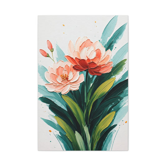
Blush Floral Botanical Wall Art & Canvas Prints
Regular price $141.23Regular price -
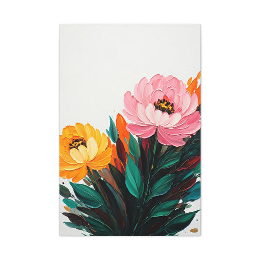
Soft Pink and Yellow Floral Wall Art & Canvas Prints
Regular price $141.23Regular price


Guide to Pink Wall Art Ideas for Modern Interiors
Pink represents one of the most captivating and versatile color choices for contemporary home decoration. This enchanting hue has transcended traditional boundaries, emerging as a sophisticated palette option that seamlessly blends timeless elegance with modern sensibilities. The spectrum of pink tones available today offers unlimited creative possibilities, from soft whisper-like pastels to bold statement-making magentas that command attention in any living space.
The evolution of pink in interior design reflects broader cultural shifts toward embracing color psychology and emotional well-being within our personal environments. This magnificent shade possesses unique characteristics that can transform ordinary rooms into extraordinary sanctuaries of comfort and style. Unlike other colors that may feel overwhelming or restrictive, pink demonstrates remarkable adaptability, working harmoniously with various design philosophies and architectural styles.
Contemporary designers increasingly recognize pink's capacity to create depth, warmth, and visual interest without compromising sophistication. The color's inherent versatility allows for subtle integration through accent pieces or bold transformation through comprehensive color schemes. Whether incorporated through wall art, furniture selections, or decorative accessories, pink establishes an atmosphere of refined luxury that appeals to diverse aesthetic preferences.
The psychological impact of pink cannot be understated in modern interior design approaches. Research consistently demonstrates this color's ability to promote feelings of calmness, creativity, and emotional balance. These qualities make pink particularly valuable for creating spaces that serve as retreats from the demands of contemporary life. The color's association with tranquility and renewal makes it an ideal choice for individuals seeking to establish harmonious living environments.
Pink's remarkable ability to complement both warm and cool color palettes sets it apart from other decorative options. This flexibility enables homeowners to experiment with various design combinations without fear of creating visual discord. The color works equally well with metallic accents, natural materials, and modern synthetic elements, providing endless opportunities for creative expression within residential spaces.
Emerging Trends in Pink Interior Decoration
The contemporary approach to pink interior decoration emphasizes layering different tones and textures to create sophisticated visual narratives. Modern designers are moving away from monochromatic applications toward more nuanced approaches that incorporate multiple pink variations within single spaces. This trend reflects growing appreciation for color complexity and the understanding that subtle variations can create more engaging visual experiences.
Millennial pink, which dominated design conversations in previous years, has evolved into more complex interpretations that embrace both warmer and cooler undertones. Contemporary applications focus on creating depth through tonal variation rather than relying on single-shade implementations. This evolution demonstrates the color's maturation as a serious design element rather than a passing trend.
The integration of pink with unexpected color companions represents another significant trend in contemporary decoration. Designers are successfully pairing pink with deep forest greens, rich navy blues, and even sophisticated blacks to create striking contrasts that challenge traditional color theory assumptions. These bold combinations demonstrate pink's versatility and its ability to anchor sophisticated color schemes.
Textural applications of pink have gained prominence in modern design approaches. Rather than relying solely on paint or fabric applications, contemporary interiors incorporate pink through various materials including stone, metal, glass, and ceramic elements. This multi-material approach creates visual richness while maintaining color cohesion throughout living spaces.
The emergence of sustainable design practices has influenced pink applications in interior decoration. Designers increasingly seek eco-friendly materials and production methods when incorporating pink elements into residential spaces. This conscious approach aligns with broader environmental awareness while maintaining aesthetic excellence in design execution.
Pop art influences continue to shape contemporary pink applications, with modern interpretations drawing inspiration from iconic artistic movements while adapting them for residential environments. These influences manifest through bold graphic elements, geometric patterns, and artistic reproductions that celebrate color's emotional and visual power.
Monochromatic pink schemes have gained sophistication through careful attention to lighting, texture, and proportion. Modern applications avoid the potentially overwhelming effects of single-color dominance by incorporating varied finishes, lighting conditions, and spatial arrangements that create visual interest within cohesive color frameworks.
Color Harmony and Sophisticated Schemes
The mastery of pink color schemes requires understanding the subtle relationships between different tones and their interactions with surrounding elements. Successful pink applications depend on careful consideration of undertones, saturation levels, and environmental factors that influence color perception. Professional designers recognize that pink's appearance changes dramatically under different lighting conditions, making careful planning essential for achieving desired aesthetic outcomes.
Warm pink tones, characterized by peachy or coral undertones, create inviting atmospheres that complement natural materials and traditional design elements. These variations work particularly well with wood finishes, natural stone surfaces, and organic textiles that enhance their inherent warmth. The combination creates spaces that feel both sophisticated and welcoming, appealing to individuals who appreciate comfort without sacrificing style.
Cool pink variations, featuring blue or purple undertones, offer contemporary alternatives that align with modern minimalist design principles. These cooler tones integrate seamlessly with metallic finishes, glass surfaces, and sleek architectural details that define contemporary interior spaces. The result is sophisticated environments that feel both current and timeless.
The relationship between pink and neutral colors forms the foundation for many successful interior design schemes. Sophisticated grays, creamy whites, and warm beiges provide perfect backdrops for pink accents while maintaining visual balance. These combinations allow pink elements to serve as focal points without overwhelming the overall design composition.
Pink and red combinations, once considered problematic in traditional color theory, have found new acceptance in contemporary design applications. Modern interpretations carefully balance these related hues through strategic placement, varied intensities, and thoughtful proportional relationships. The key lies in understanding that successful red-pink combinations require careful attention to undertones and spatial distribution.
The integration of pink with earth tones creates grounding effects that prevent the color from appearing overly ethereal or disconnected from natural environments. Rich browns, deep ochres, and muted greens provide stability while allowing pink elements to maintain their distinctive character. These combinations work particularly well in spaces that connect indoor and outdoor environments.
Metallic accents play crucial roles in elevating pink color schemes from simple to sophisticated. Gold, copper, and rose gold finishes enhance pink's inherent luxury associations while providing visual anchors that prevent color schemes from appearing too soft or undefined. The strategic placement of metallic elements creates focal points that draw attention while maintaining overall harmony.
Luxurious Pink and Gold Combinations
The pairing of pink and gold represents one of interior design's most enduringly elegant combinations. This sophisticated partnership draws inspiration from historical precedents while adapting to contemporary sensibilities through modern materials and applications. The inherent luxury associations of both colors create environments that exude refinement and exclusivity.
Rose gold has emerged as a particularly compelling variation of the traditional pink-gold combination. This modern interpretation offers subtlety that appeals to contemporary tastes while maintaining the glamorous qualities associated with metallic finishes. Rose gold hardware, light fixtures, and decorative accessories provide perfect complements to various pink tones without creating overwhelming metallic dominance.
The key to successful pink-gold applications lies in achieving proper proportional relationships between these powerful colors. Professional designers recommend using gold as an accent color rather than a dominant element, allowing pink tones to establish the primary color narrative while metallic elements provide punctuation and emphasis. This approach prevents environments from appearing overly ornate or visually chaotic.
Textural variation becomes particularly important in pink-gold schemes to prevent monotony and create visual interest. Combining matte pink surfaces with glossy gold finishes, or pairing textured pink fabrics with smooth metallic accessories, creates dynamic visual relationships that engage viewers while maintaining overall cohesion.
The incorporation of natural materials helps ground pink-gold combinations and prevents them from appearing artificial or disconnected from authentic design principles. Natural stone surfaces, wood grain patterns, and organic textile weaves provide earthy counterpoints that balance the inherent glamour of pink-gold partnerships.
Lighting design plays a crucial role in pink-gold applications, as both colors respond dramatically to different light sources and intensities. Warm lighting enhances the romantic qualities of these combinations, while cooler lighting can create more contemporary interpretations. Professional lighting design ensures that color relationships remain consistent throughout different times of day and usage patterns.
The scale of pink-gold applications influences their overall impact within interior spaces. Large-scale implementations create dramatic environments suitable for entertaining and formal occasions, while smaller-scale applications provide subtle luxury touches that enhance everyday living experiences. Understanding the intended use of spaces helps determine appropriate application scales.
Vibrant Hot Pink Statement Pieces
Hot pink applications in contemporary interiors require careful consideration and strategic placement to achieve sophisticated results rather than overwhelming visual chaos. This bold color choice can transform ordinary spaces into extraordinary environments when applied with professional understanding of proportion, balance, and visual hierarchy. The key lies in treating hot pink as a powerful accent rather than attempting comprehensive room coverage.
Modern interpretations of hot pink often incorporate purple undertones that create more sophisticated appearances than traditional bright pink applications. Magenta and fuchsia variations offer complexity that prevents hot pink from appearing juvenile or overly simplistic. These nuanced interpretations work particularly well in contemporary design contexts that value color sophistication over pure intensity.
The placement of hot pink elements within interior spaces dramatically influences their overall impact and acceptance. Strategic positioning near natural light sources enhances the color's vibrancy while preventing it from appearing artificial or harsh. Conversely, placement in areas with limited natural light may require artificial lighting adjustments to maintain color integrity and visual appeal.
Balancing hot pink with complementary neutral elements prevents visual overwhelm while maintaining the color's impact potential. Sophisticated whites, elegant grays, and rich blacks provide necessary visual relief while allowing hot pink elements to maintain their attention-commanding qualities. These combinations create dynamic tension that enhances rather than diminishes hot pink's inherent power.
The scale of hot pink applications significantly affects their appropriateness within different interior contexts. Small-scale applications through artwork, accessories, or textile accents allow for bold color introduction without overwhelming existing design schemes. Larger applications require more careful consideration and professional design guidance to achieve successful integration.
Textural considerations become particularly important with hot pink applications to prevent flat, one-dimensional appearances. Incorporating varied surface treatments, fabric weaves, and material finishes creates visual richness that enhances hot pink's natural vibrancy. These textural variations also help integrate bold color choices with surrounding design elements.
The psychological impact of hot pink requires consideration when planning its integration into residential spaces. While this color can create energizing, stimulating environments, it may prove overwhelming in spaces intended for relaxation or concentration. Understanding the intended use of spaces helps determine appropriate hot pink application strategies.
Optimal Room Selection for Pink Integration
The selection of appropriate rooms for pink integration depends on various factors including natural lighting conditions, intended usage patterns, and existing architectural features. Each space within residential environments presents unique opportunities and challenges for pink incorporation, requiring tailored approaches that respect both functional requirements and aesthetic objectives.
Bedrooms represent ideal environments for pink integration due to their private nature and association with rest and relaxation. The color's calming psychological effects align perfectly with bedroom functions while providing opportunities for personal expression without concern for public reception. Pink bedroom applications can range from subtle accent walls to comprehensive color schemes that create cocoon-like retreats from external stresses.
Living rooms offer excellent opportunities for sophisticated pink applications that demonstrate the color's versatility in public spaces. The key lies in achieving balance between pink elements and other design components to create welcoming environments that appeal to diverse guests while reflecting personal style preferences. Strategic pink placement through artwork, textiles, or accent furniture allows for bold color introduction without overwhelming conversational areas.
Dining rooms provide unique contexts for pink applications that can enhance the social and ceremonial aspects of meal sharing. Warm pink tones create intimate atmospheres that encourage lingering conversations, while cooler pink variations can create more formal dining experiences. The key lies in understanding how pink interacts with food presentation and appetite psychology.
Bathroom applications of pink require careful consideration of lighting conditions and moisture resistance. Modern pink bathroom designs move beyond traditional pastel applications toward more sophisticated interpretations that incorporate contemporary materials and fixtures. The result can be spa-like environments that promote relaxation and self-care rituals.
Home office spaces present interesting opportunities for pink integration, challenging traditional assumptions about professional color choices. Subtle pink applications can create inspiring work environments that promote creativity and reduce stress, while bold pink accents can provide energizing elements that combat workplace monotony.
Kitchen pink applications have evolved significantly from traditional country-style interpretations toward more contemporary approaches that integrate with modern appliances and materials. The key lies in selecting pink variations that complement rather than compete with functional kitchen elements while creating environments that encourage culinary creativity.
Entryways and hallways offer opportunities for dramatic pink applications that create memorable first impressions without requiring long-term exposure. These transitional spaces can accommodate bolder pink choices that might prove overwhelming in primary living areas while establishing color themes that extend throughout residential environments.
Design Style Compatibility and Aesthetic Integration
Pink's remarkable versatility allows for integration across diverse interior design styles, from traditional to ultramodern interpretations. Understanding how different pink applications align with various aesthetic philosophies enables homeowners and designers to make informed decisions about color integration that enhance rather than conflict with existing design commitments.
Contemporary minimalist design styles benefit from pink applications that emphasize clean lines, simple forms, and sophisticated color relationships. Muted pink tones work particularly well within minimalist contexts, providing subtle warmth without compromising the essential simplicity that defines this aesthetic approach. The key lies in restraint and careful selection of pink elements that contribute to rather than detract from overall design coherence.
Traditional design styles accommodate pink through historical precedents that demonstrate the color's longstanding acceptance in formal interior contexts. Classic pink applications draw inspiration from historical periods while adapting traditional approaches to contemporary living requirements. These interpretations often incorporate pink through formal textiles, traditional artwork, and period-appropriate decorative accessories.
Scandinavian design principles align naturally with certain pink applications that emphasize natural materials, functional beauty, and emotional well-being. Dusty rose and blush pink variations complement the light woods, natural textiles, and simplified forms characteristic of Scandinavian aesthetics while contributing to the hygge philosophy of comfortable, cozy living.
Industrial design styles present interesting opportunities for unexpected pink integration that challenges traditional assumptions about appropriate industrial color palettes. Strategic pink applications can soften harsh industrial elements while maintaining the essential authenticity that defines this aesthetic approach. The contrast between rough industrial materials and refined pink elements creates dynamic visual tension.
Bohemian design styles embrace pink as part of broader eclectic color approaches that celebrate individuality and creative expression. Pink applications within bohemian contexts often incorporate global influences, artisanal materials, and layered textural relationships that create rich, complex visual narratives reflecting personal history and cultural appreciation.
Art Deco influences accommodate pink through glamorous applications that emphasize luxury, geometric patterns, and sophisticated material combinations. Pink integration within Art Deco-inspired interiors often incorporates metallic accents, bold patterns, and dramatic proportional relationships that celebrate the optimism and innovation associated with this historical design movement.
Mid-century modern design principles align well with certain pink applications that emphasize clean lines, functional beauty, and innovative material usage. Pink integration within mid-century contexts often focuses on furniture selections, artwork, and decorative accessories that reflect the period's optimistic approach to color and design experimentation.
Abstract Art Applications and Contemporary Interpretations
Abstract art represents one of the most effective vehicles for pink integration within contemporary interior design contexts. The inherent flexibility of abstract artistic expression allows for pink applications that transcend traditional representational limitations while creating sophisticated focal points that anchor entire room designs. These applications demonstrate pink's capacity to function as both decorative element and serious artistic statement.
The selection of abstract pink artwork requires careful consideration of existing interior elements to ensure harmonious integration rather than visual competition. Successful abstract pink art selections complement rather than duplicate existing color relationships while introducing new visual dynamics that enhance overall spatial experiences. The key lies in understanding how abstract compositions interact with surrounding architectural and decorative elements.
Scale considerations become particularly important when selecting abstract pink artwork for specific interior contexts. Large-scale abstract pieces can serve as dramatic focal points that establish entire room color schemes, while smaller works provide subtle pink introduction that supports rather than dominates existing design narratives. Understanding intended visual impact helps guide appropriate scale selection.
The relationship between abstract pink artwork and lighting design significantly influences final aesthetic outcomes. Natural lighting enhances pink's inherent warmth and vibrancy, while artificial lighting requires careful selection to maintain color integrity throughout different usage periods. Professional lighting design ensures that abstract pink artworks maintain their intended visual impact regardless of environmental lighting conditions.
Compositional elements within abstract pink artworks influence their compatibility with different interior design styles. Geometric abstract works align well with contemporary and modern design approaches, while organic abstract compositions complement more traditional or eclectic interior styles. Understanding these relationships helps ensure successful artwork integration within existing design frameworks.
The layering of multiple abstract pink pieces within single spaces creates opportunities for sophisticated color storytelling that demonstrates advanced design sensibilities. Successful layering requires understanding of visual hierarchy, proportional relationships, and color variation to create cohesive narratives rather than chaotic visual confusion. Professional guidance often proves valuable for complex multiple-artwork installations.
The integration of abstract pink artwork with other decorative elements requires careful attention to avoid redundancy while maintaining visual coherence. Successful integration often involves selecting artwork that introduces complementary rather than duplicate color relationships while providing visual anchors that unify diverse decorative elements throughout interior spaces.
Sophisticated Dusty Rose Applications
Dusty rose represents one of pink's most sophisticated interpretations, offering complexity that appeals to refined aesthetic sensibilities while maintaining approachability that welcomes diverse design applications. This nuanced color choice bridges traditional and contemporary design philosophies through its inherent versatility and timeless appeal. Understanding dusty rose's unique characteristics enables successful integration across various interior contexts.
The subtle complexity of dusty rose derives from its balanced combination of pink base tones with gray and brown undertones that create depth and sophistication. This complexity prevents dusty rose from appearing overly sweet or juvenile while maintaining enough warmth to create welcoming environments. The result is a color choice that satisfies both emotional and intellectual design criteria.
Dusty rose applications benefit from careful consideration of surrounding material selections to maximize the color's inherent sophistication. Natural materials including wood, stone, and linen textiles complement dusty rose's organic qualities while enhancing its upscale associations. These material partnerships create environments that feel both luxurious and authentic.
The versatility of dusty rose enables successful integration across diverse lighting conditions without dramatic color shifts that plague many other pink variations. This stability makes dusty rose particularly valuable for spaces with varying natural light exposure throughout daily cycles. The color maintains its essential character while adapting subtly to changing environmental conditions.
Dusty rose combinations with other colors demonstrate remarkable flexibility that supports diverse design approaches. Pairing dusty rose with deep forest greens creates sophisticated nature-inspired schemes, while combinations with navy blue produce elegant nautical interpretations. These diverse compatibility options provide endless creative possibilities for interior applications.
The psychological impact of dusty rose aligns well with contemporary lifestyle priorities that emphasize wellness, balance, and sophisticated comfort. The color promotes feelings of tranquility and refinement without creating overwhelming sensory experiences. These qualities make dusty rose particularly suitable for spaces intended for relaxation, contemplation, or sophisticated entertaining.
Seasonal considerations influence dusty rose applications differently than more intense pink variations. The color's inherent subtlety allows it to function effectively throughout annual cycles without appearing seasonally inappropriate. This year-round suitability makes dusty rose investment-worthy for homeowners seeking long-term color satisfaction.
Professional Canvas Sizing Guidelines and Spatial Relationships
The selection of appropriate canvas sizes for pink wall art requires understanding mathematical relationships between artwork dimensions and available wall space to achieve visually pleasing proportional balance. Professional designers rely on established guidelines that ensure artwork selections enhance rather than overwhelm interior environments while providing sufficient visual impact to justify their presence within design schemes.
The foundational principle for canvas sizing recommends that wall art occupy between sixty and seventy-five percent of available wall space to create optimal visual relationships. This range provides flexibility for different aesthetic preferences while ensuring that artwork selections maintain appropriate presence without dominating surrounding elements. Calculating specific dimensions requires measuring available wall space and applying these percentage guidelines.
Wall measurement considerations extend beyond simple height and width calculations to include factors such as furniture placement, architectural details, and traffic patterns that influence artwork placement and sizing decisions. Professional measurements account for these variables to ensure that final artwork selections function effectively within real-world usage contexts rather than theoretical spatial calculations.
The relationship between artwork size and viewing distance significantly influences appropriate canvas selection for different interior contexts. Artworks intended for close viewing in intimate spaces can successfully incorporate more detailed compositions, while pieces designed for distance viewing require simpler compositions and larger overall dimensions to maintain visual impact across extended viewing distances.
Multiple artwork installations require additional sizing considerations that account for spacing relationships between individual pieces and their collective visual impact. Professional installations often incorporate mathematical progressions or systematic sizing relationships that create visual harmony while avoiding monotonous repetition that diminishes individual artwork significance.
Room proportion considerations influence canvas sizing decisions beyond simple wall measurement calculations. High-ceiling spaces can accommodate larger artworks that might overwhelm more modest room proportions, while smaller spaces benefit from artwork selections that maintain intimacy without creating cramped visual relationships. Understanding these proportional dynamics ensures successful artwork integration.
The integration of canvas artwork with other decorative elements requires sizing decisions that consider collective visual impact rather than individual artwork dimensions alone. Successful integration often involves selecting canvas sizes that complement rather than compete with furniture selections, lighting fixtures, and architectural details that contribute to overall interior design success.
Mastering Single-Canvas Presentations Through Strategic Positioning and Scale Considerations
Single-canvas installations represent the foundational approach to wall art presentation, offering opportunities for dramatic visual impact through careful selection and positioning strategies that maximize individual artwork potential. These installations succeed when artists, designers, and homeowners understand the nuanced relationships between artwork characteristics, spatial contexts, and viewing experiences that determine overall effectiveness.
The selection of appropriate single-canvas pieces requires comprehensive evaluation of compositional complexity, color relationships, textural elements, and thematic content that will sustain extended viewing interest without becoming overwhelming or monotonous. Successful single-piece installations feature sufficient visual density and narrative depth to anchor entire room designs while providing focal points that enhance rather than dominate surrounding elements.
Scale considerations play crucial roles in single-canvas success, requiring careful balance between artwork dimensions and available wall space that creates harmonious proportional relationships. Oversized pieces can overwhelm smaller rooms while generating dramatic impact in expansive spaces, whereas smaller artworks may disappear in large environments without proper supporting elements or strategic positioning techniques.
Positioning strategies for single-canvas installations must account for viewing angles, lighting conditions, furniture arrangements, and traffic patterns that influence visitor experiences and overall spatial harmony. Central positioning creates formal, symmetrical presentations suitable for traditional design contexts, while off-center placements generate dynamic tension appropriate for contemporary environments that celebrate asymmetrical balance.
The relationship between single artworks and surrounding architectural elements requires careful consideration to avoid visual conflicts that diminish overall design coherence. Successful installations complement existing features such as moldings, windows, doorways, and built-in elements rather than competing for attention or creating awkward spatial relationships that fragment viewer focus.
Color relationships between single artworks and surrounding environments significantly impact overall design success, requiring strategic coordination that enhances both artistic and architectural elements. Complementary color schemes create harmonious presentations that feel integrated and purposeful, while contrasting approaches can generate dynamic tension that energizes spaces and creates memorable visual experiences.
Lighting design plays essential roles in single-canvas presentations, requiring specialized techniques that highlight artwork characteristics while integrating seamlessly with overall illumination strategies. Natural lighting considerations must account for changing conditions throughout daily cycles, while artificial lighting systems should provide consistent, high-quality illumination that enhances rather than distorts color relationships and textural elements.
Split-Canvas Configurations and Diptych Presentation Methodologies
Split-canvas configurations represent sophisticated alternatives to traditional single-piece presentations, offering opportunities for creative storytelling and visual dialogue through carefully coordinated paired elements that maintain compositional unity while exploring thematic variations. These arrangements demonstrate advanced curatorial sensibilities that transform wall surfaces into dynamic narrative platforms.
The conceptual foundation of successful split-canvas arrangements lies in establishing clear relationships between paired elements through shared compositional elements, color palettes, thematic content, or stylistic approaches that create visual coherence despite physical separation. These connecting elements must be sufficiently strong to overcome spatial gaps while allowing individual pieces to maintain distinct identities within the broader narrative framework.
Spacing considerations for split-canvas installations require careful balance between maintaining visual connection and providing sufficient breathing room for individual pieces to function independently. Excessive proximity can merge pieces into single compositions, while excessive separation may break visual relationships entirely, requiring experimentation with various spacing options to achieve optimal balance for specific contexts.
Proportional relationships between paired canvases offer opportunities for creative exploration that enhances overall visual interest through size variations, orientation changes, or format experiments. Equal-sized pieces create balanced, harmonious presentations suitable for formal environments, while varied proportions generate dynamic tension that energizes contemporary spaces and creates engaging visual rhythms.
Color coordination strategies for split-canvas arrangements must maintain sufficient unity to establish clear relationships while providing enough variation to justify separate pieces rather than single large formats. Successful approaches include complementary color schemes that create visual dialogue, monochromatic variations that explore tonal relationships, or strategic color distribution that guides viewer attention across paired elements.
Compositional flow between split canvases requires careful attention to visual pathways that connect paired elements through implied lines, directional elements, or shared focal points that create seamless viewing experiences. These connecting elements should feel natural and purposeful rather than forced or artificial, enhancing rather than interfering with individual piece appreciation while supporting overall narrative development.
The integration of split-canvas configurations within broader interior design contexts requires consideration of furniture arrangements, architectural features, and spatial flows that either support or compete with artistic presentations. Successful installations complement existing design elements while maintaining sufficient prominence to fulfill their role as focal points within overall spatial compositions.
Multi-Panel Narrative Development Through Sequential Visual Storytelling
Multi-panel arrangements incorporating three to five separate canvas pieces enable complex visual storytelling that unfolds across wall surfaces through sequential viewing experiences, transforming static art presentations into dynamic narrative journeys that engage viewers through progressive revelation and thematic development.
The conceptual development of multi-panel installations begins with establishing clear narrative threads that connect individual pieces while allowing each element to contribute unique perspectives or thematic variations to the overall story. These narratives can be literal, abstract, temporal, or conceptual, providing organizing principles that guide both creation and viewing experiences while maintaining coherent artistic vision.
Sequential arrangement strategies for multi-panel installations require careful attention to viewing patterns and visual flow that guide observer attention through intended narrative progressions. Left-to-right arrangements follow conventional reading patterns familiar to Western audiences, while alternative configurations can create more complex viewing experiences that reward careful observation and contemplation.
Scale variation within multi-panel arrangements offers opportunities for emphasizing key narrative moments while creating visual rhythm and hierarchical relationships that enhance storytelling effectiveness. Central panels often serve as focal points with larger dimensions, while surrounding pieces provide supporting narrative elements at smaller scales that maintain visual balance without overwhelming primary themes.
Color progression strategies across multi-panel installations can reinforce narrative development through gradual transitions, dramatic contrasts, or rhythmic variations that support thematic content while creating visually cohesive presentations. These color relationships must be carefully planned to maintain unity while providing sufficient variation to justify multiple pieces rather than single large formats.
Compositional relationships between multiple panels require sophisticated understanding of visual weight distribution, directional forces, and focal point management that creates harmonious overall presentations despite complex individual elements. Successful multi-panel arrangements balance competing visual demands while maintaining clear hierarchical relationships that support intended narrative development.
The positioning of multi-panel arrangements within interior spaces must account for viewing distances, furniture arrangements, and architectural constraints that influence observer experiences and narrative comprehension. Optimal positioning provides sufficient viewing distance for overall composition appreciation while maintaining proximity for detailed individual panel examination.
Geometric Canvas Arrangements and Alternative Format Explorations
Hexagonal canvas arrangements represent innovative approaches to wall art presentation that challenge traditional rectangular format assumptions while creating distinctive focal points through geometric precision and contemporary design sensibilities. These alternative configurations demonstrate sophisticated understanding of spatial relationships and compositional principles that elevate interior design beyond conventional boundaries.
The geometric precision required for successful hexagonal arrangements demands careful attention to angular relationships, spacing consistency, and proportional balance that creates visually satisfying presentations despite complex multi-sided formats. These arrangements succeed when mathematical precision combines with artistic sensibility to create installations that feel both structured and organic within their spatial contexts.
Design considerations for hexagonal arrangements must account for the unique visual properties of six-sided formats that create different spatial relationships compared to traditional rectangular presentations. The inherent geometry of hexagonal shapes generates specific visual dynamics that can either complement or contrast with surrounding architectural elements, requiring careful integration planning for optimal results.
Scale relationships within hexagonal arrangements offer opportunities for creating dynamic visual interest through size variations that maintain geometric harmony while providing hierarchical emphasis and rhythmic variation. Central hexagons often serve as focal points with larger dimensions, while surrounding elements create supporting frameworks that enhance overall compositional strength and visual impact.
Color distribution strategies for geometric arrangements must account for the unique spatial relationships created by hexagonal configurations, requiring careful planning that maintains visual balance despite asymmetrical positioning. Successful color approaches include gradient progressions that follow geometric patterns, contrasting schemes that emphasize individual elements, or harmonious palettes that create unified overall presentations.
The integration of hexagonal arrangements within existing interior design contexts requires consideration of how geometric precision interacts with organic architectural elements, furniture curves, and natural lighting patterns. Successful installations balance geometric order with environmental harmony, creating focal points that enhance rather than clash with surrounding design elements.
Alternative geometric configurations extend beyond hexagonal formats to include triangular, circular, and irregular shaped canvases that offer unlimited creative possibilities for innovative wall art presentations. These alternative approaches require confident design sensibilities and careful planning to achieve successful results that enhance rather than detract from overall interior design coherence.
Gallery Wall Curation Principles and Collection Display Strategies
Gallery wall configurations incorporating multiple artworks of varying sizes create sophisticated collections that demonstrate curatorial sensibilities while maximizing wall surface utilization through strategic arrangement planning that balances individual piece appreciation with overall compositional harmony. These complex installations require advanced planning and execution skills that transform residential spaces into museum-quality presentation environments.
The curatorial foundation of successful gallery walls begins with establishing thematic connections between diverse pieces that create intellectual and visual coherence despite varied sizes, styles, and subjects. These connecting elements might include color relationships, stylistic approaches, temporal periods, thematic content, or cultural contexts that provide organizing principles for complex multi-piece presentations.
Layout planning for gallery walls requires systematic approaches that account for visual weight distribution, spacing consistency, and proportional relationships between pieces of different sizes and orientations. Traditional approaches begin with central anchor pieces around which smaller elements are arranged, while contemporary strategies might employ grid systems or asymmetrical arrangements that create dynamic visual tension.
Visual hierarchy establishment within gallery wall contexts requires careful attention to piece selection, positioning, and sizing that creates clear focal points while maintaining supporting roles for secondary elements. Successful hierarchies guide viewer attention through intended viewing sequences while allowing individual pieces to function independently when examined in detail.
Spacing considerations for gallery walls must balance proximity that creates visual connections with breathing room that allows individual piece appreciation. Consistent spacing creates formal, organized presentations suitable for traditional contexts, while varied spacing generates organic, collected-over-time aesthetics that feel more casual and approachable in contemporary settings.
Color coordination across multiple gallery wall pieces requires sophisticated understanding of how different color relationships interact within complex visual environments. Successful approaches might emphasize harmonious palettes that create unified presentations, strategic color distribution that guides viewer attention, or intentional contrasts that create dynamic visual interest and energy.
The growth potential of gallery walls over time requires initial planning that accommodates future additions while maintaining visual coherence as collections expand. Flexible arrangement strategies allow for piece rotation, seasonal changes, or acquisition integration without requiring complete reinstallation of existing elements.
Asymmetrical Balance Techniques and Dynamic Spatial Arrangements
Asymmetrical arrangement strategies offer contemporary alternatives to traditional balanced compositions while creating dynamic visual tension that engages viewers and enhances spatial interest through innovative positioning approaches that challenge conventional design assumptions. These sophisticated techniques require advanced understanding of visual weight, compositional balance, and spatial relationships to achieve successful outcomes.
The theoretical foundation of asymmetrical balance relies on visual weight principles that account for factors including size, color intensity, textural complexity, and positional relationships that influence perceived balance despite unequal spatial distribution. Successful asymmetrical arrangements achieve equilibrium through strategic manipulation of these visual weight factors rather than relying on symmetrical positioning.
Visual weight calculation for asymmetrical arrangements requires consideration of multiple factors that contribute to perceived importance and attention-drawing power. Large pieces naturally carry more visual weight, while smaller pieces can achieve equivalent impact through intense colors, complex textures, or strategic positioning that enhances their presence within overall compositions.
Compositional anchor points in asymmetrical arrangements serve as reference points around which other elements are positioned to achieve visual balance despite irregular spacing. These anchor points might be architectural features, furniture elements, or major artwork pieces that provide stability for more dynamic surrounding arrangements.
Dynamic tension creation through asymmetrical positioning generates visual energy that engages viewer attention while creating memorable presentation experiences. This tension must be carefully managed to create intentional rather than accidental appearances, requiring confident design decisions that demonstrate sophisticated aesthetic sensibilities.
Color distribution in asymmetrical arrangements requires strategic planning that maintains visual balance despite irregular positioning. Intense colors carry more visual weight and must be positioned carefully to avoid overwhelming compositions, while neutral tones can help balance more dramatic elements and create breathing space within complex arrangements.
The integration of asymmetrical arrangements within architectural contexts must account for existing spatial features that either support or conflict with irregular positioning strategies. Successful installations work with architectural elements rather than against them, creating harmonious relationships that enhance both artistic and spatial elements.
Three-Dimensional Integration and Mixed-Media Installation Approaches
The integration of three-dimensional elements with traditional flat canvas artworks creates innovative mixed-media installations that add sculptural interest to wall surfaces while expanding possibilities for creative expression and spatial enhancement. These sophisticated approaches require careful planning and execution to achieve harmonious results that enhance rather than overwhelm primary artistic elements.
Sculptural element integration begins with careful selection of three-dimensional pieces that complement rather than compete with flat artworks for attention and visual prominence. Successful sculptural additions should share thematic connections, stylistic approaches, or material relationships with canvas pieces while providing textural contrast that enhances overall installation interest and complexity.
Spatial relationship planning for mixed-media installations requires three-dimensional thinking that accounts for viewing angles, shadow patterns, and depth perception effects that influence observer experiences. These installations must be designed to function effectively from multiple viewing positions while maintaining compositional harmony when observed from primary viewing locations.
Lighting considerations for three-dimensional installations become significantly more complex than flat artwork presentations, requiring specialized techniques that highlight sculptural elements without creating distracting shadow patterns or overwhelming flat pieces. Strategic lighting design can enhance textural contrasts and dimensional relationships while maintaining overall visual harmony.
Material coordination between canvas artworks and three-dimensional elements offers opportunities for creating sophisticated aesthetic relationships through shared textures, complementary materials, or intentional contrasts that enhance both elements. Successful material choices demonstrate curatorial sophistication while supporting thematic content and overall design coherence.
Scale balance in mixed-media installations requires careful attention to proportional relationships between flat and dimensional elements that maintains visual hierarchy while preventing any single element from overwhelming the overall composition. This balance must account for the inherent prominence of three-dimensional elements while ensuring flat artworks retain appropriate visual importance.
The architectural integration of mixed-media installations must account for structural requirements, weight considerations, and building code compliance while maintaining aesthetic intentions and artistic integrity. These practical concerns require early planning and professional consultation when necessary to ensure successful installation outcomes.
Contemporary mixed-media approaches continue evolving as artists and designers explore new combinations of traditional and innovative materials, creating installation possibilities that blur boundaries between art, architecture, and interior design. These emerging approaches offer exciting opportunities for creating unique environments that reflect individual aesthetic sensibilities while demonstrating sophisticated design understanding.
The future development of wall art arrangement strategies will likely incorporate emerging technologies, sustainable materials, and interactive elements that transform static presentations into dynamic, responsive environments. These evolving possibilities require continued learning and adaptation while maintaining foundational principles of good design and aesthetic sensitivity.
Professional development in wall art arrangement requires ongoing study of contemporary trends, historical precedents, and emerging techniques that expand creative possibilities while respecting established design principles. This continuous learning process enables designers and homeowners to create increasingly sophisticated installations that reflect current aesthetic sensibilities while maintaining timeless appeal.
The democratization of design knowledge through digital platforms and educational resources has expanded access to professional-quality arrangement techniques, enabling broader participation in sophisticated interior design practices previously reserved for trained professionals. This accessibility revolution continues transforming residential and commercial environments through improved aesthetic standards and creative innovation.
Cultural influences on wall art arrangement preferences reflect broader societal shifts toward personalization, sustainability, and experiential design that prioritize individual expression over mass-produced solutions. Understanding these cultural contexts enables more effective arrangement planning that resonates with contemporary values while respecting historical precedents and aesthetic traditions.
Regional variations in arrangement preferences reflect local architectural traditions, cultural values, and material availability that influence design approaches and aesthetic sensibilities. Successful arrangement strategies account for these regional factors while incorporating global design trends that reflect contemporary international aesthetic developments.
The psychological impact of well-designed wall art arrangements extends beyond visual appeal to influence mood, productivity, and overall quality of life within interior environments. Understanding these psychological effects enables more thoughtful arrangement planning that supports inhabitant wellbeing while achieving aesthetic objectives and functional requirements.
Economic considerations increasingly influence arrangement decision-making as homeowners and designers seek maximum visual impact within budget constraints. Strategic planning and creative problem-solving enable sophisticated results despite financial limitations, demonstrating that effective design relies more on knowledge and skill than expensive materials or prominent artists.
Sustainability concerns continue influencing material selection and arrangement longevity planning as environmental consciousness becomes integral to responsible design practice. These considerations encourage thoughtful purchasing decisions, quality material selection, and arrangement strategies that accommodate changing needs without requiring complete replacement.
The integration of digital art and interactive elements represents emerging frontiers in wall art arrangement that blur boundaries between traditional static presentations and dynamic, responsive installations. These innovative approaches require new technical skills while maintaining fundamental design principles that ensure aesthetic success and viewer engagement.
Professional collaboration between artists, designers, framers, and contractors becomes increasingly important as arrangement complexity increases and technical requirements expand. Successful installations often require coordinated teamwork that combines diverse expertise areas while maintaining unified aesthetic vision and execution standards.
Documentation and maintenance planning for complex arrangements ensure long-term success and enable future modifications or relocations without losing aesthetic integrity or arrangement effectiveness. Systematic approaches to installation documentation support both immediate execution and future maintenance needs.
Conclusion
Successful arrangement examples provides foundation knowledge that supports creative development and aesthetic sophistication. Analyzing both historical and contemporary examples reveals underlying principles that guide effective arrangement planning while inspiring innovative approaches to common design challenges.
Quality material selection significantly impacts arrangement longevity and aesthetic success, requiring knowledge of framing techniques, canvas characteristics, and hardware requirements that support both immediate installation needs and long-term durability. Investment in quality materials and professional installation services often proves economically beneficial through extended lifespan and maintained aesthetic appeal.
Client communication and expectation management play crucial roles in professional arrangement projects, requiring clear explanation of design concepts, timeline expectations, and outcome possibilities. Effective communication prevents misunderstandings while building client confidence and satisfaction with final installation results.
The evolution of arrangement trends reflects broader cultural shifts while maintaining connection to fundamental design principles that transcend temporary fashion movements. Understanding this balance enables arrangement decisions that feel current while avoiding dated approaches that quickly become obsolete or aesthetically inappropriate.
International exposure through digital media platforms has globalized arrangement trends while highlighting regional variations and cultural specificities that enrich overall design vocabulary. This global perspective enables more sophisticated arrangement approaches that draw from diverse aesthetic traditions while respecting local contexts and preferences.
The democratization of high-quality printing and reproduction technologies has expanded access to diverse artistic content while raising questions about originality and artistic value in arrangement contexts. These technological developments enable more sophisticated arrangement possibilities while requiring thoughtful consideration of artistic integrity and aesthetic authenticity.
Professional development opportunities in arrangement design continue expanding through workshops, online courses, and certification programs that provide structured learning paths for both professionals and enthusiasts. These educational resources support skill development while maintaining quality standards and professional ethics in design practice.
The integration of arrangement planning with broader interior design processes ensures cohesive results that support overall design objectives while maximizing artistic impact. This integrated approach requires early collaboration and systematic planning that coordinates artistic elements with architectural features, lighting design, and functional requirements.