
-
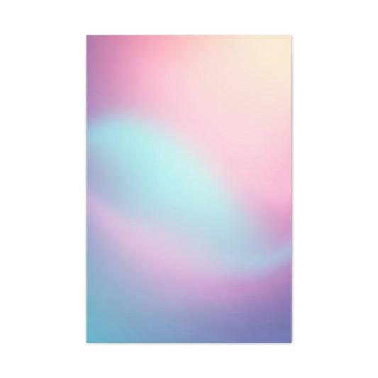
Ethereal Blush Gradient Wall Art & Canvas Prints
Regular price $141.23Regular price

Transformative Soothing Pastel Wall Art for Contemporary Living Spaces
The allure of gentle, muted colors has captivated interior design enthusiasts for decades, yet their true potential extends far beyond traditional expectations. Delicate artwork featuring subdued chromatic palettes possesses remarkable versatility, capable of revolutionizing any residential environment while maintaining sophisticated elegance. These ethereal color schemes create atmospheric depth that resonates with modern sensibilities, offering homeowners unprecedented flexibility in crafting personalized sanctuaries.
Contemporary design philosophy embraces the transformative power of subtle artistic expressions, recognizing their ability to establish emotional connections within living spaces. The soft luminosity inherent in these gentle hues creates visual harmony that transcends conventional decorative boundaries, allowing for seamless integration across diverse architectural styles and existing furnishing arrangements.
The Science Behind Color Perception and Emotional Response
The neurological impact of soft, muted colors on human consciousness represents a fascinating intersection of scientific research and aesthetic appreciation. Studies conducted by leading color theorists demonstrate that exposure to gentle chromatic variations triggers measurable reductions in cortisol levels, the primary stress hormone responsible for anxiety and tension. These physiological responses occur unconsciously, creating subconscious associations between peaceful environments and emotional wellbeing.
Gentle color palettes stimulate the parasympathetic nervous system, which governs relaxation responses and restorative processes. When individuals encounter artwork featuring soft pink undertones, their brain chemistry shifts toward increased serotonin production, naturally elevating mood and promoting feelings of contentment. Similarly, pale blue variations activate regions associated with tranquility and mental clarity, explaining their widespread popularity in meditation spaces and therapeutic environments.
The phenomenon known as chromatic adaptation allows viewers to experience prolonged exposure to these gentle hues without experiencing visual fatigue or sensory overload. Unlike their vibrant counterparts, which can become overwhelming in residential settings, muted artistic expressions maintain their appeal across extended viewing periods, making them ideal for spaces where occupants spend considerable time.
Research conducted by environmental specialists reveals that individuals surrounded by soft-toned artwork report significantly higher satisfaction levels with their living environments compared to those exposed to harsh, contrasting color schemes. This satisfaction translates into improved sleep quality, enhanced creativity, and reduced interpersonal conflict within shared domestic spaces.
The cultural significance of gentle chromatic expressions varies across different societies, yet universal themes of peace, renewal, and emotional comfort consistently emerge. These cross-cultural associations suggest deep-rooted human preferences for environments that mirror natural phenomena such as dawn skies, spring blossoms, and ocean depths.
Neuroplasticity research indicates that consistent exposure to calming visual stimuli can actually rewire neural pathways, creating lasting improvements in stress response patterns and emotional regulation. This scientific understanding elevates gentle artwork from mere decoration to therapeutic intervention, justifying its inclusion in spaces designed for healing and restoration.
The concept of visual anchoring demonstrates how strategic placement of soft-hued compositions can establish reference points that influence perception of entire environments. These anchor points create stability in visual processing, reducing cognitive load and promoting mental clarity throughout daily activities.
Chromotherapy principles, rooted in ancient healing traditions and supported by modern research, recognize the medicinal properties of specific color frequencies. Gentle pastels occupy therapeutic ranges that promote cellular regeneration and hormonal balance, making them particularly beneficial for spaces dedicated to rest and recovery.
Seasonal affective responses to color demonstrate cyclical preferences that align with natural light patterns and biological rhythms. Understanding these temporal variations enables strategic artwork selection that supports circadian health while maintaining year-round aesthetic appeal.
The biomimicry aspect of gentle color palettes connects human spaces with natural environments, satisfying evolutionary preferences for landscapes associated with safety, abundance, and tranquility. This connection explains the instinctive comfort experienced when viewing soft-toned compositions that echo natural color relationships.
Historical Evolution of Pastel Artistic Movements
The historical trajectory of gentle artistic expressions spans centuries, evolving from exclusive aristocratic preferences to democratized contemporary aesthetics. Early European portraiture utilized soft chromatic palettes to convey refinement and social status, establishing cultural associations between muted colors and sophistication that persist today.
Rococo movement artists pioneered the systematic exploration of pastel techniques, developing methods for achieving subtle tonal variations that captured ethereal qualities previously impossible to reproduce. These innovations laid groundwork for contemporary printing processes that democratize access to gentle artistic expressions across diverse economic segments.
Impressionist painters revolutionized understanding of color relationships by demonstrating how gentle hues could capture atmospheric conditions and emotional states with unprecedented accuracy. Their discoveries about optical color mixing inform modern approaches to creating depth and luminosity in printed artwork.
The Arts and Crafts movement emphasized handcrafted quality and natural materials, values that align with contemporary preferences for authentic artistic expressions over mass-produced alternatives. This historical connection validates investment in quality gentle artwork as continuation of established aesthetic traditions.
Modernist design principles stripped away ornamental excess while retaining essential color relationships, creating frameworks for contemporary integration of gentle artistic elements within minimalist environments. These historical precedents demonstrate timeless appeal of soft chromatic palettes across changing design philosophies.
Post-war suburban development coincided with increased appreciation for domestic tranquility, driving demand for artwork that promoted peaceful home environments. This historical context explains continued popularity of gentle expressions in residential settings seeking refuge from urban intensity.
Scandinavian design traditions cultivated appreciation for understated elegance and connection with natural cycles, creating cultural frameworks that naturally accommodate soft-toned artistic expressions. These regional preferences influence global design trends while maintaining authentic cultural connections.
The democratization of art reproduction technologies throughout the twentieth century transformed gentle artistic expressions from exclusive luxury items to accessible decorative elements, enabling broader appreciation while maintaining quality standards that justify investment consideration.
Contemporary wellness movements draw inspiration from historical healing traditions that recognized therapeutic properties of color exposure. This convergence of ancient wisdom and modern research validates the selection of gentle artwork for health-conscious living environments.
Digital reproduction capabilities now enable faithful capture of subtle color relationships that define gentle artistic expressions, ensuring contemporary accessibility while preserving historical aesthetic achievements that inform current appreciation standards.
Fundamental Principles of Spatial Harmony
Spatial harmony emerges from carefully considered relationships between artistic elements and architectural contexts, requiring understanding of proportion, balance, and visual flow patterns that influence occupant experience. Gentle artwork serves as mediating element between hard architectural surfaces and human comfort requirements.
The golden ratio appears repeatedly in successful gentle artwork arrangements, creating proportional relationships that satisfy subconscious preferences for mathematical harmony. These universal proportions transcend cultural boundaries while establishing frameworks for effective placement decisions.
Visual weight distribution affects perceived balance within rooms, with gentle artwork providing counterpoints to heavier architectural elements or bold furnishing choices. Understanding these weight relationships enables strategic placement that enhances rather than conflicts with existing design elements.
Sight line analysis reveals optimal viewing angles and distances for maximizing aesthetic impact of gentle compositions. These considerations become particularly important in multipurpose spaces where artwork must remain visually accessible from various activity zones.
Acoustic properties of spaces influence color perception through synesthetic responses that connect auditory and visual processing. Gentle artwork contributes to perceived acoustic softness, creating environments that feel quieter and more peaceful regardless of actual sound levels.
Circulation patterns within rooms affect how occupants encounter and appreciate artistic elements, requiring placement strategies that account for natural movement flows while creating opportunities for contemplative viewing experiences.
Scale relationships between artwork dimensions and room proportions determine whether gentle compositions enhance or overwhelm existing spatial qualities. Successful integration requires careful measurement and visualization before final placement decisions.
Light reflection patterns from gentle artwork surfaces contribute to overall illumination quality within spaces, creating soft bounced light that enhances atmospheric warmth while reducing harsh shadows from architectural elements.
Focal hierarchy establishes visual importance rankings among competing elements within rooms, with gentle artwork often serving as secondary focal points that support rather than challenge primary architectural features.
Color temperature coordination between gentle artwork palettes and ambient lighting ensures consistent atmospheric qualities throughout daily light cycles, preventing chromatic distortions that could diminish intended peaceful effects.
Material Science Behind Lasting Color Retention
Contemporary printing substrate selection significantly influences both visual presentation and longevity of gentle artistic expressions, requiring understanding of fiber composition, weave density, and surface preparation techniques that ensure optimal color adhesion and retention over extended display periods.
Canvas materials derived from premium cotton fibers provide superior dimensional stability compared to synthetic alternatives, minimizing expansion and contraction cycles that could stress printed surfaces and compromise color integrity. These natural fibers also exhibit enhanced chemical compatibility with pigment-based inks.
Archival ink formulations utilizing light-fast pigments demonstrate remarkable resistance to ultraviolet degradation, preserving delicate color relationships essential for effective gentle artistic expressions. These superior ink systems justify higher initial costs through extended functional lifespans and maintained aesthetic appeal.
Coating technologies applied to canvas substrates create protective barriers that prevent environmental contaminants from penetrating printed surfaces while maintaining breathability necessary for dimensional stability. These treatments prove particularly valuable for gentle artwork exposed to varying humidity conditions.
Molecular bonding between pigments and canvas fibers determines color permanence under various environmental stresses, with superior bonding systems ensuring stable color relationships even under challenging display conditions such as direct sunlight or temperature fluctuations.
Surface texture variations in canvas materials affect light reflection patterns and perceived color saturation, with smoother surfaces providing enhanced color vibrancy while textured alternatives create subtle visual interest that complements gentle chromatic palettes.
pH neutrality in both canvas and ink components prevents chemical reactions that could cause color shifts or material degradation over time. Acid-free materials ensure artwork maintains intended appearance throughout decades of display.
Humidity buffering properties of quality canvas materials help stabilize moisture content within printed layers, preventing cracking, delamination, or color bleeding that could compromise gentle artwork integrity during seasonal environmental changes.
Static dissipation treatments reduce dust attraction to canvas surfaces, minimizing maintenance requirements while preserving color clarity and surface smoothness essential for optimal presentation of gentle artistic expressions.
Quality control testing procedures for archival materials include accelerated aging studies that predict long-term performance under various environmental conditions, providing confidence in material selection decisions for investment-quality gentle artwork.
Environmental Factors Affecting Color Perception
Lighting conditions dramatically influence color perception and emotional response to gentle artistic expressions, requiring careful consideration of both natural and artificial illumination sources throughout daily and seasonal cycles to maintain intended atmospheric effects.
Directional lighting creates varying shadow patterns and highlights that can enhance or diminish subtle tonal variations within gentle compositions. Understanding these effects enables strategic placement decisions that optimize visual presentation under available lighting conditions.
Color temperature variations in artificial lighting systems significantly affect perceived warmth or coolness of gentle palettes, with warmer light sources enhancing pink and cream tones while cooler systems emphasize blue and green variations within the same artwork.
Natural light cycles throughout days and seasons create dynamic viewing experiences that reveal different aspects of gentle compositions at various times. This temporal variation adds depth to artwork appreciation while requiring consideration of primary viewing periods during placement planning.
Glare reduction strategies become particularly important for gentle artwork, as excessive reflection can wash out subtle color relationships that define these delicate expressions. Anti-reflective glazing options provide effective solutions while maintaining color accuracy.
Adjacent surface colors influence perceived hue relationships through simultaneous contrast effects, requiring consideration of wall colors, furnishing arrangements, and other decorative elements that could shift apparent color balance within gentle compositions.
Atmospheric perspective effects within rooms can enhance or diminish perceived depth in gentle artwork, with proper lighting and positioning creating three-dimensional illusions that increase visual interest and engagement.
Metamerism phenomena cause apparent color changes under different illumination sources, requiring evaluation of gentle artwork under various lighting conditions to ensure consistent appearance throughout daily use cycles.
Chromatic adaptation of human vision affects color perception over extended viewing periods, with gentle palettes demonstrating superior stability compared to high-contrast alternatives that can cause visual fatigue or apparent color shifts.
Environmental pollution and airborne contaminants can gradually affect color perception by depositing particles on artwork surfaces or glazing materials. Regular maintenance protocols preserve color clarity and ensure continued optimal presentation.
Strategic Placement for Maximum Visual Impact
Room orientation significantly affects natural lighting patterns and optimal placement strategies for gentle artwork, with northern exposures benefiting from warm-toned compositions while southern orientations can accommodate cooler palette variations without sacrificing atmospheric warmth.
Eye-level positioning ensures optimal viewing conditions for detailed appreciation while creating natural focal points that anchor furniture arrangements and establish visual stability within dynamic living spaces. Standard eye-level measurements range from 57 to 60 inches from floor level.
Corner installations represent frequently overlooked opportunities for introducing gentle artistic elements that soften angular architectural features while creating transitional zones between different functional areas within open floor plans.
Above-seating placements create natural focal points that enhance conversation areas while providing visually interesting backgrounds for social activities. The non-aggressive nature of gentle chromatic palettes ensures artwork enhances rather than competes with human interaction.
Hallway sequences enable creation of visual narratives through coordinated gentle artwork arrangements that guide movement patterns while maintaining atmospheric continuity throughout residential environments. These installations transform utilitarian spaces into gallery experiences.
Scale relationships between artwork dimensions and surrounding architectural elements determine visual impact and emotional resonance, with oversized gentle compositions creating immersive experiences while smaller pieces provide intimate focal points.
Grouping strategies for multiple gentle pieces require consideration of visual weight distribution, color harmony, and spacing relationships that create cohesive arrangements without overwhelming individual compositions or surrounding design elements.
Height variation techniques within grouped installations create visual rhythm and movement while maintaining overall compositional balance. These sophisticated arrangement approaches demonstrate design sophistication while preserving peaceful qualities.
Lighting integration planning ensures optimal illumination for gentle artwork throughout daily cycles, requiring coordination between natural light patterns and artificial lighting systems to maintain consistent color presentation and atmospheric effects.
Seasonal accessibility considerations enable artwork rotation possibilities that refresh environments without major redecorating investments, with gentle collections offering sufficient variety to emphasize different atmospheric qualities throughout annual cycles.
Color Harmony Theory in Contemporary Applications
Color theory applications in gentle artistic expressions require understanding of both traditional harmonic relationships and contemporary interpretations that account for modern viewing conditions and lifestyle requirements within residential environments.
Monochromatic color schemes utilizing variations of single hues create sophisticated depth while maintaining visual tranquility, with gentle palettes offering extensive tonal ranges that prevent monotony while preserving atmospheric cohesion.
Analogous color relationships between adjacent hues on the color wheel generate natural harmony that mirrors landscape color transitions, creating organic connections that satisfy evolutionary preferences for environmental color patterns.
Complementary color applications in gentle artwork require subtle handling to maintain peaceful qualities while introducing sufficient contrast for visual interest. These relationships create vibrancy without aggressive competition for attention.
Triadic color schemes utilizing three equally spaced hues can create dynamic gentle compositions when executed with appropriate saturation levels, offering complexity and visual engagement while preserving calming atmospheric qualities.
Split-complementary arrangements provide sophisticated alternatives to direct complementary relationships, creating visual interest through controlled tension while maintaining harmony essential for residential applications.
Temperature contrast techniques involve balancing warm and cool gentle hues to create depth and dimensional illusion within flat artwork surfaces, enhancing perceived spatial qualities without disrupting peaceful atmospheric effects.
Saturation gradations within gentle palettes create subtle movement and visual flow that guides viewer attention while maintaining overall compositional unity. These techniques add sophistication without compromising tranquil qualities.
Tint and shade relationships within gentle color families enable creation of complex harmonic structures that reward detailed viewing while maintaining broad appeal for casual observation during daily activities.
Cultural color associations influence interpretation of gentle compositions, requiring awareness of symbolic meanings and emotional connections that may vary among diverse viewer populations within contemporary living environments.
Contemporary color trend analysis reveals cyclical preferences for specific gentle palette combinations, enabling strategic selection decisions that balance current appeal with long-term aesthetic relevance for investment consideration purposes.
Living Space Dynamics and Visual Flow Creation
Contemporary living spaces demand sophisticated integration of gentle artistic expressions that enhance natural traffic patterns while creating zones of visual interest and emotional respite. The strategic placement of soft-hued compositions can fundamentally alter spatial perception, making compact areas feel more expansive while lending intimacy to oversized rooms.
Open floor plan environments benefit tremendously from gentle artwork serving as visual anchors that define functional zones without creating physical barriers. These subtle demarcation strategies maintain spatial fluidity while providing psychological boundaries that enhance comfort and usability. The non-intrusive nature of muted palettes allows artwork to function as organizational elements without competing with architectural features or furniture arrangements.
Sight line manipulation through carefully positioned gentle compositions directs attention toward desired focal points while softening harsh architectural transitions. This technique proves particularly valuable in renovated spaces where original structural elements may create awkward visual disruptions that gentle artwork can ameliorate through strategic color placement and tonal harmony.
Vertical space utilization maximizes the transformative potential of gentle artwork in rooms with standard ceiling heights, creating illusions of increased spatial volume through strategic color temperature manipulation and tonal progression techniques. Cool gentle hues positioned higher on walls recede visually, while warmer tones at eye level create approachable comfort zones.
Natural light interaction with gentle artwork creates dynamic atmospheric changes throughout daily cycles, transforming static decorative elements into responsive environmental features that evolve with changing illumination conditions. This temporal variation prevents visual stagnation while maintaining consistent peaceful qualities essential for residential comfort.
Reflection patterns from gentle artwork surfaces contribute to overall room illumination through soft light bouncing that reduces harsh shadows and creates more even distribution of ambient lighting. This optical enhancement reduces dependency on artificial lighting during daylight hours while improving energy efficiency and environmental comfort.
Spatial proportion relationships between gentle artwork and room dimensions require mathematical precision to achieve optimal visual harmony, with specific ratios creating psychological comfort through subconscious recognition of proportional correctness that satisfies innate preferences for balanced environments.
Traffic flow consideration in artwork placement ensures unobstructed movement patterns while maximizing viewing opportunities from various positions within rooms. Strategic positioning creates multiple appreciation angles that reveal different aspects of gentle compositions depending on viewer location and activity.
Functional zone integration allows gentle artwork to serve dual purposes as decorative elements and subtle space organizers, creating psychological boundaries that enhance room usability without imposing physical restrictions that could limit furniture arrangement flexibility.
Color temperature transitions between different areas within open spaces can be smoothly managed through graduated gentle artwork selections that create visual bridges between distinct functional zones while maintaining atmospheric coherence throughout interconnected environments.
Bedroom Sanctuary Enhancement Through Chromatic Serenity
Bedroom environments represent intimate spaces where gentle artistic expressions achieve maximum therapeutic impact through direct influence on sleep quality, emotional regulation, and personal restoration processes that occur during extended periods of private occupation.
Circadian rhythm support through strategic gentle artwork placement leverages scientific understanding of light sensitivity and hormonal regulation to create environments that naturally promote healthy sleep-wake cycles. Cool gentle blues positioned within primary sight lines help trigger melatonin production, while warm cream tones near morning light sources support natural awakening processes.
Headboard alternatives utilizing oversized gentle compositions create dramatic focal points that eliminate need for traditional furniture pieces while providing soft visual anchoring that enhances perceived bed comfort and luxury. These artistic headboards offer unlimited customization possibilities while maintaining budget-friendly accessibility.
Relaxation zone creation through gentle artwork positioning establishes designated areas within bedrooms for meditation, reading, or quiet contemplation activities that support mental health and stress reduction goals essential for quality rest environments.
Romantic atmosphere enhancement benefits from carefully selected gentle palettes that create emotional warmth without overwhelming intimacy requirements. Soft pink and peach variations promote connection while maintaining sophistication necessary for adult bedroom environments.
Privacy enhancement through strategic gentle artwork placement can create visual barriers that provide psychological comfort in shared bedroom spaces or rooms with challenging architectural features such as awkward window placements or structural intrusions.
Morning light optimization involves positioning gentle artwork to capture and reflect early daylight in ways that create pleasant awakening experiences while preventing harsh glare that could disrupt natural sleep patterns or create uncomfortable visual conditions.
Color therapy applications in bedroom environments utilize specific gentle hues known to support healing processes, with pale green promoting cellular regeneration and soft lavender encouraging deep restorative sleep that enhances overall health and wellbeing.
Personal reflection enhancement through gentle artwork creates contemplative spaces that support self-care practices and emotional processing activities essential for mental health maintenance within busy contemporary lifestyles.
Seasonal adaptation capabilities enable bedroom artwork rotation that addresses changing light patterns and emotional needs throughout annual cycles, providing environmental flexibility that supports both physical comfort and psychological wellbeing throughout varied weather conditions.
Kitchen and Dining Area Atmospheric Refinement
Kitchen environments traditionally associated with functional efficiency can achieve unexpected sophistication through strategic incorporation of gentle artistic expressions that balance productivity requirements with atmospheric serenity essential for enjoyable culinary experiences and social dining activities.
Appetite stimulation through specific gentle hues, particularly warm peach and cream variations, creates psychological conditions that enhance dining pleasure while supporting healthy eating behaviors. Research demonstrates measurable increases in food enjoyment and social interaction when dining occurs in environments featuring appropriate gentle color selections.
Humidity resistance considerations require careful material selection for kitchen artwork installations, with properly sealed canvas compositions and protective glazing systems ensuring longevity despite challenging environmental conditions including steam, temperature fluctuations, and airborne cooking particles.
Social interaction enhancement through gentle artwork positioning creates welcoming atmospheres that encourage extended meal conversations and informal gathering activities that strengthen family relationships and social connections within domestic environments.
Cleanliness perception improvement results from gentle color associations with purity and freshness, creating psychological impressions of enhanced hygiene that support food preparation confidence while maintaining aesthetic appeal that elevates utilitarian spaces.
Counter space optimization through strategic gentle artwork placement can create visual expansion illusions that make compact kitchen areas feel more spacious while providing color coordination opportunities with appliances and cabinetry selections.
Lighting enhancement in kitchen environments benefits from gentle artwork reflection properties that increase ambient illumination levels while reducing reliance on harsh task lighting during food preparation and casual dining activities.
Storage integration possibilities include gentle artwork serving as cabinet door treatments or backsplash alternatives that provide easy cleaning access while maintaining decorative appeal and color coordination with existing kitchen design elements.
Entertaining preparation benefits from gentle artwork creating sophisticated backgrounds for dinner parties and social gatherings, establishing atmospheric foundation that supports both casual family meals and formal entertaining requirements.
Seasonal menu inspiration can draw from gentle artwork color selections, creating thematic connections between visual environment and culinary choices that enhance overall dining experiences through multisensory coordination and aesthetic harmony.
Bathroom Transformation into Personal Retreat Spaces
Bathroom environments offer unique opportunities for gentle artistic expressions to transform utilitarian spaces into personal retreat experiences that support daily grooming rituals while providing atmospheric respite from external stressors and time pressures.
Humidity management requirements necessitate specialized preparation techniques for gentle artwork in bathroom applications, including moisture barrier coatings and ventilation considerations that ensure longevity while maintaining color integrity despite challenging environmental conditions.
Spa-like atmosphere creation through gentle color selections establishes luxurious ambiance that elevates routine activities into self-care experiences, promoting relaxation and stress reduction during personal maintenance activities that begin and end each day.
Mirror reflection enhancement utilizes gentle artwork positioning to create pleasant visual backgrounds that appear in mirror reflections, improving perceived attractiveness of grooming spaces while providing subtle color therapy benefits during extended mirror use periods.
Privacy enhancement through strategic gentle artwork placement creates psychological comfort in bathroom environments, particularly beneficial in shared facilities or spaces with challenging architectural features such as awkward window locations or insufficient natural screening.
Natural light optimization involves positioning gentle artwork to capture and enhance available daylight while preventing harsh glare that could interfere with grooming activities or create uncomfortable visual conditions during morning and evening routines.
Small space maximization through carefully selected gentle artwork can create visual expansion effects that make compact bathroom areas feel more spacious while providing color coordination opportunities with fixtures and tile selections.
Aromatherapy coordination enables gentle artwork color selections to complement scented products and environmental fragrances, creating multisensory experiences that enhance relaxation benefits through coordinated visual and olfactory stimulation.
Cleaning convenience considerations require selection of gentle artwork with appropriate protective treatments that facilitate easy maintenance while preserving color quality despite regular exposure to cleaning products and moisture conditions.
Personal sanctuary establishment transforms bathrooms from purely functional spaces into environments that support mental health through beautiful surroundings that provide daily inspiration and stress reduction during private moments.
Home Office Productivity and Stress Reduction Balance
Home office environments require careful balance between stimulating productivity and maintaining stress reduction, making gentle artistic expressions ideal for creating spaces that support focused concentration without inducing anxiety or visual fatigue that could compromise work quality.
Focus enhancement through strategic gentle artwork placement eliminates visual distractions while providing subtle stimulation that maintains alertness during extended work periods. The calming influence of soft color palettes reduces cortisol production while supporting cognitive clarity essential for complex tasks.
Eye strain reduction benefits from gentle artwork positioned to provide visual relief destinations during computer work, offering focal distance variation that exercises eye muscles while providing color therapy benefits that counteract digital screen exposure effects.
Creativity stimulation through specific gentle hue selections activates brain regions associated with innovative thinking while maintaining atmospheric calm necessary for sustained concentration during creative work processes that require both inspiration and discipline.
Professional appearance maintenance ensures home office environments remain suitable for video conferencing and client meetings, with gentle artwork providing sophisticated backgrounds that project competence while avoiding distracting elements that could interfere with professional communication.
Noise perception reduction results from gentle color associations with quietness, creating psychological impressions of reduced acoustic disturbance regardless of actual sound levels within home office environments that may lack professional sound treatment.
Ergonomic positioning considerations ensure gentle artwork placement supports healthy work postures by providing visual reference points that encourage proper head positioning and eye movement patterns during extended computer use periods.
Productivity measurement studies indicate measurable improvements in work output quality and satisfaction levels when office environments feature appropriate gentle artwork selections that support both cognitive function and emotional wellbeing throughout working hours.
Stress hormone regulation through color exposure provides measurable health benefits for home office workers, with gentle palettes supporting cortisol reduction and improved stress response patterns that enhance both work performance and overall wellbeing.
Work-life balance enhancement utilizes gentle artwork to create psychological separation between professional activities and personal relaxation within shared home environments, establishing visual cues that support mental transitions between different activity modes.
Hallway and Transitional Space Animation
Hallway environments often represent underutilized opportunities for gentle artistic expressions to transform purely functional circulation spaces into engaging gallery experiences that connect different areas of homes while providing visual interest and atmospheric continuity.
Movement guidance through sequential gentle artwork arrangements creates visual narratives that naturally direct traffic flow while preventing the corridor effect that can make hallways feel cramped or uninviting despite adequate physical dimensions.
Lighting enhancement capabilities of gentle artwork prove particularly valuable in hallway environments that frequently suffer from inadequate natural illumination, with light-reflecting properties of pale compositions brightening these transitional spaces while reducing artificial lighting requirements.
Width perception manipulation utilizes color temperature and tonal contrast to create illusions of increased spatial dimensions in narrow hallways, with cool gentle hues creating recession effects while warm accents provide visual anchoring that prevents tunnel-like appearances.
Gallery wall opportunities in hallway environments enable display of multiple gentle compositions that create immersive artistic experiences without overwhelming adjacent living spaces with extensive artwork collections.
Height emphasis through vertical gentle artwork arrangements draws attention upward in hallway environments, creating impressions of increased ceiling height while adding visual interest to otherwise unutilized wall surfaces.
Historical narrative creation enables hallway artwork sequences to tell stories through progressive gentle compositions that reveal different chapters or themes as viewers move through transitional spaces between primary living areas.
Color transition management between different rooms utilizes hallway artwork to create smooth chromatic bridges that prevent jarring visual shifts while maintaining distinct atmospheric identities for various functional spaces.
Safety consideration integration ensures hallway artwork installation provides adequate clearance for safe passage while contributing to overall navigation ease through consistent visual markers and reference points.
Storage concealment opportunities utilize strategically positioned gentle artwork to disguise utility access panels, electrical components, or storage areas that could otherwise create visual disruptions in hallway environments.
Entertainment Area Atmosphere and Social Dynamics
Entertainment spaces require sophisticated balance between stimulating social interaction and maintaining atmospheric comfort that supports extended gathering periods, making gentle artistic expressions valuable tools for creating welcoming environments that encourage relaxation and connection.
Conversation facilitation through gentle artwork positioning creates natural focal points that anchor seating arrangements while providing non-controversial discussion topics that can bridge social gaps during gatherings with diverse participant groups.
Acoustic comfort enhancement results from gentle color associations with quietness and calm, creating psychological impressions of improved sound quality that support conversation clarity even in rooms lacking professional acoustic treatment.
Lighting mood management utilizes gentle artwork reflection properties to create ambient illumination that can be adjusted through strategic placement of accent lighting that highlights compositions while contributing to overall atmospheric control.
Entertainment equipment integration enables gentle artwork to visually balance technological elements such as televisions and audio systems, preventing these functional items from dominating room aesthetics while maintaining easy access and operation.
Seating arrangement optimization benefits from gentle artwork serving as visual anchors that establish furniture placement patterns supporting both intimate conversations and group activities during various types of social gatherings.
Party planning advantages include gentle artwork providing sophisticated backgrounds for photography while creating atmospheres that enhance guest comfort and social interaction throughout various types of entertainment events.
Game area designation utilizes gentle artwork to create psychological boundaries that separate different activity zones within multi-purpose entertainment spaces, enabling simultaneous activities without visual or atmospheric conflicts.
Seasonal celebration adaptation allows gentle artwork to provide consistent atmospheric foundation while accommodating temporary decorative additions for holidays and special occasions without creating visual competition or design conflicts.
Children's activity accommodation ensures entertainment area gentle artwork selections remain appropriate and visually appealing for family gatherings that include various age groups, maintaining sophistication while avoiding content that could be unsuitable for young viewers.
Canvas Substrate Engineering and Fiber Composition Analysis
Contemporary canvas substrate selection represents critical foundation decisions that determine both aesthetic presentation and functional longevity of gentle artistic expressions, requiring comprehensive understanding of fiber characteristics, weave structures, and surface preparation techniques that influence color adhesion, dimensional stability, and environmental resistance.
Natural fiber compositions, particularly premium cotton varieties, demonstrate superior dimensional stability compared to synthetic alternatives due to inherent molecular structures that accommodate moisture absorption and release cycles without excessive expansion or contraction that could stress printed surfaces or compromise color integrity over extended display periods.
Linen canvas substrates offer exceptional longevity characteristics through unique fiber strength and natural resistance to degradation, making them ideal choices for investment-quality gentle artwork intended for permanent installation in challenging environmental conditions including high humidity areas or spaces with significant temperature fluctuations.
Synthetic blend formulations combine natural fiber benefits with engineered polymer enhancements that provide specific performance characteristics such as enhanced moisture resistance, reduced stretch properties, or improved ink adhesion capabilities while maintaining authentic textile appearance and texture qualities.
Weave density specifications affect both surface texture appearance and structural integrity of canvas substrates, with tighter weaves providing smoother printing surfaces for enhanced color saturation while looser weaves create textural interest that can complement gentle artistic compositions requiring organic visual qualities.
Thread count measurements indicate relative quality and durability expectations for canvas materials, with higher thread counts generally correlating with improved surface smoothness and reduced ink absorption that maintains color vibrancy and prevents premature fading under normal display conditions.
Surface preparation treatments including sizing applications and primer coatings create optimal printing surfaces while providing protective barriers against environmental contaminants that could penetrate canvas fibers and cause long-term degradation or color shifting effects.
pH neutrality requirements in canvas materials prevent chemical reactions between substrates and printing inks that could cause color instability or material degradation over time, with acid-free compositions ensuring stable chemical environments throughout decades of display.
Texture variation options range from ultra-smooth surfaces ideal for photographic reproduction to heavily textured alternatives that create painterly effects suitable for artistic interpretations requiring organic visual characteristics that complement gentle chromatic palettes.
Quality control testing procedures for premium canvas materials include tensile strength evaluations, color fastness assessments, and accelerated aging studies that predict long-term performance under various environmental conditions, providing confidence in material selection decisions for high-value gentle artwork.
Manufacturing consistency standards ensure uniform quality across production runs, preventing batch variations that could affect color reproduction accuracy or create visual inconsistencies in multiple artwork installations requiring precise color matching and aesthetic coordination.
Ink Technology and Pigment Permanence Systems
Archival ink formulations represent revolutionary advances in color permanence technology that enable gentle artistic expressions to maintain intended chromatic relationships throughout decades of display exposure to environmental stresses including ultraviolet radiation, atmospheric pollution, and humidity fluctuations.
Pigment-based printing systems demonstrate superior light fastness compared to dye-based alternatives through molecular structures that resist photochemical breakdown when exposed to ultraviolet radiation, ensuring gentle color palettes maintain subtle tonal relationships essential for atmospheric effectiveness.
Color gamut capabilities in contemporary printing systems enable accurate reproduction of extensive gentle color ranges that were previously impossible to achieve through traditional printing methods, expanding creative possibilities while maintaining archival quality standards necessary for investment consideration.
Ink droplet precision technology controls color density and blending characteristics at microscopic levels, creating smooth tonal transitions and subtle gradations essential for effective gentle artistic expressions that depend on delicate color relationships for emotional impact.
Fade resistance testing procedures utilize accelerated light exposure protocols that simulate decades of normal display conditions, providing quantitative predictions of color stability that enable informed decisions regarding artwork placement and expected longevity.
Chemical stability factors prevent ink interactions with canvas substrates or environmental contaminants that could cause color shifts, bleeding, or degradation effects that would compromise the delicate color relationships essential for gentle artistic expression effectiveness.
Humidity resistance characteristics protect printed surfaces against moisture-induced effects such as color bleeding, surface deterioration, or chemical changes that could alter intended appearance or reduce structural integrity of gentle artwork over time.
Temperature stability ranges define safe environmental conditions for displayed gentle artwork, with archival ink systems designed to withstand normal residential temperature variations without experiencing color shifts or chemical degradation that could affect aesthetic quality.
UV filtering capabilities in specialized ink formulations provide inherent protection against photochemical breakdown even in challenging display environments, reducing dependency on external UV filtering systems while maintaining long-term color accuracy.
Quality assurance protocols for archival ink systems include batch testing procedures that verify color accuracy, chemical stability, and permanence characteristics before production use, ensuring consistent quality standards for investment-grade gentle artwork applications.
Protective Framing Systems and Environmental Barriers
Professional framing systems serve dual functions as presentation enhancement tools and protective barriers against environmental threats that could compromise gentle artwork integrity, requiring sophisticated understanding of material compatibility, protective capabilities, and aesthetic coordination principles.
Wood species selection for framing applications affects both appearance coordination and chemical compatibility with gentle artwork, with hardwood varieties offering superior dimensional stability while avoiding species that could emit acidic compounds potentially harmful to canvas or ink systems.
Metal framing alternatives provide contemporary aesthetic options while offering superior dimensional stability and moisture resistance compared to traditional wood systems, making them particularly suitable for gentle artwork installation in challenging environmental conditions.
Glazing material options range from standard glass to specialized museum-quality materials offering enhanced ultraviolet filtration, reduced reflective glare, and superior impact resistance while maintaining optical clarity essential for accurate color perception.
Anti-reflective coating technologies eliminate surface glare that could interfere with optimal viewing of gentle artwork, particularly important for delicate compositions where subtle color relationships could be obscured by reflected ambient lighting.
UV filtering capabilities in protective glazing materials provide essential protection against photochemical degradation while maintaining natural color perception, enabling display in locations with significant natural lighting without compromising long-term color stability.
Matting system design creates protective spacing between artwork surfaces and glazing materials while providing aesthetic framing that enhances presentation quality and visual impact of gentle compositions through color coordination and proportional relationships.
Conclusion
Conservation mounting techniques ensure artwork attachment to framing systems without chemical interactions or physical stresses that could cause long-term damage, utilizing archival materials and reversible methods that preserve investment value.
Moisture barrier integration prevents humidity infiltration that could affect canvas dimensional stability or create conditions conducive to mold growth or chemical degradation within framing systems during storage or display periods.
Structural engineering considerations ensure framing systems provide adequate support for gentle artwork while accommodating thermal expansion cycles and seismic movement without transmitting stress forces to delicate canvas or printed surfaces.
Climate control requirements for gentle artwork preservation extend beyond basic comfort considerations to encompass specific temperature and humidity ranges that optimize color stability while preventing material degradation that could compromise aesthetic quality or structural integrity.
Relative humidity management maintains optimal moisture levels that prevent excessive canvas expansion or contraction while avoiding conditions that could promote mold growth or chemical degradation in artwork materials or protective systems.
Temperature stability importance becomes critical for gentle artwork preservation, with fluctuation ranges affecting chemical reaction rates, dimensional stability, and color fastness characteristics that determine long-term aesthetic preservation success.
Air circulation requirements prevent stagnant conditions that could concentrate atmospheric pollutants or create humidity variations that might affect gentle artwork materials, while avoiding direct airflow that could deposit particulate matter on surfaces.