
-
Octopus in Kelp Forest Wall Art & Canvas Prints
Regular price $141.23Regular price

Transforming Your Living Space with Handcrafted Octopus Wall Art
Creating personalized wall decorations has become an increasingly popular way to infuse character and creativity into our living spaces. Among the myriad of artistic possibilities, ocean-themed artwork holds a special place in contemporary home design. The majestic octopus, with its flowing tentacles and mysterious allure, represents one of the most captivating subjects for wall art projects that can dramatically transform any room's aesthetic appeal.
This comprehensive exploration delves into the fascinating world of handcrafted octopus wall art, providing detailed insights into materials, techniques, and creative approaches that will help you produce stunning decorative pieces. Whether you're designing a nautical-themed bedroom, creating a focal point for your living room, or adding personality to a child's space, understanding the nuances of this artistic endeavor will empower you to craft memorable and impactful visual elements.
The journey of creating octopus wall art extends far beyond simple painting techniques. It encompasses understanding color theory, texture manipulation, composition principles, and the psychological impact of marine-themed imagery on interior environments. Throughout this detailed guide, we'll explore various methodologies, material considerations, and creative variations that can elevate your artistic project from a simple craft activity to a sophisticated decorative masterpiece.
Understanding the Artistic Foundation of Marine-Themed Wall Decorations
The foundation of exceptional octopus wall art lies in comprehending the creature's unique characteristics and translating them into visually compelling artistic representations. Octopuses possess distinctive features that make them ideal subjects for wall decorations: their fluid tentacles create dynamic movement, their bulbous heads provide focal points, and their mysterious nature evokes curiosity and wonder.
When approaching this artistic endeavor, consider the octopus's natural habitat and behavioral patterns. These magnificent cephalopods inhabit diverse marine environments, from shallow coral reefs to deep ocean trenches. This versatility in their natural setting provides artists with numerous creative possibilities for background treatments, color palettes, and compositional arrangements.
The psychological impact of marine imagery in interior spaces cannot be understated. Ocean-themed artwork often evokes feelings of tranquility, mystery, and adventure. The octopus, in particular, symbolizes intelligence, adaptability, and transformation in many cultures, making it an excellent choice for spaces designed to inspire creativity and contemplation.
Understanding color psychology becomes crucial when planning your octopus wall art. Deep blues and teals can create calming atmospheres, while vibrant corals and oranges add energy and warmth. Neutral tones like grays and whites provide sophisticated elegance, while darker hues create dramatic focal points that command attention in any room.
The scale and proportion of your octopus artwork significantly influence its visual impact. Larger pieces create bold statements and can serve as room anchors, while smaller artworks work beautifully as part of gallery walls or accent pieces. Consider the intended placement when determining dimensions, ensuring the finished piece complements rather than overwhelms the surrounding space.
Texture plays a vital role in creating engaging octopus wall art. The creature's soft, undulating form can be enhanced through various painting techniques that simulate the smooth, wet appearance of octopus skin. Layering different paint consistencies, using specialized brushes, and incorporating mixed media elements can add depth and tactile interest to your creation.
The composition of your octopus artwork should consider the creature's natural movement patterns. Tentacles that flow gracefully across the canvas create visual rhythm and guide the viewer's eye throughout the piece. Planning the tentacle placement strategically can help balance the composition and create dynamic energy within the artwork.
Material Selection and Preparation Strategies
Selecting appropriate materials forms the cornerstone of successful octopus wall art creation. The choice of canvas or substrate significantly impacts the final result, with options ranging from traditional stretched canvases to wood panels, paper, and alternative surfaces. Each material brings unique characteristics that influence paint application, texture development, and overall artistic expression.
Wood panels offer exceptional durability and provide interesting texture variations that can enhance the organic feel of octopus artwork. The natural grain patterns can complement the flowing lines of tentacles, while the solid surface allows for confident brush strokes and detailed work. Preparing wood surfaces properly ensures optimal paint adhesion and longevity of the finished piece.
Canvas remains the most popular choice for acrylic paintings due to its versatility and accessibility. Stretched canvases provide slight flexibility that can be advantageous when applying thick paint layers or creating textured effects. The fabric texture of canvas can add subtle interest to smooth paint applications, creating depth without overwhelming the primary subject.
Paper substrates, particularly heavyweight watercolor papers, offer unique possibilities for octopus wall art. These surfaces readily absorb paint, creating soft, diffused effects that can beautifully capture the ethereal quality of underwater scenes. The absorbent nature of paper allows for interesting bleeding and blending effects that can enhance the organic appearance of octopus forms.
Paint selection requires careful consideration of desired effects, working time, and final appearance. High-quality acrylic paints provide excellent coverage, vibrant colors, and reasonable working time for blending and manipulation. The consistency of acrylic paint can be modified with various mediums to achieve specific textural effects or extend working time for complex blending operations.
Brush selection directly impacts the final appearance of your octopus artwork. Flat brushes excel at covering large areas and creating smooth color transitions, while round brushes provide precision for detailed work and organic curved lines. Specialty brushes, such as fan brushes or texture brushes, can create unique effects that enhance the representation of octopus skin or water environments.
Medium selection opens numerous creative possibilities for enhancing paint performance and achieving specific visual effects. Matte mediums reduce gloss levels and extend paint volume, while texture mediums add dimensional elements that can simulate water surfaces or create tactile interest. Extender mediums slow drying time, allowing for more complex blending and gradient work.
Color palette planning ensures cohesive and visually appealing results. Consider creating color swatches before beginning the painting process, testing various combinations and mixing ratios. This preparation phase allows for confident color application during the painting process and helps avoid costly mistakes or unsatisfactory results.
Sketching and Design Planning Techniques
The preliminary design phase establishes the foundation for successful octopus wall art creation. Developing a clear vision before beginning paint application ensures confident execution and helps avoid compositional problems that can be difficult to correct later in the process. This planning stage allows for experimentation with different poses, proportions, and environmental elements.
Beginning with thumbnail sketches helps explore various compositional possibilities quickly and efficiently. These small, rough drawings allow for rapid evaluation of different octopus positions, tentacle arrangements, and overall design concepts. Spending time on this preliminary exploration phase often reveals unexpected creative solutions and helps identify the strongest compositional approach.
Proportion studies ensure that the octopus appears anatomically believable and visually appealing. While artistic interpretation allows for creative liberties, maintaining basic proportional relationships between the head and tentacles creates more convincing representations. Understanding the octopus's natural proportions provides a solid foundation for stylistic interpretation.
Grid methods can assist artists who feel uncertain about their drawing abilities. By creating a grid system over reference images and transferring the proportional relationships to the canvas, even novice artists can achieve accurate basic shapes. This systematic approach removes much of the guesswork from the sketching process and builds confidence for free-hand drawing.
Transfer techniques offer alternative approaches for artists who prefer to focus on painting rather than drawing. Carbon paper, graphite transfer methods, or projector tracing can help establish accurate outlines on the canvas. These methods allow artists to concentrate their creative energy on color application and texture development rather than struggling with proportional accuracy.
Reference material gathering enhances the authenticity and visual interest of octopus artwork. High-quality photographs, video footage, and even visits to aquariums provide valuable insights into octopus anatomy, movement patterns, and coloration. This research phase enriches the artistic interpretation and provides inspiration for creative details.
Composition rules, such as the rule of thirds or golden ratio, can guide the placement of key elements within the artwork. While these guidelines shouldn't restrict creativity, understanding basic compositional principles helps create more visually engaging and balanced results. The flowing nature of octopus tentacles provides excellent opportunities for creating dynamic compositional elements.
Environmental context planning enriches the overall impact of octopus artwork. Considering whether to include background elements such as coral, rocks, or water effects influences material choices and painting sequence. Simple backgrounds often enhance the octopus as the primary subject, while detailed environments can create immersive underwater scenes.
Color Theory and Palette Development
Understanding color relationships and their emotional impact forms a crucial component of creating compelling octopus wall art. The marine environment offers a rich spectrum of color possibilities, from the deep indigos and teals of ocean depths to the vibrant corals and yellows of tropical reefs. Developing a cohesive color palette ensures visual harmony and enhances the overall impact of your artistic creation.
Primary color relationships provide the foundation for effective palette development. The classic combination of blues and oranges creates dynamic contrast that can make octopus subjects appear to glow against darker backgrounds. This complementary relationship naturally draws the viewer's attention and creates visual excitement within the composition.
Analogous color schemes, using colors that appear adjacent on the color wheel, create harmonious and soothing effects. Combinations of blues, blue-greens, and greens evoke the natural ocean environment while maintaining visual coherence. These palettes work particularly well for creating calming, meditative atmospheres in bedrooms or relaxation spaces.
Monochromatic approaches, utilizing various values and saturations of a single hue, can create sophisticated and elegant results. A monochromatic blue palette, for example, can capture the essence of deep ocean environments while maintaining visual unity. These approaches often appear more refined and work well in contemporary interior design schemes.
Temperature variations within color palettes add depth and visual interest to octopus artwork. Warm colors tend to advance visually, making them effective for highlighting important areas such as the octopus's eyes or prominent tentacles. Cool colors recede, making them suitable for background areas and creating atmospheric depth.
Saturation levels significantly impact the mood and energy of octopus artwork. Highly saturated colors create vibrant, energetic effects that work well in children's spaces or rooms designed for creativity and play. Muted, desaturated colors create sophisticated, calming effects suitable for adult bedrooms or professional environments.
Value contrasts between light and dark elements create visual hierarchy and dimensional effects within octopus artwork. Strategic placement of light values can simulate underwater lighting effects, while darker values create shadows and depth. Understanding how to manipulate value relationships enhances the three-dimensional appearance of painted subjects.
Mixing techniques for achieving desired colors require practice and understanding of pigment characteristics. Some colors mix readily and create predictable results, while others may produce muddy or unexpected outcomes. Testing color combinations on separate surfaces before applying them to the final artwork prevents disappointing surprises.
Fundamental Painting Techniques and Application Methods
Mastering basic painting techniques provides the foundation for creating professional-quality octopus wall art. The application of paint involves more than simply covering surfaces with color; it requires understanding how different brushstrokes, pressure variations, and layering methods contribute to the overall visual impact and textural quality of the finished piece.
Brush handling techniques significantly influence the character and quality of painted surfaces. Confident, flowing strokes create dynamic energy that complements the organic nature of octopus forms. Hesitant, choppy brushwork can detract from the fluid grace that makes these creatures so visually appealing. Practicing basic stroke techniques on separate surfaces builds the muscle memory necessary for confident execution.
Paint consistency manipulation allows for various textural effects that can enhance the representation of octopus skin and underwater environments. Thick, impasto applications create dimensional texture that catches light and adds tactile interest. Thinned paint applications create smooth, flowing effects that can simulate the wet appearance of marine life.
Layering strategies build depth and complexity within octopus artwork. Starting with basic color blocking establishes the fundamental shapes and proportions, while subsequent layers add refinement, detail, and dimensional effects. Understanding when to allow layers to dry completely versus working wet-into-wet creates different visual outcomes.
Blending techniques create smooth color transitions that can simulate the subtle gradations found in natural octopus coloration. Wet blending allows colors to flow together naturally, creating soft, organic transitions. Dry blending involves working with partially dried paint to achieve more controlled color mixing and precise gradient effects.
Texture creation methods add visual and tactile interest to octopus artwork. Stippling techniques can simulate the bumpy texture of octopus skin, while dry brushing creates subtle surface variations. Sponging and other alternative application methods can create unique effects that enhance the organic nature of marine subjects.
Highlighting and shadow placement create dimensional effects that make painted octopuses appear to emerge from the canvas surface. Understanding basic lighting principles helps determine where highlights should appear brightest and where shadows should be deepest. These tonal variations create the illusion of three-dimensional form on flat surfaces.
Detail work requires patience and careful observation of reference materials. Octopus eyes, sucker details, and skin patterns provide opportunities for adding visual interest and authenticity to artwork. Using appropriate brush sizes and maintaining steady hand control becomes crucial for executing these refined elements successfully.
Environmental Background Creation and Atmospheric Effects
The background environment surrounding your octopus subject plays a crucial role in creating compelling and immersive wall art. Whether you choose to suggest a simple atmospheric setting or develop a detailed underwater scene, understanding how to create convincing environmental effects enhances the overall impact and believability of your artistic creation.
Underwater atmosphere creation involves understanding how light behaves in aquatic environments. Water filters and diffuses light, creating soft, ethereal effects that can be simulated through careful color application and blending techniques. The deeper the suggested water depth, the more blue-green filtration should be incorporated into the color palette.
Gradient backgrounds provide effective foundations for octopus subjects without competing for visual attention. Smooth color transitions from light to dark or warm to cool can suggest depth, lighting conditions, or environmental mood. These simplified backgrounds allow the octopus to remain the primary focal point while providing visual context.
Coral reef environments offer opportunities for creating colorful, detailed backgrounds that complement octopus subjects. However, balancing detail levels becomes important to prevent backgrounds from overwhelming the primary subject. Suggesting coral forms through loose brushwork often proves more effective than attempting photorealistic detail.
Rocky seafloor representations provide natural habitat contexts for octopus artwork. These environments can be suggested through various texture techniques and earth-toned color palettes. The irregular, organic shapes of underwater rock formations complement the flowing lines of octopus tentacles.
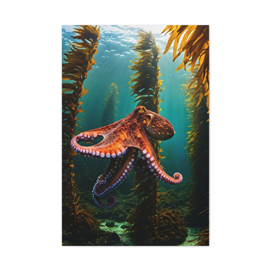
Kelp forest environments create dramatic vertical elements that can frame octopus subjects effectively. The long, flowing fronds of kelp plants echo the movement of octopus tentacles while adding compositional structure. These elements can be painted with loose, confident brushstrokes to maintain visual flow.
Bubble effects and water distortion can add dynamic movement to octopus artwork backgrounds. These elements suggest underwater currents, breathing, or movement, adding life and energy to otherwise static compositions. Simple circular shapes with highlights can effectively represent bubbles at various scales.
Lighting effects within underwater environments create mood and dimensional depth. Suggesting filtered sunlight streaming down through water can be achieved through careful value manipulation and directional brushwork. These lighting effects help establish spatial relationships and enhance the three-dimensional quality of the composition.
Finishing Touches and Protective Treatments
The completion phase of octopus wall art creation involves critical decisions regarding final details, surface treatments, and protective measures that ensure the longevity and visual impact of your artistic investment. These finishing considerations can significantly influence the professional appearance and durability of the completed artwork.
Final detail assessment requires stepping back from the artwork and evaluating it with fresh eyes. Often, paintings benefit from subtle refinements that might not be apparent during the creation process. Adding small highlights to eyes, adjusting color intensities, or refining edge qualities can elevate the overall impact significantly.
Protective coating selection depends on desired surface appearance and environmental factors. Matte varnishes preserve the natural appearance of acrylic paints while providing protection from dust, moisture, and UV damage. Gloss varnishes enhance color saturation and create reflective surfaces that can add visual impact but may create glare issues in certain lighting conditions.
Application techniques for protective coatings require careful attention to avoid brush marks or uneven coverage. Using high-quality brushes and maintaining consistent pressure ensures smooth, professional results. Some artists prefer spray applications for large surfaces, while others achieve excellent results with careful brush application.
Drying and curing considerations affect the timing of protective coating applications. Acrylic paints may appear dry to the touch but continue curing for extended periods. Applying protective coatings too early can trap solvents and create adhesion problems. Following manufacturer recommendations for drying times ensures optimal results.
Edge treatment and mounting preparation influence how the finished artwork integrates with its display environment. Clean, straight edges create professional appearances, while painting edges to match the primary colors can eliminate distracting white borders. Consider the intended mounting or framing method when planning edge treatments.
Signature placement and documentation provide important finishing touches that establish authorship and create records of your creative work. Signatures should be placed discreetly to avoid interfering with the composition while remaining visible enough to establish authorship. Dating artwork helps track artistic development over time.
Quality assessment involves evaluating the finished piece against initial goals and identifying areas for improvement in future projects. This reflective process contributes to artistic growth and helps refine techniques for subsequent creations. Honest self-evaluation builds skills and confidence for future artistic endeavors.
Illumination Strategies for Marine-Themed Artwork Presentation
Proper illumination transforms octopus wall art from mere decoration into captivating focal points that command attention and admiration. Understanding how different lighting scenarios affect marine-themed artwork allows homeowners and designers to maximize visual impact while preserving the integrity of their investment pieces.
Natural daylight creates dynamic viewing experiences as sunlight shifts throughout daily cycles. Morning illumination often provides cooler, bluish tones that enhance the aquatic qualities inherent in octopus imagery, creating depth and movement within tentacle patterns. Afternoon sunlight brings warmer golden hues that can intensify earthy pigments and create dramatic shadow play across textured surfaces. Evening light transitions toward amber tones, softening contrast levels and creating intimate atmospheric conditions perfect for contemplative viewing.
Window placement relative to artwork positioning determines exposure intensity and duration. North-facing walls receive consistent, indirect illumination that prevents color fading while maintaining steady viewing conditions throughout the day. East-facing installations capture morning brightness but avoid harsh afternoon glare that might wash out subtle color variations. West-facing positions benefit from dramatic evening illumination but require protective measures against prolonged sun exposure. South-facing locations offer maximum brightness but demand careful consideration of UV protection and heat management.
Artificial lighting systems provide controlled environments where octopus artwork can be showcased consistently regardless of weather conditions or seasonal variations. LED track lighting offers precise directional control, allowing multiple beam angles to highlight different aspects of complex compositions simultaneously. Picture lights mounted directly above or below artwork create intimate viewing environments while minimizing glare and reflection issues. Recessed ceiling fixtures provide ambient illumination that supports detailed examination without creating harsh shadows or hotspots.
Color temperature selection significantly impacts how viewers perceive octopus artwork characteristics. Warm white lighting around 2700K creates cozy, residential atmospheres that complement traditional interior design schemes while enhancing red and orange pigments commonly found in coral reef scenes. Cool white illumination at 4000K provides balanced color rendering that accurately represents artist intentions while supporting detailed examination of intricate tentacle textures. Daylight-balanced lighting at 5000K-6500K offers museum-quality color accuracy essential for appreciating subtle color relationships and gradations within sophisticated marine compositions.
Dimming capabilities enable dynamic presentation scenarios where lighting intensity adapts to different viewing requirements and environmental conditions. Bright settings support detailed examination and photography, while subdued illumination creates relaxed viewing experiences perfect for residential entertainment areas. Programmable lighting systems can automatically adjust throughout daily cycles, maintaining optimal viewing conditions while conserving energy and extending artwork lifespan.
Reflection management prevents distracting glare while maintaining clear visibility of artwork details. Matte-finish frames and glazing materials minimize reflective surfaces that compete with artwork for viewer attention. Strategic lighting placement at angles that avoid direct reflection paths ensures clear visibility from primary viewing positions. Anti-reflective glass treatments virtually eliminate surface reflections while providing protection against dust, humidity, and physical contact.
Multiple light source combinations create layered illumination schemes that enhance visual depth and dimensionality within octopus compositions. Primary lighting provides overall visibility and color accuracy, while accent lighting emphasizes specific features like tentacle movement or coral formations. Background lighting separates artwork from wall surfaces, creating floating effects that enhance perceived depth. Grazing light across textured surfaces reveals surface qualities and brushwork details that contribute to overall artistic appreciation.
Seasonal lighting adjustments accommodate changing environmental conditions and viewing preferences throughout the year. Winter months may require brighter illumination to compensate for reduced daylight hours and maintain vibrant color appearance. Summer installations benefit from reduced intensity levels that prevent overheating while maintaining adequate visibility. Spring and autumn transitions provide opportunities to fine-tune lighting systems for optimal year-round performance.
Professional lighting design considers architectural elements, furniture placement, and traffic patterns to create comprehensive illumination schemes that support both artwork appreciation and general room functionality. Lighting layers include ambient illumination for general visibility, task lighting for specific activities, and accent lighting for artwork presentation. Integrated control systems enable scene presets that instantly configure lighting for different activities like entertaining, relaxation, or focused artwork appreciation.
Energy efficiency considerations balance optimal artwork presentation with sustainable operation costs and environmental responsibility. LED lighting systems consume significantly less energy than traditional incandescent options while generating minimal heat that could affect artwork condition. Smart lighting controls can automatically adjust intensity based on occupancy patterns, time of day, and ambient light levels, optimizing energy consumption without compromising presentation quality.
Strategic Positioning Principles for Optimal Visual Impact
Artwork positioning determines viewer engagement levels and influences how octopus-themed pieces integrate with existing interior design elements. Understanding spatial relationships, viewing angles, and architectural constraints enables informed placement decisions that maximize aesthetic impact while supporting comfortable viewing experiences.
Height considerations establish comfortable viewing relationships between artwork and observers in various postures and locations throughout interior spaces. Standard eye-level placement at 57-60 inches from floor to center creates optimal viewing experiences for standing observers while remaining accessible to seated viewers in most furniture arrangements. However, specific room functions and furniture configurations may require adjusted mounting heights to maintain visual accessibility and engagement.
Living room installations often benefit from slightly higher placement to accommodate varied seating arrangements and viewing distances. Sofa-mounted artwork typically positions 6-12 inches above furniture to create visual connection while preventing physical contact. Coffee table viewing requires consideration of seated sight lines to ensure artwork remains visible and engaging from primary relaxation positions. Television wall installations must balance entertainment viewing requirements with artwork appreciation, often requiring careful height coordination to prevent visual competition.
Dining room placements consider seated viewing heights during meal times while accommodating standing circulation patterns around tables and serving areas. Artwork mounted at 54-56 inches from floor to center often provides optimal viewing from dining chairs while remaining visually accessible during standing conversations and social gatherings. Buffet or sideboard installations require careful height coordination to create visual flow between furniture and wall-mounted pieces.
Bedroom positioning addresses both standing and reclining viewing angles while supporting restful atmospheres conducive to relaxation and sleep. Headboard installations typically mount 6-10 inches above mattress levels to create visual anchoring without overwhelming sleeping areas. Dresser-mounted pieces require consideration of mirror placement and daily use patterns to prevent visual conflicts and maintain functional accessibility.
Hallway and corridor installations must accommodate traffic flow patterns while maximizing visual impact within often narrow spatial constraints. Higher mounting heights around 64-68 inches can improve visibility over pedestrian traffic while preventing accidental contact. Multiple piece arrangements can create gallery-style presentations that transform transitional spaces into engaging visual experiences.
Stairwell positioning presents unique challenges requiring consideration of ascending and descending sight lines, safety requirements, and architectural constraints. Landing installations provide stable viewing platforms while stepped arrangements can create dynamic visual progressions that complement architectural movement. Proper securing methods become critical in high-traffic areas where vibration and accidental contact pose increased risks.
Bathroom installations require special consideration of humidity levels, ventilation patterns, and moisture exposure while maintaining visual appeal and accessibility. Positioning away from direct shower spray and steam concentrations helps preserve artwork condition while strategic placement can enhance spa-like atmospheres. Proper sealing and framing materials become essential for long-term preservation in high-humidity environments.
Distance relationships between artwork and primary viewing positions influence perceived size, detail visibility, and overall visual impact. Optimal viewing distances typically range from 1.5 to 3 times the artwork's maximum dimension, allowing comfortable examination without requiring uncomfortable head movement or eye strain. Larger octopus pieces benefit from greater viewing distances that enable appreciation of overall composition and movement patterns.
Furniture arrangement considerations ensure artwork remains visible and engaging regardless of room configuration changes or seasonal furniture rearrangements. Permanent installations should anticipate potential furniture layout variations while maintaining visual accessibility from multiple positions. Flexible mounting systems can accommodate changing room configurations without requiring complete reinstallation.
Architectural integration addresses structural constraints, electrical requirements, and building code compliance while maximizing installation flexibility and visual impact. Load-bearing capacity determines maximum artwork weight and mounting hardware requirements. Electrical access enables integrated lighting systems that enhance presentation quality. HVAC system locations influence positioning to prevent air circulation impacts on hanging artwork.
Traffic pattern analysis ensures artwork placement enhances rather than obstructs natural movement through interior spaces. Primary circulation paths should maintain clear sight lines to artwork while preventing physical interference with daily activities. Secondary viewing positions can provide alternative perspectives that reveal different aspects of complex octopus compositions.
Ceiling height relationships influence artwork scale selection and positioning strategies that maintain proper proportional relationships within room volumes. Higher ceilings accommodate larger pieces and enable elevated positioning that creates dramatic visual impact. Lower ceilings require careful scale consideration to prevent overwhelming spatial proportions while maintaining engaging visual presence.
Color Harmony and Background Selection Methods
Background color selection significantly influences how octopus wall art integrates with interior design schemes while affecting perceived color relationships, contrast levels, and overall visual impact. Understanding color theory principles and practical application methods enables informed decisions that enhance rather than compete with artistic elements.
Neutral background strategies provide versatile foundations that allow octopus artwork to command primary visual attention while maintaining compatibility with diverse decorating styles and color schemes. White backgrounds create maximum contrast that emphasizes artwork edges and color saturation while providing clean, contemporary presentations suitable for modern and minimalist interior designs. Off-white and cream tones offer softer contrast levels that maintain artwork prominence while creating warmer, more residential atmospheres.
Gray backgrounds in various tones provide sophisticated presentations that complement both warm and cool color palettes commonly found in marine-themed artwork. Light gray creates subtle contrast that allows artwork colors to appear vibrant without harsh transitions, while darker gray tones provide dramatic backdrops that can make lighter elements within octopus compositions appear to glow or float. Medium gray values offer balanced presentations that neither overpower nor fade into insignificance.
Beige and taupe backgrounds complement warm color schemes while providing enough contrast to maintain artwork visibility and impact. These earth-tone neutrals work particularly well with octopus artwork featuring coral reef settings, warm sunset scenes, or compositions emphasizing orange and red tentacle colorations. The natural compatibility between beige backgrounds and marine themes creates harmonious presentations that feel organic and well-coordinated.
Bold color backgrounds can create dramatic presentations when carefully selected to complement rather than compete with artwork elements. Deep blue backgrounds naturally enhance marine themes while providing striking contrast for octopus tentacles in lighter colors. Rich green tones can support underwater garden settings while creating sophisticated presentations suitable for formal interior designs. Purple backgrounds offer unique presentations that can emphasize the mysterious, exotic qualities often associated with deep-sea creatures.
Color temperature relationships between backgrounds and artwork influence perceived warmth or coolness within interior spaces. Warm backgrounds including cream, peach, or pale yellow create inviting atmospheres that complement octopus artwork featuring sunset colors, coral formations, or tropical reef scenes. Cool backgrounds such as pale blue, lavender, or sage green enhance artwork featuring deep-sea themes, moonlit ocean scenes, or compositions emphasizing blue and purple tentacle colorations.
Monochromatic color schemes use various shades, tints, and tones of single colors to create sophisticated presentations that emphasize texture, form, and movement over color contrast. Blue monochromatic schemes naturally complement marine themes while creating serene, cohesive presentations. Gray monochromatic approaches emphasize artistic technique and composition structure while maintaining elegant simplicity suitable for contemporary interior designs.
Complementary color relationships create dynamic visual energy through strategic use of opposing colors on the color wheel. Orange backgrounds can dramatically enhance blue-dominant octopus artwork while creating vibrant, energetic presentations. Purple backgrounds provide striking contrast for yellow-green tentacle colors while creating sophisticated, unexpected combinations that command attention.
Analogous color schemes use adjacent color wheel positions to create harmonious presentations with subtle color variations. Blue-green backgrounds complement blue-purple octopus artwork while maintaining color family relationships. Yellow-orange backgrounds enhance red-orange tentacle colors while creating warm, cohesive presentations that feel naturally coordinated.
Texture considerations influence how background colors interact with artwork surfaces and lighting conditions. Matte paint finishes minimize reflections while providing consistent color appearance under various lighting conditions. Satin finishes offer subtle texture that can add visual interest without competing with artwork details. Glossy finishes create reflective surfaces that can enhance lighting effects but may cause distracting glare under certain viewing conditions.
Pattern integration requires careful balance between background visual interest and artwork prominence. Subtle geometric patterns or organic textures can add sophistication without overwhelming octopus compositions. However, busy or high-contrast patterns typically compete with artwork details and should be avoided in favor of solid colors or very subtle texture variations.
Sample testing methods enable accurate color assessment before committing to permanent background color decisions. Large paint samples applied directly to walls provide realistic color representation under actual lighting conditions throughout daily cycles. Temporary mounting methods allow artwork positioning against different background colors for direct comparison and selection. Photography documentation of various combinations enables objective evaluation and consultation with others before final decisions.
Existing decor coordination ensures background color selections support overall interior design schemes while enhancing octopus artwork presentation. Furniture colors, textile patterns, and accessory selections should inform background color choices to maintain visual coherence throughout interior spaces. However, artwork should remain the primary focus, with background colors supporting rather than competing with artistic elements.
Lighting interaction testing reveals how different background colors perform under various illumination conditions. Warm artificial lighting can shift cool gray backgrounds toward brown tones while enhancing warm beige backgrounds. Cool LED lighting can make warm backgrounds appear washed out while intensifying cool color relationships. Testing background colors under actual lighting conditions prevents unpleasant surprises after installation completion.
Scale Relationships and Proportional Balance Strategies
Proper scale relationships between octopus wall art and surrounding interior elements create visual harmony while establishing appropriate focal point hierarchy within room compositions. Understanding proportional principles enables informed sizing decisions that enhance rather than overwhelm existing architectural and decorative elements.
Furniture proportion guidelines provide practical frameworks for determining appropriate artwork sizes relative to major interior elements. Sofa-mounted artwork typically ranges from one-half to two-thirds of furniture width to create balanced visual relationships without overwhelming seating areas. Larger pieces approaching full sofa width create dramatic focal points suitable for spacious rooms with high ceilings, while smaller pieces work better in intimate settings or when grouped with other decorative elements.
Bed installation proportions consider both headboard presence and overall bedroom scale to maintain comfortable visual balance. Artwork width typically ranges from one-third to one-half of bed width when mounted alone, while larger pieces may overwhelm sleeping areas and create restless atmospheres. Height considerations prevent artwork from appearing to press down on sleeping spaces while maintaining visual connection with bed positioning.
Dining room scale relationships address both table dimensions and seating capacity to create appropriate visual weight within eating and entertainment areas. Buffet or sideboard installations typically feature artwork ranging from one-half to three-quarters of furniture width, depending on room size and ceiling height. Wall-mounted pieces above dining tables require careful consideration of pendant lighting and chandelier positioning to prevent visual conflicts.
Console table and credenza proportions guide artwork selection for entry areas, hallways, and living room accent walls. Artwork width typically ranges from two-thirds to full furniture width, with larger pieces creating more dramatic presentations suitable for spacious areas. Height relationships consider both furniture proportions and ceiling relationships to maintain balanced visual hierarchy.
Room volume considerations influence overall artwork scale selection to maintain comfortable proportional relationships within architectural spaces. Large rooms with high ceilings can accommodate oversized octopus pieces that would overwhelm smaller spaces, while intimate rooms require careful scale selection to prevent cramped or cluttered appearances. Room function also influences appropriate scale, with active areas typically benefiting from larger, more engaging pieces.
Multiple piece arrangements enable scale flexibility while creating dynamic visual compositions that can adapt to various room sizes and proportional requirements. Gallery wall installations combine different sizes to fill wall spaces while maintaining individual piece integrity. Symmetrical arrangements create formal presentations suitable for traditional interior designs, while asymmetrical compositions offer contemporary flexibility.
Ceiling height relationships determine maximum practical artwork sizes while maintaining comfortable visual proportions. Standard eight-foot ceilings typically accommodate artwork up to 40-48 inches in height, while higher ceilings enable larger pieces that can fill wall spaces more dramatically. However, extremely large pieces may require professional installation and structural considerations for safe mounting.
Wall space utilization balances artwork prominence with surrounding architectural elements including windows, doors, built-in features, and other wall-mounted items. Artwork should neither appear lost on large wall expanses nor crammed into insufficient spaces. Proper spacing from ceiling, floor, and adjacent elements maintains visual breathing room essential for comfortable viewing experiences.
Viewing distance optimization ensures artwork appears appropriately sized from primary observation points while maintaining detail visibility and overall composition appreciation. Recommended viewing distances range from 1.5 to 3 times artwork maximum dimension, with larger pieces requiring greater distances for optimal composition appreciation. Room layouts should accommodate these distances while maintaining natural traffic flow patterns.
Visual weight distribution considers how octopus artwork mass and color intensity affect perceived balance within room compositions. Dark, high-contrast pieces carry greater visual weight than light, subtle compositions, requiring different proportional relationships with surrounding elements. Color intensity, texture complexity, and compositional density all influence visual weight perception and proportional balance requirements.
Architectural feature integration addresses relationships between artwork and permanent room elements including fireplaces, built-in shelving, window treatments, and molding details. Artwork should complement rather than compete with architectural features while maintaining appropriate scale relationships that enhance overall room composition. Existing focal points may require artwork scale adjustment to maintain balanced visual hierarchy.
Seasonal flexibility considerations enable scale selections that accommodate changing decorative themes, furniture arrangements, and lighting conditions throughout the year. Permanent artwork installations should maintain appropriate proportions regardless of seasonal decorating changes, while modular or flexible mounting systems can enable scale adjustments for special occasions or room reconfiguration.
Growth accommodation addresses long-term scale relationships as interior spaces evolve through furniture updates, family changes, and lifestyle modifications. Initial artwork scale selections should anticipate potential room changes while maintaining current proportional balance. Investment pieces warrant careful consideration of long-term proportional relationships that will remain appropriate through various interior design updates.
Thematic Coordination and Design Coherence Principles
Successful thematic integration transforms octopus wall art from isolated decorative elements into cohesive components that enhance overall interior design narratives while maintaining individual artistic impact. Understanding design coherence principles enables strategic coordination that feels natural and intentional rather than forced or contrived.
Marine theme development creates comprehensive design narratives that extend beyond individual artwork pieces to encompass color palettes, material selections, and accessory choices throughout interior spaces. Ocean-inspired color schemes featuring various blues, greens, and sandy neutrals provide natural foundations for octopus artwork while supporting broader nautical themes. Coral and seafoam accents can enhance marine atmospheres without overwhelming primary design elements.
Natural material integration supports marine themes through organic textures and earth-friendly elements that complement underwater imagery. Weathered wood furniture and decor accessories create coastal atmospheres that naturally accommodate octopus artwork while maintaining sophisticated presentations suitable for contemporary interior designs. Stone and shell accessories provide textural variety that enhances marine themes without appearing theme park-like or overly literal.
Contemporary coordination approaches demonstrate how octopus artwork can enhance modern interior designs without relying on obvious nautical themes or beach house aesthetics. Abstract interpretations of tentacle forms can complement geometric patterns and clean-lined furniture while maintaining artistic sophistication. Bold color combinations within octopus compositions can inspire accent colors throughout contemporary room designs.
Minimalist integration strategies focus on octopus artwork as primary focal points within simplified interior compositions that emphasize clean lines, open spaces, and carefully curated decorative elements. Single large-scale pieces can anchor minimalist rooms while providing organic complexity that balances geometric architectural elements. Neutral backgrounds and simple framing maintain minimalist aesthetics while allowing artwork details to command attention.
Eclectic design approaches use octopus artwork as unifying elements within diverse collections of furniture, accessories, and decorative objects from various style periods and cultural traditions. Marine themes can bridge gaps between seemingly unrelated design elements while providing coherent visual narratives that make eclectic combinations feel intentional and sophisticated rather than chaotic or random.
Color story development uses octopus artwork as inspiration for comprehensive interior color schemes that extend throughout room compositions. Dominant colors within marine artwork can inform paint selections, textile choices, and accessory colors while maintaining visual coherence. Secondary colors provide accent opportunities that add visual interest without overwhelming primary design themes.
Texture coordination balances smooth and rough surfaces to create tactile variety that enhances visual interest while supporting thematic coherence. Smooth glass and ceramic accessories can represent water elements while rough natural textures like jute, rope, or weathered wood provide contrast that prevents marine themes from becoming monotonous. Metal accessories in appropriate finishes can suggest underwater light effects or marine hardware.
Pattern integration requires careful balance between various design motifs to prevent visual chaos while maintaining thematic coherence. Wave patterns in textiles or wallpapers can support marine themes without directly copying octopus imagery. Organic shapes in rugs, pillows, or window treatments can echo tentacle forms while providing subtle thematic reinforcement rather than obvious repetition.
Lighting coordination supports thematic development through strategic illumination choices that enhance marine atmospheres while showcasing octopus artwork effectively. Blue-tinted accent lighting can suggest underwater environments while warm accent lighting can create sunset or tropical reef atmospheres. Layered lighting systems enable scene changes that support different moods and activities while maintaining thematic coherence.
Furniture selection considers how form, color, and material choices support or conflict with marine themes and octopus artwork presentation. Curved furniture lines can echo organic tentacle forms while angular pieces provide contrast that prevents themes from becoming overwhelming. Material choices should support rather than compete with artwork while maintaining functional requirements and comfort standards.
Accessory curation focuses on carefully selected pieces that enhance rather than overwhelm octopus artwork while supporting broader thematic narratives. A few high-quality marine-inspired accessories create more sophisticated presentations than numerous small items that can appear cluttered or theme park-like. Strategic placement ensures accessories support artwork presentation rather than competing for visual attention.
Seasonal adaptation enables thematic flexibility that maintains coherence while accommodating changing decorative preferences throughout the year. Marine themes can shift from bright summer presentations to deeper, more mysterious winter atmospheres while maintaining core octopus artwork as consistent focal points. Textile changes, accessory rotation, and lighting adjustments can refresh themes without requiring major redecoration.
Cultural sensitivity considerations ensure marine themes feel appropriate and respectful rather than appropriative or superficial. Understanding the cultural significance of ocean imagery in various traditions enables thoughtful integration that honors rather than trivializes important cultural elements. Contemporary interpretations can celebrate marine beauty while maintaining cultural awareness and sensitivity.
Conclusion
Different room functions create unique requirements for octopus wall art placement, influencing size selection, positioning strategies, and thematic approaches that support intended activities while maintaining aesthetic impact. Understanding functional considerations enables strategic placement decisions that enhance rather than interfere with daily life patterns.
Living room installations must balance multiple functions including relaxation, entertainment, social gathering, and daily family activities while maintaining octopus artwork as engaging focal points. Primary seating arrangements determine optimal viewing angles and distances that enable comfortable artwork appreciation during various activities. Television walls require careful coordination to prevent visual competition while maintaining both entertainment functionality and artistic presentation.
Conversation area positioning considers how octopus artwork can enhance social interactions while providing engaging visual elements that stimulate discussion and create memorable impressions for guests. Artwork positioned within natural sight lines during conversations becomes part of social experiences rather than competing distractions. Scale and color intensity should support rather than overwhelm conversational atmospheres.
Family room considerations address the needs of multiple age groups and activity levels while maintaining octopus artwork accessibility and protection from potential damage. Higher placement prevents accidental contact from active children while remaining visually engaging from various furniture arrangements. Durable framing and protective glazing become important considerations in high-traffic family spaces.
Bedroom positioning supports restful atmospheres conducive to relaxation and sleep while providing visual interest and personal expression opportunities. Calming octopus imagery with muted colors and gentle movement creates soothing focal points appropriate for sleep environments. Positioning relative to natural light sources prevents early morning glare while maintaining adequate illumination for evening appreciation.
Master bedroom installations can accommodate larger, more sophisticated octopus pieces that reflect personal taste and create intimate, luxurious atmospheres. Headboard positioning creates natural focal points that anchor sleeping areas while providing visual interest during both standing and reclining positions. Lighting coordination enables romantic atmospheres while supporting detailed artwork appreciation.
Guest bedroom considerations focus on creating welcoming, sophisticated environments that demonstrate hospitality while accommodating diverse personal preferences. Octopus artwork can provide memorable focal points that create distinctive, engaging spaces without overwhelming neutral decorating schemes that appeal to various tastes. Educational or culturally interesting pieces can enhance guest experiences while supporting conversation opportunities.