
-
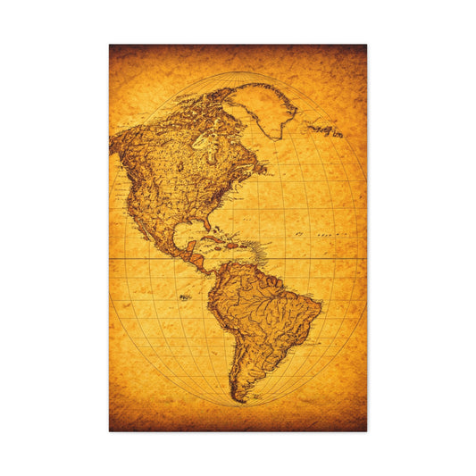
Americas Antique Map Wall Art & Canvas Prints .
Regular price $141.23Regular price -
Old Europe Map Illustration Wall Art & Canvas Prints
Regular price $141.23Regular price -
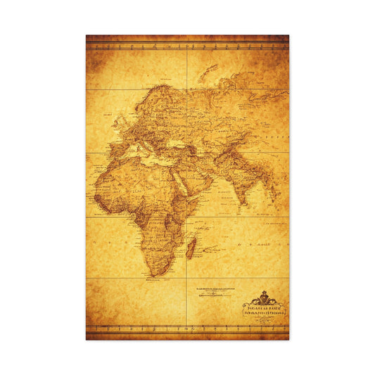
Vintage Africa Continent Map Wall Art & Canvas Prints
Regular price $141.23Regular price -
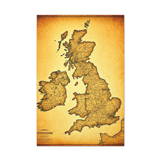
United Kingdom Vintage Map Print Wall Art & Canvas Prints
Regular price $141.23Regular price -
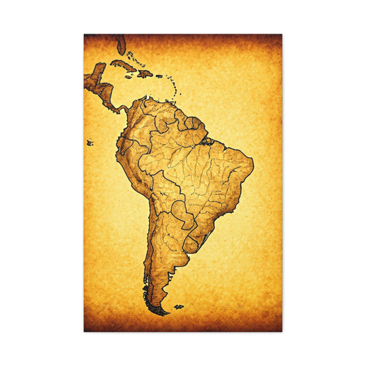
South America Vintage Cartography Poster Wall Art & Canvas Prints
Regular price $141.23Regular price -
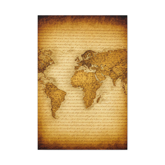
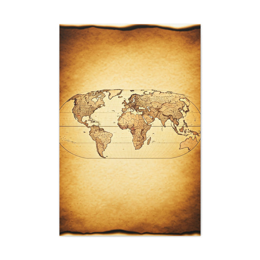
World Map on Aged Scroll Background Wall Art & Canvas Prints .
Regular price $141.23Regular price -
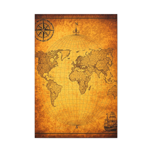
Classic Nautical Map with Ships Wall Art & Canvas Prints
Regular price $141.23Regular price -
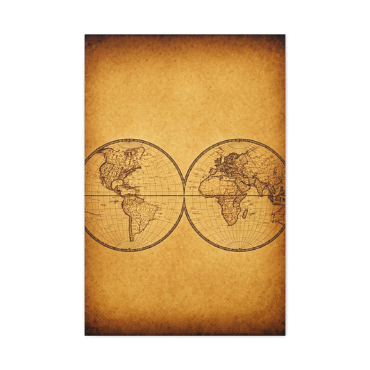
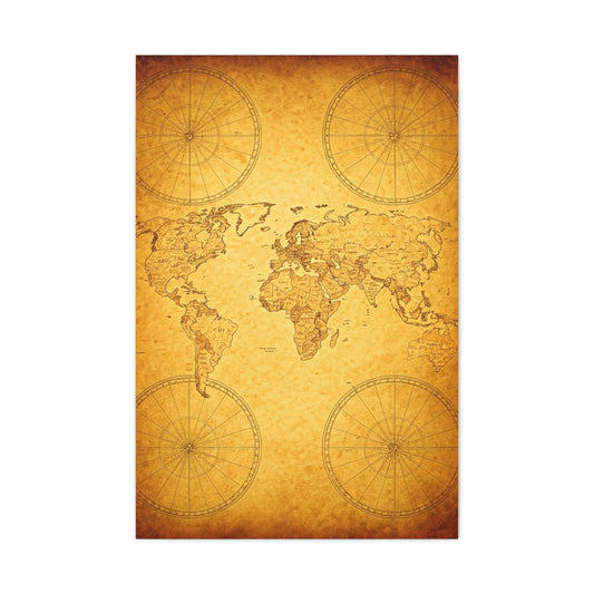
Decorative Double Hemisphere World Map Wall Art & Canvas Prints
Regular price $141.23Regular price -
Antique Parchment Texture Abstract Wall Art & Canvas Prints
Regular price $141.23Regular price -
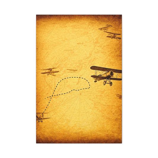
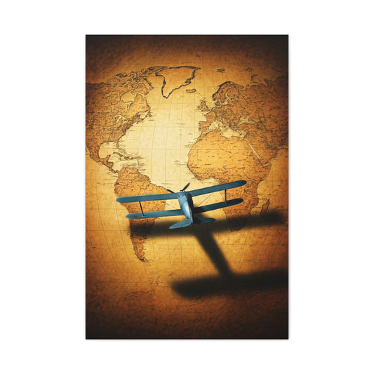
Vintage Aviation Flight Path Wall Art & Canvas Prints
Regular price $141.23Regular price -
Minimal Vintage World Silhouette Map Wall Art & Canvas Prints
Regular price $141.23Regular price -
Classic Oval World Explorer Map Wall Art & Canvas Prints
Regular price $141.23Regular price -
Twin Hemisphere Antique World Map Wall Art & Canvas Prints
Regular price $141.23Regular price -
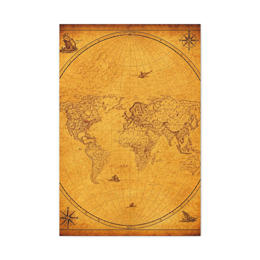
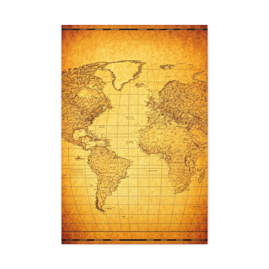
Historic Old World Atlas Map Wall Art & Canvas Prints
Regular price $141.23Regular price -
Golden Compass Mandala Wall Art & Canvas Prints
Regular price $141.23Regular price -
Antique Coastal Expedition Map Wall Art & Canvas Prints
Regular price $141.23Regular price -
Old World Nautical Map Wall Art & Canvas Prints
Regular price $141.23Regular price -
Vintage World Scroll Map Wall Art & Canvas Prints
Regular price $141.23Regular price -
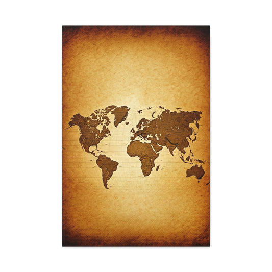
Sepia Continent Map Wall Art & Canvas Prints
Regular price $141.23Regular price -
Classic Globe World Map Wall Art & Canvas Prints
Regular price $141.23Regular price -
Modern Vintage Silhouette World Map Wall Art & Canvas Prints
Regular price $141.23Regular price -
Antique Twin Hemisphere Map Wall Art & Canvas Prints
Regular price $141.23Regular price -
Explorer’s Compass Map Wall Art & Canvas Prints
Regular price $141.23Regular price -
Vintage Portrait Map Fusion Wall Art & Canvas Prints
Regular price $141.23Regular price


Creating Stunning Map Wall Art Decor for Your Home
Transform ordinary maps into extraordinary wall decor pieces that capture memories, showcase travel dreams, and add personality to any living space. This comprehensive guide will walk you through every step of creating beautiful map wall art that rivals expensive gallery pieces while maintaining complete control over your home's aesthetic vision.
The art of repurposing vintage maps and contemporary cartographic materials has gained tremendous popularity among interior design enthusiasts and craft lovers alike. What once served purely functional purposes now becomes the foundation for meaningful home decor that tells stories and sparks conversations. Whether you're preparing a nursery, updating a living room, or creating a travel-themed bedroom, handmade map wall art offers unlimited creative possibilities.
Understanding Map Selection and Preparation Methods
Selecting the right maps forms the cornerstone of any successful wall art project. Topographical maps provide rich textures and visual interest through their intricate contour lines and elevation markers. These specialized charts create depth and movement across your wall surface, making them particularly suitable for larger spaces where visual impact matters most.
Vintage maps bring historical charm and authentic character to your decor scheme. Antique cartographic materials often feature beautiful typography, decorative borders, and unique color palettes that complement traditional and eclectic interior styles. The aged patina and subtle discoloration of older maps add warmth and sophistication that modern reproductions cannot replicate.
Consider the scale relationship between your chosen maps and the intended display area. Oversized maps work magnificently as statement pieces above beds, sofas, or dining tables, while smaller regional charts cluster beautifully in gallery wall arrangements. The geographic content should align with your personal connections whether through travel experiences, hometown pride, or aspirational destinations.
Map condition significantly impacts the final result of your wall art project. While minor creases and age marks often enhance vintage appeal, excessive damage may compromise structural integrity during the creation process. Examine edges carefully for tears that might worsen during handling, and assess whether the paper quality will withstand the attachment of hanging hardware.
Color coordination between your maps and existing room decor ensures seamless integration into your design scheme. Maps featuring blues, greens, and earth tones typically complement neutral color palettes, while those with warmer hues like oranges and reds work beautifully in spaces with similar accent colors. The natural aging process of paper creates subtle variations that add visual interest without overwhelming surrounding elements.
Source acquisition plays a crucial role in project success and budget management. Thrift stores, antique shops, and estate sales often yield excellent map selections at reasonable prices. Online marketplaces provide access to specific geographic regions or time periods that might be difficult to find locally. Consider purchasing multiple copies of particularly appealing maps to create coordinated sets or to have backup materials for future projects.
Paper weight and durability directly influence construction techniques and longevity expectations. Heavier paper stocks support additional embellishments and handling without significant wear, while thinner materials require gentler treatment throughout the creation process. Understanding these characteristics helps you plan appropriate construction methods and realistic timeline expectations for completion.
Quote Selection and Meaningful Typography Choices
Meaningful text additions transform simple maps into personalized storytelling devices that reflect individual personalities and life experiences. The selection process involves balancing visual impact with emotional resonance, ensuring that chosen words complement rather than compete with the underlying cartographic elements.
Travel-inspired quotations resonate deeply with adventurous spirits and wanderlust enthusiasts. Phrases celebrating exploration, discovery, and the journey itself create natural connections between the map imagery and personal aspirations. Consider quotes from famous explorers, travel writers, or contemporary adventurers whose words capture the essence of exploration and discovery.
Family-focused sentiments work beautifully for nurseries, family rooms, and spaces dedicated to gathering and connection. Phrases about home, belonging, and shared experiences create warm, inviting atmospheres that encourage togetherness and reflection. These selections often incorporate words like journey, adventure, love, and home while maintaining universal appeal.
Literary references add intellectual depth and cultural sophistication to your wall art pieces. Excerpts from classic novels, poetry, or philosophical works create conversation starters and demonstrate personal interests and values. Choose passages that maintain clarity and impact when separated from their original context, ensuring they stand alone as meaningful statements.
Typography selection significantly influences the overall aesthetic and readability of your finished pieces. Script fonts convey elegance and femininity, making them suitable for romantic spaces and traditional decor styles. Sans-serif options provide clean, modern appearances that complement contemporary interior design approaches. Consider the viewing distance when selecting font sizes, ensuring text remains legible from typical conversation distances.
Color choices for text should create sufficient contrast against map backgrounds while harmonizing with your overall color scheme. Black ink provides maximum readability and timeless appeal, while colored options can highlight specific design elements or coordinate with accent colors throughout the room. Test color combinations on sample areas before committing to full-scale application.
Length considerations affect both visual balance and construction complexity. Shorter phrases often pack more emotional punch and integrate more easily with map graphics, while longer passages provide opportunities for more elaborate design arrangements. Consider how text length will influence the overall composition and whether your chosen words will fit comfortably within the available space.
Personal relevance ensures lasting satisfaction with your completed wall art. Quotes that reflect your values, experiences, or aspirations create deeper connections than generic phrases, even if they're beautifully executed. Consider words that will remain meaningful as your life circumstances change and evolve over time.
Professional Transfer Techniques and Precision Methods
Accurate text transfer requires patience, proper tools, and systematic approaches that ensure professional-looking results. The light box method provides superior precision for complex fonts and detailed lettering, while alternative techniques offer viable solutions when specialized equipment isn't available.
Light box setup involves creating optimal working conditions that minimize eye strain while maximizing transfer accuracy. Position your light box on a stable, comfortable surface at appropriate height for extended working sessions. Ensure adequate ambient lighting to reduce contrast stress on your eyes while maintaining sufficient illumination for detailed work.
Template preparation begins with careful measurement and positioning to ensure perfect alignment between text and map elements. Mark center points on both your template and map using light pencil marks that can be easily erased later. These reference points serve as crucial guides throughout the transfer process, preventing costly mistakes and ensuring balanced compositions.
Tracing techniques require steady hands and consistent pressure to create clean, even lines. Begin with light strokes to establish letter shapes, then gradually build opacity and line weight through multiple passes. This approach allows for corrections and adjustments before committing to final line weights and provides greater control over the finished appearance.
Quality control during transfer involves regular assessments and adjustments to maintain consistency throughout the project. Step back periodically to evaluate overall balance and make necessary corrections while changes remain relatively simple. Pay particular attention to letter spacing, baseline alignment, and consistent stroke weights that contribute to professional appearances.
Error correction strategies help salvage projects when mistakes occur during the transfer process. Minor variations in line weight can often be corrected through careful additional inking, while more significant errors might require creative solutions like incorporating decorative elements or adjusting surrounding text to minimize visual impact.
Alternative transfer methods accommodate different skill levels and available resources. Carbon paper techniques work well for simpler fonts and shorter text passages, while projection methods allow for scaling adjustments and easier positioning. Grid systems provide structured approaches for those who prefer mathematical precision over artistic intuition.
Detail refinement occurs after initial transfer completion, focusing on smoothing irregular lines and enhancing overall consistency. Use steady, confident strokes when making final adjustments, as hesitant movements often create additional irregularities. Work systematically from one end of your text to the other to maintain consistent approaches and quality standards.
Hardware Selection and Mounting Solutions
Choosing appropriate mounting hardware ensures both attractive presentation and long-term durability of your finished wall art pieces. The selection process involves balancing aesthetic preferences with structural requirements while considering the specific characteristics of your maps and display locations.
Dowel rod selection depends on map dimensions, paper weight, and desired visual impact. Wooden dowels provide natural warmth and organic appeal that complements most interior design styles. Consider diameter carefully as thicker rods create more substantial visual presence while thinner options maintain delicate, refined appearances.
Length calculations ensure proper proportions and functional hanging capabilities. Plan for overhang on both sides of your maps to create visual balance and provide adequate attachment points for hanging hardware. Standard overhangs range from one to three inches depending on map size and personal preference, with larger pieces typically requiring more substantial margins.
Attachment methods vary in complexity and permanence, requiring careful consideration of future flexibility needs. Hot glue provides quick, secure bonds that work well for permanent installations, while removable alternatives like double-sided tape allow for easier adjustments and updates. Consider the archival quality of adhesives if working with valuable or irreplaceable maps.
Drilling techniques for hanging hardware require precision and appropriate tools to avoid damage to delicate dowel materials. Use sharp drill bits sized appropriately for your chosen fasteners, and work slowly to prevent splintering or cracking. Support dowels adequately during drilling to minimize vibration and movement that could cause irregularities.
Hanging cord selection influences both functionality and appearance of your finished pieces. Natural fiber options like jute or hemp provide rustic, organic aesthetics that complement vintage maps and farmhouse decor styles. Synthetic alternatives offer greater strength and weather resistance for pieces that might be exposed to humidity or temperature fluctuations.
Knot techniques ensure secure attachment while maintaining neat, professional appearances. Practice consistent knot sizes and positioning to create balanced visual elements that don't distract from your map and text combination. Consider the visibility of knots in your final display and choose techniques that enhance rather than detract from overall aesthetics.
Weight distribution considerations become increasingly important with larger pieces or heavier paper stocks. Plan attachment points to distribute hanging loads evenly across dowel lengths, preventing sagging or stress concentrations that could lead to hardware failure. Consider the wall mounting system capabilities when planning piece dimensions and mounting strategies.
Color Coordination and Interior Design Integration
Successful color coordination ensures your map wall art enhances rather than competes with existing decor elements while creating cohesive visual flow throughout your living spaces. Understanding color theory principles and practical application techniques helps you make informed decisions that result in harmonious, attractive arrangements.
Neutral foundation colors provide versatile bases that accommodate changing accent colors and seasonal decor updates. Maps featuring browns, tans, and cream tones integrate seamlessly with most color schemes while maintaining timeless appeal. These natural earth tones create calming, sophisticated atmospheres that work particularly well in bedrooms and living areas.
Accent color extraction involves identifying existing color elements within your maps and amplifying them through text choices and surrounding decor selections. Look for subtle blues in water features, greens in topographical elements, or warm tones in aged paper backgrounds. Use these discoveries to guide ink color selections and complementary decor choices.
Seasonal adaptability allows your wall art to feel fresh and current throughout the year without requiring major changes. Choose base colors that transition well between seasons, then add removable accent elements like seasonal greenery, colored lighting, or adjacent decor pieces that reflect current preferences or holiday themes.
Room-specific considerations influence color choices and intensity levels appropriate for different living spaces. Bedrooms benefit from softer, more muted tones that promote relaxation and rest, while social areas can accommodate bolder, more energetic color combinations that encourage conversation and activity.
Lighting interaction significantly affects color perception and overall visual impact of your finished pieces. Natural light reveals different color aspects throughout the day, while artificial lighting can dramatically alter appearance and mood. Consider primary lighting sources when making color decisions and test combinations under various lighting conditions.
Texture coordination extends beyond color matching to encompass surface qualities and visual weight considerations. Rough, textured walls might require bolder colors and simpler designs for optimal visibility, while smooth surfaces can accommodate more subtle color variations and intricate details.
Balance achievement involves distributing visual weight and color intensity across your wall arrangement to create pleasing, stable compositions. Avoid concentrating all bold elements in one area while leaving other sections feeling empty or unfinished. Consider how your map art relates to furniture placement and traffic patterns within the room.
Troubleshooting Common Creation Challenges
Anticipating and addressing potential problems during the creation process prevents frustration and ensures successful project completion. Understanding common challenges and proven solutions helps you maintain confidence and momentum throughout your crafting journey.
Ink bleeding occurs when markers penetrate map paper more than expected, creating fuzzy or irregular line edges. Prevention involves testing ink flow on sample areas before beginning full-scale work, while correction techniques include careful overtracing with appropriate tools or incorporating bleeding effects into intentional design elements.
Alignment difficulties arise when text positioning doesn't match original intentions or when multiple elements fail to coordinate properly. Systematic measuring and marking prevent most alignment issues, while correction strategies include strategic spacing adjustments or creative repositioning that transforms mistakes into intentional design features.
Paper handling challenges become more significant with delicate or aged map materials that tear easily or respond poorly to adhesives. Gentle techniques, appropriate tools, and patience help preserve fragile materials while achieving desired results. Consider reinforcement strategies for particularly vulnerable areas before beginning intensive manipulation.
Scale proportion problems occur when text size doesn't coordinate well with map features or when finished pieces appear too large or small for intended display areas. Preliminary mockups using cardboard templates help identify scale issues before committing time and materials to full construction.
Hardware compatibility issues arise when dowel dimensions don't coordinate properly with map sizes or when attachment methods prove inadequate for specific material combinations. Advance planning and material testing prevent most compatibility problems, while adaptation strategies help salvage projects when unexpected issues arise.
Visibility concerns develop when text contrast proves insufficient for comfortable reading or when map details overwhelm textual elements. Color adjustments, positioning modifications, or selective background treatments can restore appropriate visual balance and readability.
Durability expectations require realistic assessments of material limitations and environmental factors that affect longevity. Understanding these constraints helps you make appropriate construction choices and set reasonable expectations for maintenance needs and replacement schedules.
Display Strategies and Room Placement Options
Strategic placement maximizes visual impact while ensuring your map wall art integrates seamlessly with existing furniture arrangements and traffic patterns. Understanding spatial relationships and viewing angles helps you select optimal locations that showcase your creative efforts effectively.
Height positioning influences viewer interaction and overall room proportions. Standard art hanging guidelines suggest positioning pieces so their centers align with average eye levels, typically around 57 to 60 inches from floor surfaces. Adjust these recommendations based on furniture heights and primary viewing positions for optimal results.
Grouping arrangements create opportunities for storytelling and visual interest through coordinated collections. Consider geographic relationships between multiple maps, chronological connections, or thematic links that create coherent narratives. Maintain consistent spacing and alignment for professional, curated appearances.
Lighting enhancement dramatically improves visibility and aesthetic appeal of your finished pieces. Picture lights provide focused illumination that highlights text and map details while creating warm, inviting ambiances. Consider adjustable options that accommodate different activities and times of day.
Furniture coordination ensures your wall art complements rather than competes with surrounding elements. Consider color relationships, style compatibility, and scale proportions when selecting placement locations. Avoid positioning pieces where they might be obscured by furniture backs or conflicting visual elements.
Traffic flow considerations prevent interference with daily activities while maintaining accessibility for viewing and appreciation. Avoid narrow hallways or high-traffic areas where pieces might be damaged, while ensuring adequate space for comfortable viewing from multiple angles.
Seasonal flexibility allows for easy updates and refreshing without major room rearrangements. Consider mounting systems that accommodate changes while maintaining structural integrity and visual appeal. Plan for storage solutions when rotating seasonal displays or updating color schemes.
Unveiling Water Mirror Artistry in Japanese Maple Photography
The mesmerizing world of Japanese maple reflection photography transcends conventional botanical imagery, entering realms where reality doubles upon itself in perfect aquatic mirrors. These extraordinary visual compositions capture the profound essence of seasonal transformation through the lens of still water surfaces, creating breathtaking duplications that speak to fundamental human desires for harmony and completeness. The delicate interplay between terrestrial beauty and its liquid reflection generates artistic statements that resonate with viewers on multiple sensory and emotional levels.
Water mirror photography demands extraordinary patience and environmental awareness from practitioners who must orchestrate perfect timing between atmospheric conditions, lighting scenarios, and water surface tranquility. The photographer becomes part naturalist, part meteorologist, anticipating moments when wind subsides completely, allowing water bodies to transform into flawless reflecting planes that duplicate maple magnificence with pristine clarity. These fleeting opportunities require readiness to capture ephemeral perfection that may last mere minutes before environmental conditions shift.
The technical mastery required for successful reflection imagery encompasses understanding complex light behavior as it travels through air, strikes vegetation, bounces from water surfaces, and returns to camera sensors. Photographers must carefully balance exposure settings to properly illuminate both original subjects and their reflected counterparts, avoiding overexposure of sky elements while maintaining detail in shadowed water areas. This delicate balancing act separates amateur attempts from professional-grade reflection artistry that commands attention in gallery spaces.
The mystical quality inherent in perfect reflections stems from their ability to suggest infinite depth beneath water surfaces, creating visual illusions that challenge perception and invite contemplation. Viewers often experience disorientation when examining high-quality reflection photographs, uncertain which portion represents reality and which constitutes the mirror image. This perceptual ambiguity creates engaging viewing experiences that hold attention far longer than conventional single-plane imagery.
Japanese maple varieties offer particularly compelling subjects for reflection photography due to their intricate branching patterns, diverse leaf shapes, and spectacular seasonal color transformations. The delicate lacework of dissected maple leaves creates complex reflection patterns that multiply visual interest exponentially when doubled in still water. Each variety brings unique characteristics to reflection compositions, from the burgundy elegance of Bloodgood cultivars to the chartreuse brilliance of emerging spring foliage.
The seasonal progression of Japanese maples provides reflection photographers with year-round opportunities to explore different moods and atmospheric qualities. Spring reflections capture the tender green emergence of new growth, while summer imagery showcases full canopy development in various shade combinations. Autumn presentations reveal the spectacular color transformations that make Japanese maples legendary, with reflections intensifying the visual impact of red, orange, and golden displays. Winter compositions focus on intricate bare branch patterns that create delicate linear drawings across water surfaces.
Serpentine Branch Formations: Channeling Mythological Power Through Natural Architecture
The fascinating world of Medusa-inspired Japanese maple photography celebrates the extraordinary sculptural qualities inherent in certain branch formations that evoke mythological serpentine imagery. These natural architectural marvels demonstrate nature's incredible ability to create complex, dynamic structures that command attention and inspire awe rather than fear. The intertwining, curvilinear branch patterns that characterize these formations represent millions of years of evolutionary adaptation to environmental pressures, resulting in living sculptures of remarkable beauty and power.
Medusa branch formations develop through complex interactions between genetic predispositions, environmental stressors, and seasonal growth cycles that encourage non-linear development patterns. Trees subjected to particular wind patterns, soil conditions, or light availability may develop these distinctive serpentine characteristics as adaptive responses that maximize survival advantages. The resulting branch architecture creates visual complexity that transforms ordinary maple trees into extraordinary natural artworks worthy of mythological associations.
The photographic challenge of capturing Medusa branch formations requires sophisticated understanding of three-dimensional composition translated into two-dimensional imagery. Photographers must navigate intricate spatial relationships between overlapping branches while maintaining clarity of individual elements within complex overall compositions. The interplay of positive and negative spaces becomes crucial for successful Medusa imagery, requiring careful attention to background selection and lighting direction to reveal rather than obscure the magnificent complexity of serpentine branch patterns.
Lighting plays particularly critical roles in Medusa formation photography, as dramatic shadows and highlights can either enhance or destroy the sculptural qualities that make these trees so compelling. Backlighting often proves most effective for revealing the delicate structure of intertwining branches while creating ethereal rim lighting effects that separate individual elements from complex backgrounds. The photographer must carefully control contrast levels to maintain detail throughout the tonal range while preserving the dramatic impact that makes Medusa formations so visually striking.
The seasonal variations in Medusa branch visibility create different opportunities for photographers to explore these remarkable natural sculptures. Winter presentations offer the clearest view of pure branch architecture unobscured by foliage, allowing full appreciation of serpentine complexity and sculptural beauty. Spring and summer imagery incorporates emerging and mature foliage into compositions, creating different relationships between structural elements and organic decoration. Autumn photography combines spectacular color displays with visible branch architecture for maximum visual impact.
The symbolic resonance of serpentine forms extends far beyond their mythological associations, connecting with cultural traditions that view these patterns as representations of life force, wisdom, and transformative power. Many spiritual traditions recognize serpentine patterns as sacred geometries that embody fundamental life principles and cosmic energies. Japanese maple Medusa formations tap into these deeper symbolic meanings while avoiding negative mythological connotations, creating artwork that suggests positive transformation and natural wisdom.
The artistic interpretation of Medusa formations requires photographers to balance documentary accuracy with creative expression, capturing both the literal reality of complex branch structures and their metaphorical significance as symbols of natural power and beauty. Successful Medusa photography transforms potentially chaotic branch tangles into organized, aesthetically pleasing compositions that reveal underlying patterns and rhythms inherent in natural growth processes. This transformation from apparent chaos to visible order mirrors the deeper artistic goal of finding meaning and beauty in complexity.
Psychological Resonance: Understanding Human Response to Symmetrical Natural Imagery
The profound psychological impact of reflection imagery stems from fundamental human preferences for symmetry and balance that appear to be hardwired into perceptual processing systems. Research in cognitive psychology demonstrates that symmetrical compositions receive preferential attention from viewers and generate more positive emotional responses than asymmetrical alternatives. Perfect water reflections satisfy these deep-seated aesthetic preferences while creating visual experiences that promote psychological calm and emotional equilibrium.
The concept of completion represented by perfect reflections resonates with psychological theories about human needs for wholeness and integration. When viewers encounter reflection imagery that presents complete symmetrical compositions, they experience subconscious satisfaction related to gestalt principles of perceptual completion. This psychological response explains why reflection artwork consistently generates positive viewer reactions and why these pieces prove so effective in interior spaces designed for relaxation and contemplation.
The meditative qualities inherent in reflection photography create opportunities for viewers to engage in contemplative experiences that promote mental wellness and stress reduction. The doubled imagery encourages prolonged viewing as the eye moves between original subjects and their reflected counterparts, creating natural scanning patterns that induce relaxed attention states similar to those achieved through formal meditation practices. This makes reflection artwork particularly valuable in spaces dedicated to rest, recovery, and mental renewal.
The infinite depth suggestion created by perfect reflections taps into human fascination with mystery and the unknown, providing psychological stimulation that maintains viewer interest while promoting peaceful contemplation. The visual illusion of endless depth beneath water surfaces creates engaging perceptual challenges that hold attention without causing stress or anxiety. This balance between stimulation and tranquility makes reflection imagery ideal for environments where both mental engagement and relaxation are desired.
Cultural associations with water as a purifying and renewing element add additional psychological dimensions to reflection photography that enhance its therapeutic potential in interior environments. Water imagery consistently generates positive emotional responses across cultures, connecting with archetypal associations related to cleansing, renewal, and spiritual purification. Japanese maple reflections combine these universal water associations with the specific cultural meanings attached to maple symbolism in various traditions.
The psychological impact of seasonal imagery captured in reflection photography connects with human biological rhythms and emotional cycles that correspond to natural temporal progressions. Spring reflections generate feelings of hope and renewal, while summer imagery promotes feelings of abundance and vitality. Autumn reflections evoke contemplation of change and transformation, while winter compositions encourage introspection and peaceful rest. These seasonal psychological associations make reflection artwork particularly effective for supporting emotional wellness throughout annual cycles.
The therapeutic potential of Medusa formation imagery requires careful consideration of individual psychological responses to complex visual stimuli. While some viewers find serpentine branch patterns energizing and inspiring, others may experience overstimulation when exposed to highly complex visual compositions. The key to successful therapeutic utilization of Medusa imagery lies in matching visual complexity levels to individual psychological needs and environmental contexts where the artwork will be displayed.
Cultural Symbolism: Serpentine Patterns and Cross-Cultural Meanings
The rich symbolic heritage associated with serpentine patterns across world cultures provides profound contextual depth for Japanese maple Medusa photography that extends far beyond surface aesthetic appreciation. Throughout human history, serpentine forms have represented fundamental life principles including wisdom, transformation, healing, and the cyclical nature of existence. These positive associations contrast sharply with the negative mythological connotations of the Medusa figure, allowing photographers to tap into beneficial symbolic meanings while avoiding problematic cultural baggage.
Ancient Eastern philosophical traditions consistently view serpentine patterns as representations of kundalini energy and spiritual awakening processes that lead to higher consciousness and personal transformation. The coiling, spiraling movements inherent in serpentine forms mirror the energy patterns described in various meditative and spiritual practices designed to promote personal growth and enlightenment. Japanese maple Medusa formations naturally embody these positive serpentine associations while remaining firmly grounded in accessible natural imagery.
The medical symbol of the caduceus demonstrates how serpentine forms have long been associated with healing and restoration across Western cultural traditions. The intertwining serpents wrapped around a central staff represent the balance of opposing forces necessary for health and wholeness. Japanese maple branch patterns that evoke serpentine imagery connect with these healing associations, making Medusa formation artwork particularly appropriate for healthcare environments and spaces dedicated to wellness and recovery.
Celtic and Norse mythological traditions feature serpentine forms as symbols of wisdom, protection, and connection between earthly and spiritual realms. The world serpent of Norse mythology encircles and supports the entire world, while Celtic knotwork incorporates serpentine patterns to represent eternal cycles and interconnected relationships. Japanese maple Medusa photography can draw upon these positive mythological associations while avoiding the specifically negative connotations of Greek Medusa mythology.
Native American traditions consistently associate serpentine patterns with earth energy, fertility, and the life-giving power of natural systems. The serpent represents connection to earth wisdom and the ability to navigate both physical and spiritual landscapes with equal facility. Japanese maple trees with serpentine branch formations embody these positive associations while providing concrete natural subjects that ground abstract spiritual concepts in tangible reality.
The rainbow serpent of Australian Aboriginal tradition represents creation power and the life-giving properties of water, connecting serpentine symbolism with the aquatic elements featured in reflection photography. This mythological figure brings rain, creates rivers, and shapes the landscape through its movements, demonstrating how serpentine forms can represent positive creative forces rather than destructive powers. Japanese maple reflection photography that incorporates both water elements and serpentine branch patterns taps into these beneficial cultural associations.
Contemporary psychological interpretations of serpentine symbolism focus on transformation and renewal processes that mirror natural cycles of growth, death, and regeneration. The serpent's ability to shed its skin has long been viewed as a metaphor for personal transformation and the ability to leave behind outdated aspects of identity in favor of renewed personal growth. Japanese maple trees demonstrate similar transformative powers through their spectacular seasonal changes, making them ideal subjects for exploring themes of renewal and positive transformation through serpentine-inspired photography.
Technical Mastery: Advanced Capture Methodologies for Water Mirror Photography
Professional-grade reflection photography demands comprehensive understanding of complex optical principles that govern light behavior in aquatic environments where multiple variables interact to create perfect mirror conditions. The photographer must master precise timing coordination between atmospheric stability, solar positioning, and water surface characteristics while maintaining technical control over camera settings that optimize image quality under challenging lighting conditions. Success requires patient observation of environmental patterns combined with rapid technical execution when ideal conditions briefly appear.
Water surface preparation often requires active intervention to achieve the pristine mirror quality necessary for stunning reflection imagery. Photographers may need to remove floating debris, wait for subsidence of underwater disturbances, or select shooting locations protected from wind currents that disturb surface tranquility. Understanding microclimates around various water bodies helps predict optimal shooting windows when reflection conditions remain stable long enough for proper composition and exposure execution.
The optical complexity of reflection photography requires sophisticated understanding of how light travels different distances when illuminating original subjects versus their reflected counterparts. This distance differential creates subtle exposure variations that must be compensated through precise camera settings or post-processing corrections to maintain balanced tonality throughout final images. Successful reflection photographers develop intuitive understanding of these optical principles that allows rapid adjustment to changing light conditions.
Polarizing filter utilization becomes crucial for managing unwanted surface glare that can destroy reflection clarity while selectively enhancing certain elements within complex compositions. Proper polarizing filter orientation can eliminate distracting surface reflections from sky elements while preserving desired subject reflections, requiring careful experimentation to achieve optimal results. The photographer must understand how polarization affects different types of reflected light to make informed decisions about filter usage in various situations.
Focus stacking techniques prove particularly valuable for reflection photography where maximum depth of field ensures sharpness throughout extended focal planes that include both foreground subjects and distant reflection elements. The photographer must carefully calculate hyperfocal distance requirements while considering the optical complexities introduced by water surface refraction that can affect perceived focus positions. Advanced focus stacking protocols account for these optical variables to produce final images with consistent sharpness throughout complex spatial arrangements.
Exposure bracketing strategies become essential for capturing the full dynamic range present in challenging reflection scenarios where bright sky elements contrast sharply with darker water areas and shadowed vegetation. High dynamic range processing techniques allow photographers to extract maximum detail from both highlight and shadow regions while maintaining natural color relationships that preserve the authentic character of reflected natural subjects. Proper bracketing sequences ensure adequate data capture for sophisticated post-processing workflows.
The timing precision required for optimal reflection photography often demands extended field sessions where photographers monitor changing conditions while waiting for perfect convergence of environmental factors. Weather pattern recognition skills help predict favorable conditions, while intimate knowledge of specific shooting locations allows efficient positioning when optimal moments arrive. Professional reflection photographers develop systematic approaches to location scouting that identify potentially productive sites for future sessions when conditions align properly.
Compositional Excellence: Mastering Visual Balance in Doubled Imagery
The unique compositional challenges presented by reflection photography require sophisticated understanding of how doubled imagery affects visual weight distribution and viewer attention patterns within frame boundaries. Traditional compositional rules must be reconsidered when working with perfectly symmetrical subjects that create natural balance points around horizontal reflection lines. The photographer must carefully manage compositional elements that exist both above and below water surfaces while maintaining visual interest throughout extended vertical compositions.
Visual anchor point selection becomes crucial for reflection compositions where viewers need clear orientation references to distinguish between original subjects and their mirrored counterparts. Strong compositional anchors typically include distinctive foreground elements that break the symmetry pattern or unique lighting conditions that differentiate between upper and lower portions of doubled imagery. These anchor points provide psychological comfort for viewers while adding compositional complexity that prevents perfectly symmetrical images from appearing too static or predictable.
The rule of thirds requires modification when applied to reflection photography where horizontal reflection lines naturally create strong compositional divisions that may conflict with traditional grid placement strategies. Successful reflection photographers develop alternative compositional frameworks that acknowledge the inherent bilateral symmetry of reflected subjects while incorporating asymmetrical elements that maintain visual interest and prevent compositions from appearing too mechanically balanced.
Negative space management becomes particularly complex in reflection photography where water areas serve dual functions as compositional elements and reflective surfaces. The photographer must carefully balance the amount of visible water surface against the visual impact of reflected subjects while considering how water texture and color affect overall compositional harmony. Successful negative space utilization in reflection photography creates breathing room that allows reflected elements to register clearly without visual competition from distracting surface patterns.
Color harmony considerations multiply in complexity when reflection photography involves doubled color relationships that must work together cohesively throughout extended vertical compositions. The photographer must consider how reflected colors interact with their original counterparts while accounting for subtle color shifts that occur during light transmission through water surfaces. Successful color management in reflection photography creates unified color relationships that enhance rather than compete with the natural beauty of reflected subjects.
Leading line utilization in reflection photography requires careful consideration of how linear elements behave when doubled through water surface reflection. Shoreline elements, fallen logs, or architectural features can create powerful leading lines that guide viewer attention through complex reflected compositions. The photographer must understand how these linear elements continue or terminate at water surfaces to create cohesive visual flows that enhance rather than disrupt overall compositional unity.
Depth of field control becomes particularly challenging in reflection photography where successful compositions often require sharpness throughout extended focal planes that include multiple distance relationships. The photographer must carefully balance shallow depth of field effects that isolate specific elements against deeper focus requirements that maintain clarity throughout complex reflected arrangements. Advanced depth of field management techniques allow selective focus control that enhances compositional effectiveness while preserving necessary technical quality.
Conclusion
The strategic placement of reflection and Medusa imagery within interior environments requires sophisticated understanding of how these powerful visual elements interact with existing architectural features and decorative schemes to create harmonious yet impactful aesthetic experiences. Professional interior designers recognize that these unique photographic subjects bring both tranquil natural beauty and dramatic visual interest that can transform ordinary spaces into extraordinary environments that promote both relaxation and aesthetic appreciation.
Scale considerations become crucial when incorporating large-format reflection or Medusa imagery into residential or commercial spaces where the visual impact must complement rather than overwhelm existing architectural proportions. Oversized reflection pieces can create stunning focal points in spacious areas with high ceilings, while smaller intimate prints work effectively in more confined spaces where subtle beauty enhancement is preferred over dramatic transformation. The key lies in matching image scale to spatial requirements while maintaining the visual integrity that makes these photographic subjects so compelling.
Lighting design coordination ensures that reflection and Medusa artwork receives appropriate illumination that enhances rather than diminishes their unique visual characteristics. Reflected imagery requires careful lighting management to avoid surface glare that obscures delicate reflection details, while serpentine branch formations benefit from directional lighting that emphasizes their sculptural three-dimensional qualities. Professional lighting designers understand how to create illumination schemes that support rather than compete with the inherent drama of these specialized photographic subjects.
Color palette integration allows reflection and Medusa imagery to work harmoniously within established decorative schemes while contributing unique natural color relationships that enhance overall environmental aesthetics. The seasonal color variations available in Japanese maple photography provide options for matching specific interior color requirements, from spring greens that complement fresh contemporary schemes to autumn reds that warm traditional environments. Successful color integration creates cohesive relationships between artwork and surrounding decorative elements.