
-
Golden Drift Flow Wall Art & Canvas Prints
Regular price $141.23Regular price -
Golden Velocity Stream Wall Art & Canvas Prints
Regular price $141.23Regular price -
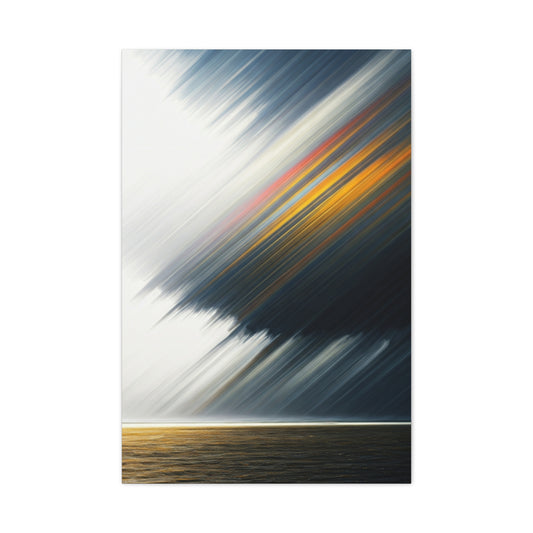
Driven Lines Wall Art & Canvas Prints
Regular price $141.23Regular price -
Golden Shadow Streaks Abstract Wall Art & Canvas Prints
Regular price $141.23Regular price -
Vertical Flowing Arcs Abstract Wall Art & Canvas Prints
Regular price $141.23Regular price -
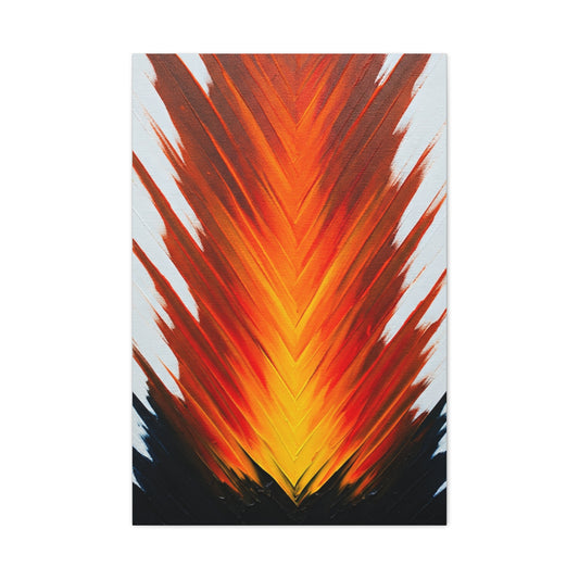
Vertical Fire Burst Abstract Wall Art & Canvas Prints
Regular price $141.23Regular price -
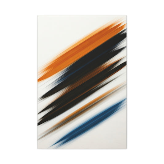
Diagonal Motion Abstract Wall Art & Canvas Prints
Regular price $141.23Regular price -
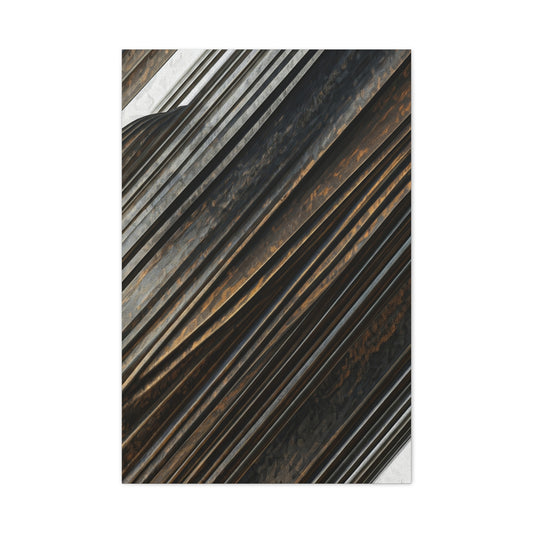
Dark Diagonal Texture Abstract Wall Art & Canvas Prints
Regular price $141.23Regular price -
Unbound Motion Wall Art & Canvas Prints
Regular price $141.23Regular price -
Velocity Drift Wall Art & Canvas Prints
Regular price $141.23Regular price


Mastering the Linear Abstract Wall Art Expression in Interior Design
The realm of abstract artistry represents one of the most compelling and transformative approaches to interior enhancement. Unlike conventional representational artwork that depicts recognizable subjects, abstract compositions communicate through pure visual elements - color, form, texture, and movement. This extraordinary medium transcends literal interpretation, creating emotional resonances that speak directly to the viewer's subconscious mind.
When we examine the fundamental question of what abstract art represents, we discover a universe of possibilities. These works embody pure emotion, kinetic energy, chromatic relationships, and compositional harmony. They serve as visual poetry, designed not merely for observation but for experiential engagement. From boldly textured impasto techniques that create sculptural surfaces to serene monochromatic compositions that whisper tranquility, abstract art offers infinite avenues for personal expression within domestic spaces.
The journey of incorporating abstract works into residential environments requires both intuitive understanding and strategic planning. This comprehensive exploration will illuminate the pathways to successful integration, providing insights for novice enthusiasts and seasoned collectors alike. We shall navigate the intricate landscape of selection criteria, spatial considerations, and the transformative potential that these powerful visual statements bring to any living environment.
Abstract art functions as a universal language that transcends cultural boundaries and linguistic barriers. Its communication occurs through fundamental visual principles that resonate with human consciousness on primordial levels. Color combinations can evoke memories, geometric arrangements can suggest movement, and textural variations can stimulate tactile responses. This inherent power makes abstract art an invaluable tool for crafting atmospheric experiences within residential spaces.
Revolutionizing Vacant Spaces Through Artistic Expression
The transformation from barren walls to dynamic visual environments represents one of interior design's most dramatic metamorphoses. Empty surfaces, while maintaining cleanliness and order, lack the narrative depth that distinguishes a house from a home. The introduction of abstract artwork initiates a profound shift that extends far beyond mere aesthetic enhancement.
When we consider the impact of a single abstract composition, we witness the emergence of spatial personality. A previously neutral dining area becomes an engaging environment for culinary experiences and social interaction through the addition of a commanding blue and gold abstract piece. This transformation demonstrates the fundamental principle that art functions as an active participant in spatial definition rather than passive decoration.
The selection process for wall-mounted abstract pieces requires careful consideration of multiple factors. Scale relationships between artwork and surrounding elements create visual harmony or tension, depending on the desired atmospheric effect. A oversized canvas can establish dominance within a room, commanding attention and serving as the primary focal point from which all other design elements derive their cues. Conversely, smaller compositions can create intimate viewing experiences that reward closer examination.
Color temperature plays a crucial role in spatial transformation. Warm-toned abstractions featuring reds, oranges, and yellows generate welcoming, energetic environments suitable for social gathering spaces. Cool-toned pieces incorporating blues, greens, and purples create calming, contemplative atmospheres ideal for private retreats and restful areas. Neutral palettes offer versatility, adapting to changing seasonal decorations and evolving design preferences.
The positioning of abstract artwork within a room influences traffic flow and visual weight distribution. Centrally placed pieces draw occupants toward specific areas, while off-center positioning can create dynamic asymmetry that energizes the entire space. Height considerations affect viewing comfort and spatial proportions, with eye-level placement generally providing optimal engagement for standing observers.
Lighting conditions dramatically alter the perception of abstract compositions throughout daily cycles. Natural illumination reveals subtle color variations and textural details that artificial lighting may obscure. Strategic placement near windows can create changing visual experiences as sunlight shifts throughout the day, while controlled artificial lighting can emphasize specific compositional elements during evening hours.
Infusing Vitality Through Chromatic and Compositional Elements
Abstract art functions as a catalyst for environmental transformation, breathing vitality into static spaces through carefully orchestrated visual relationships. Unlike passive decorative elements, these compositions actively engage with their surroundings, creating dynamic interactions that evolve with changing light conditions and viewing angles.
Color psychology forms the foundation of abstract art's emotional impact. Each hue carries inherent associations that influence mood and behavior patterns. Warm earth tones such as burnt sienna, ochre, and umber create grounding effects that promote stability and comfort. These natural colorations work particularly well in living areas where relaxation and conversation are priorities. The subtle variations within earth-tone palettes provide visual interest without overwhelming sensory input.
Conversely, vibrant chromatic combinations featuring saturated purples, electric blues, and brilliant greens stimulate mental activity and creative thinking. These energetic palettes suit workspaces, creative studios, and areas designated for active pursuits. The intensity of saturated colors can be modulated through compositional balance, incorporating neutral areas that provide visual rest points.
Monochromatic schemes demonstrate the sophisticated potential of limited color palettes. Deep forest greens explored through various values and saturation levels create immersive environments that connect interior spaces with natural landscapes. These unified color approaches establish cohesive atmospheres while allowing textural and compositional elements to assume primary importance.
The manipulation of form within abstract compositions generates kinetic energy that animates surrounding spaces. Flowing, organic shapes suggest natural processes and create calming, meditative environments. Sharp, geometric configurations impose order and structure, appealing to viewers who appreciate precision and mathematical relationships. Mixed approaches combining both organic and geometric elements create complex visual narratives that reward extended contemplation.
Textural variation adds tactile dimensions to visual experiences. Heavily impastoed surfaces create physical depth that casts shadows and catches light, generating ever-changing appearances throughout daily lighting cycles. Smooth, flat applications emphasize color relationships and compositional structure. Mixed textural approaches within single compositions create hierarchical relationships between different visual elements.
Compositional movement guides viewer attention through calculated arrangements of visual elements. Diagonal orientations suggest dynamism and change, while horizontal arrangements promote stability and rest. Vertical emphasis creates aspirational feelings and spatial expansion. Curved movements generate gentle transitions and harmonious relationships between disparate elements.
Scale relationships within abstract compositions affect their integration with architectural elements. Large-scale works that approach the dimensions of wall surfaces create immersive experiences that envelope viewers. Medium-scale pieces maintain comfortable viewing distances while asserting significant presence. Small-scale works invite intimate examination and work effectively in grouped arrangements.
Expressing Personal Identity Through Abstract Selection
The artwork chosen for residential display serves as an extension of personal identity, communicating individual values, preferences, and aesthetic sophistication to visitors while reinforcing self-image for occupants. Abstract art, in particular, demonstrates confidence in non-literal artistic expression and appreciation for intellectual complexity.
Personal style identification forms the crucial first step in successful abstract art selection. Individuals drawn to minimalist aesthetics typically respond to compositions featuring clean lines, limited color palettes, and generous negative space. These works complement uncluttered interiors and architectural simplicity. Black and white abstractions exemplify this approach, using contrast and form to create powerful statements without chromatic complexity.
Modern linear compositions appeal to viewers who appreciate geometric precision and mathematical relationships. These works often incorporate ruler-straight edges, perfect circles, and symmetrical arrangements that echo contemporary architectural elements. Office environments particularly benefit from such structured approaches, as they reinforce professional atmospheres while providing visual interest.
Mid-century modern influences continue attracting enthusiasts of retro design movements. These pieces typically feature bold geometric shapes, limited but saturated color palettes, and compositional arrangements that reflect post-war optimism and technological advancement. Such works complement furniture and decorative elements from the 1950s through 1970s while maintaining contemporary relevance.
Expressive, emotional abstractions appeal to individuals who value passion and spontaneity in artistic creation. These works often feature gestural brush strokes, varied textures, and complex color interactions that suggest intense creative processes. The raw energy embedded in such pieces creates stimulating environments that encourage emotional expression and creative thinking.
Abstract expressionist approaches demonstrate appreciation for individual artistic vision and psychological depth. These compositions frequently incorporate automatic techniques, subconscious influences, and personal symbolism that reward extended contemplation. The complexity inherent in such works provides long-term visual interest that evolves with viewer familiarity.
Structured geometric abstractions attract viewers who find beauty in mathematical relationships and systematic approaches to composition. These works celebrate precision, balance, and rational thought processes while maintaining artistic expression. The harmony achieved through careful proportional relationships creates calming environments that promote focused thinking.
Color preference analysis reveals additional personality indicators. Individuals attracted to warm color palettes typically enjoy social interaction and energetic environments. Cool color preferences suggest contemplative natures and preference for calm, reflective spaces. Neutral color attractions indicate adaptability and appreciation for subtle sophistication.
Transforming Living Areas Through Strategic Art Placement
The living room functions as the primary social hub within residential environments, making it the ideal venue for significant artistic statements. Strategic placement of abstract compositions in these spaces requires careful consideration of furniture arrangements, traffic patterns, and viewing angles to maximize visual impact while maintaining functional comfort.
The statement focal point approach represents the most direct method for living room transformation. A large abstract composition positioned above the primary seating arrangement immediately establishes visual hierarchy and serves as the room's dominant feature. This central placement allows the artwork to influence color schemes, furniture selection, and accessory choices throughout the space. The scale of such pieces should relate proportionally to the seating furniture, typically measuring approximately two-thirds the width of the sofa or sectional below.
Color coordination between abstract artwork and living room furnishings creates cohesive design schemes that feel intentional and sophisticated. Accent colors from the composition can be echoed in throw pillows, area rugs, window treatments, and decorative objects. This repetition of chromatic elements throughout the space creates visual rhythm and unity while allowing the artwork to serve as the primary color source.
Symmetrical arrangements featuring multiple related pieces create formal, balanced compositions suitable for traditional or transitional interior styles. A triptych arrangement above a sofa provides extended horizontal emphasis while maintaining unified visual impact. Diptych presentations offer similar benefits with simplified composition requirements. These multi-panel approaches allow for more complex visual narratives while maintaining manageable individual piece sizes.
Gallery wall concepts combine abstract pieces with complementary artworks, photographs, or three-dimensional objects to create eclectic, personalized displays. The abstract component typically serves as the energetic center of such arrangements, with supporting pieces chosen to enhance rather than compete with the primary work. Successful gallery walls require careful planning of spacing, scale relationships, and thematic connections between individual elements.
Lighting considerations significantly affect the perception of abstract compositions in living spaces. Natural light from windows creates changing appearances throughout daily cycles, while controlled artificial illumination can emphasize specific compositional elements during evening hours. Track lighting, picture lights, or strategically positioned table lamps can enhance textural details and color relationships that might be diminished under general room lighting.
Seasonal rotation of abstract pieces allows for changing atmospheric effects without major redecoration efforts. Summer installations might emphasize cool colors and flowing forms, while winter selections could feature warmer tones and more structured compositions. This approach requires developing collections of complementary works that can be interchanged based on desired seasonal moods.
Furniture arrangement should complement abstract art placement rather than compete for attention. Low-profile seating allows artwork to maintain visual prominence, while high-backed pieces may require larger artwork scales to maintain proper proportional relationships. Coffee tables, side tables, and decorative objects should support the overall color scheme established by the abstract composition.
Optimizing Proportional Relationships for Maximum Impact
Proper scaling represents perhaps the most critical factor in successful abstract art integration, determining whether pieces appear as deliberate design choices or afterthought additions. The mathematical relationships between artwork dimensions and surrounding architectural elements create visual harmony that supports or undermines the overall design intention.
The two-thirds proportional rule provides a reliable starting point for artwork sizing above furniture pieces. This principle suggests that artwork width should approximate sixty-seven percent of the supporting furniture's width, creating pleasing visual balance without overwhelming or underwhelming the space. However, this rule serves as a guideline rather than an absolute requirement, with variations appropriate based on specific compositional and spatial considerations.
Oversized abstract compositions make confident, luxury-oriented statements that can transform entire rooms through their commanding presence. Large-scale pieces require sufficient wall space and viewing distance to be appreciated properly, but their impact justifies the spatial requirements. These substantial works function effectively as room-defining elements, establishing color schemes and atmospheric moods that influence all subsequent design decisions.
Vertical orientation artwork addresses specific spatial challenges while creating dramatic visual effects. Tall, narrow compositions draw attention upward, making rooms appear more spacious while emphasizing ceiling height. These pieces work particularly well in hallways, stairwells, and rooms with high ceilings where horizontal artworks might appear disproportionately small.
Horizontal orientation pieces create different spatial effects, emphasizing width and creating calming, stable impressions. Panoramic abstract compositions work exceptionally well above beds, extending the visual width of sleeping areas while providing restful, contemplative focal points. These expansive formats can also bridge multiple furniture pieces or architectural elements.
Square format abstractions offer versatility in placement and scaling, adapting well to various spatial configurations. Large square pieces can anchor seating areas or dining spaces, while smaller squares work effectively in grouped arrangements. The balanced proportions of square formats complement both modern and traditional interior styles.
Installation considerations become increasingly complex with larger abstract pieces. Proper mounting hardware rated for substantial weights prevents accidents while ensuring long-term stability. Professional installation may be advisable for exceptionally large or valuable pieces, particularly those requiring special mounting systems or wall reinforcement.
Wall surface preparation affects the final appearance of mounted abstract artwork. Smooth, evenly painted surfaces provide neutral backgrounds that allow artwork to assume primary importance. Textured wall treatments can compete with or complement artwork depending on the specific combinations involved. Color coordination between wall surfaces and artwork backgrounds influences overall visual impact.
Maximizing Spatial Perception Through Strategic Art Choices
Small rooms present unique challenges for abstract art integration, requiring careful selection of compositions that enhance rather than diminish spatial perception. The psychological effects of color, composition, and scale can be leveraged to create illusions of expanded space while maintaining visual interest and personal expression.
Light-colored abstract compositions featuring generous amounts of negative space create airy, open impressions that counteract spatial confinement. Artworks with white, cream, or pale backgrounds reflect available light while providing visual breathing room that prevents claustrophobic feelings. Pastel color schemes maintain gentle visual interest without overwhelming limited spatial resources.
Singular statement pieces often prove more effective than multiple smaller works in compact spaces. A single large abstract composition focuses attention and eliminates visual clutter that multiple pieces might create. This approach also maximizes the impact of limited wall space while avoiding the complexity of arranging multiple pieces in restricted areas.
Cool color palettes featuring blues, greens, and purples create receding effects that psychologically expand spatial boundaries. These colors appear to move away from viewers, creating depth illusions that make rooms feel larger than their actual dimensions. Strategic placement of cool-toned abstractions on the most visible wall can maximize these expansive effects.
Vertical emphasis in abstract compositions draws attention upward, creating height illusions that benefit rooms with standard ceiling heights. Artworks featuring strong vertical lines, upward movement, or tall formats encourage viewers to look up, psychologically expanding vertical spatial perception. This technique works particularly well in narrow rooms or spaces with challenging proportional relationships.
Mirror integration with abstract art creates sophisticated approaches to spatial expansion. Strategically positioned mirrors can reflect abstract compositions, effectively doubling their visual impact while adding light and spatial depth. This technique requires careful planning to ensure reflected images enhance rather than compete with direct viewing experiences.
Transparent or translucent elements within abstract compositions contribute to spatial openness by allowing visual penetration through the artwork. Watercolor techniques, glazed applications, or mixed media incorporating transparent materials create layered depth effects that avoid visual solidity. These approaches maintain artistic interest while preserving spatial lightness.
Monochromatic color schemes eliminate chromatic complexity that might overwhelm small spaces while maintaining sophisticated visual appeal. Single-color explorations through various values, saturations, and textures provide artistic richness without chromatic chaos. These unified approaches create calm, spacious impressions while demonstrating refined aesthetic appreciation.
The Quintessence and Resonance of Lilac
The journey into the world of lilac is an exploration of a color that is more than a mere visual stimulus; it is an experience, an ambiance, and a statement of profound subtlety. This hue, nestled delicately between the passion of red and the serenity of blue, carries with it a legacy of meaning and a versatile character that allows it to transform any space it graces. Its inherent duality—being both warm and cool, vibrant and tranquil—makes it a uniquely potent element in the lexicon of interior design. To truly comprehend the power of incorporating lilac is to first understand its multifaceted identity, its historical whispers, and its deep-seated connection to the natural world and the human spirit. It is not simply a matter of selecting a paint chip or a fabric swatch; it is about embracing an ethos of gentle sophistication, creative inspiration, and serene living. The successful infusion of this color into a home is a testament to a designer's or homeowner's appreciation for nuance, balance, and the creation of an environment that nurtures the soul. Lilac does not shout for attention; it murmurs an invitation to a world of calm elegance and refined beauty, making its presence felt through a quiet yet undeniable charisma.
A Chromatic Chronicle: The Historical Lineage of Lilac
The story of lilac as a color is deeply intertwined with the flower from which it borrows its name and its delicate soul. For centuries, the lilac bloom, with its ephemeral beauty and intoxicating fragrance, has been a symbol of springtime, renewal, and the nascent stages of love. This symbolism has seeped into the very essence of the color itself. Historically, the creation of purple dyes was an arduous and costly endeavor, with shades like Tyrian purple reserved for royalty and the highest echelons of society. Lilac, as a lighter, more accessible member of this chromatic family, inherited a whisper of this regal ancestry, suggesting luxury and refinement without the ostentation of its deeper counterparts. During the Victorian era, a period known for its intricate language of flowers, lilacs symbolized confidence and youthful innocence. This association imbued the color with a sense of gentle romance and nostalgia. As design movements evolved, from the organic swirls of Art Nouveau to the understated elegance of modernism, lilac has consistently found its place, adapting its character to suit the spirit of the times while always retaining its core identity of graceful tranquility. Understanding this rich historical tapestry allows one to wield the color with greater intention, creating spaces that feel not only beautiful but also layered with meaning and a sense of timeless connection.
The Ethereal Spectrum: Exploring the Variegations of a Singular Hue
To speak of lilac is not to speak of a single, monolithic color. It is to invoke a whole spectrum of shades, each with its own distinct personality and atmospheric contribution. There is the pale, almost translucent lilac, a mere hint of color that feels like the soft light of dawn, perfect for creating spaces that are airy, open, and suffused with a sense of boundless serenity. Then there is the more saturated, vibrant lilac, which leans closer to lavender and carries a more playful and energetic spirit, capable of injecting a room with creativity and joyful expression. Dusty lilac, with its subtle grey undertones, offers a more muted, sophisticated, and contemporary interpretation. This version is exceptionally versatile, pairing beautifully with natural materials like wood and stone, and acting as a sophisticated neutral that provides depth without overwhelming. Deeper lilacs, bordering on mauve or heather, bring a sense of warmth, intimacy, and contemplative quietude, making them ideal for creating cozy, enveloping sanctuaries. Recognizing and appreciating these subtle variations is paramount to a successful design. The choice between a whisper of French lilac and a statement of rich amethyst lilac can fundamentally alter the narrative of a room, demonstrating that within this one color family lies a universe of expressive potential waiting to be unlocked.
The Influence on Human Spirit and Mood: Lilac's Quiet Power
Color is a silent language that speaks directly to our emotions, and lilac is a particularly eloquent orator. Its composition, a balanced blend of stimulating red and calming blue, gives it a unique capacity to soothe the mind while gently encouraging creativity and spiritual awareness. Unlike more aggressive colors that can agitate or overwhelm, lilac fosters an atmosphere of peace and introspection. It is a color that encourages one to pause, to breathe deeply, and to find a moment of quiet contemplation in the midst of a hectic world. In spaces designed for rest and rejuvenation, such as bedrooms or reading nooks, lilac can help to lower stress levels and promote a sense of well-being. Its connection to nature and springtime evokes feelings of hope, optimism, and renewal, making it a wonderful choice for any area where a fresh perspective is desired. Furthermore, lilac is often associated with imagination and fantasy, gently nudging the mind toward creative thought and daydreaming. By incorporating this hue into a living environment, one is not merely making a decorative choice; one is actively curating an emotional landscape, crafting a sanctuary that supports mental clarity, emotional balance, and the flourishing of the creative spirit.
A Muse for the Senses: Beyond Visual Appeal
The impact of lilac extends far beyond the purely visual. Its essence is synesthetic, evoking sensations that touch upon all our senses. The very name conjures the heady, sweet fragrance of the blooming flower, an aroma that is itself synonymous with the freshness and promise of spring. This olfactory association can be harnessed to create a more immersive and holistic environment. Imagine a lilac-hued living room where the subtle scent of lavender or lilac essential oils drifts through the air, creating a multisensory experience of tranquility. The color's softness also has a tactile quality; it feels gentle and soothing. This suggests the use of plush, soft-to-the-touch materials in shades of lilac—velvet cushions, cashmere throws, or silken draperies—that invite touch and enhance the overall sense of comfort and indulgence. Aurally, lilac corresponds to quietude. It is the color of a hushed morning, a gentle melody, or a soft-spoken conversation. In this way, a lilac room can feel acoustically softer, encouraging a more peaceful and less chaotic soundscape. By considering these multisensory dimensions, the incorporation of lilac becomes a more profound and enriching endeavor, transforming a simple design choice into a comprehensive strategy for creating a truly harmonious and restorative living space.
Synergistic Pairings: The Art of Chromatic Complementation
Lilac, for all its distinctiveness, is a remarkably sociable color. Its true genius is often revealed in its interactions with other hues, materials, and textures. The art of pairing it effectively is key to unlocking its full potential. For a classic and timelessly elegant look, lilac combines exquisitely with shades of cream, ivory, and soft white. This creates a serene and ethereal palette that feels both fresh and sophisticated. To introduce a touch of natural warmth, lilac can be juxtaposed with soft grays, taupe, and natural wood tones, grounding its airy quality with an earthy solidity. For a more dynamic and contemporary feel, lilac can be paired with its complementary color, a soft shade of yellow or gold. This creates a vibrant yet balanced contrast that is visually stimulating and full of positive energy. Metallic accents, such as brushed brass, polished nickel, or soft silver, also interact beautifully with lilac, lending a touch of glamour and reflecting light in a way that enhances the color's natural luminosity. The key is to think of lilac not as a standalone feature, but as a key player in a carefully curated ensemble, a chromatic catalyst that harmonizes with its surroundings to create a cohesive and deeply satisfying visual narrative.
Universal Vernacular: Lilac's Adaptability Across Design Idioms
One of the most compelling attributes of lilac is its remarkable stylistic fluidity. It is not confined to a single design aesthetic but can be seamlessly woven into a vast array of interior vernaculars. In a minimalist setting, a single lilac accent wall or a piece of sculptural furniture can provide a soft, unexpected infusion of color without disrupting the clean, uncluttered ethos. For a home steeped in rustic or farmhouse charm, dusty lilac can be introduced through weathered wood finishes, soft linen textiles, and vintage ceramics, adding a touch of gentle color that feels organic and lived-in. In a bohemian or eclectic space, more vibrant shades of lilac can be layered with other jewel tones, patterns, and textures to create a rich, artistic, and free-spirited tapestry. Even in a formal, traditional interior, lilac can be used to great effect in damask wallpapers, silk draperies, or as an upholstery choice for classic furniture silhouettes, lending an air of refined grace and updated elegance. This chameleonic ability ensures that lilac is not a fleeting trend but a timeless choice, capable of reflecting personal style preferences and enhancing the architectural character of any home, from a sleek urban apartment to a rambling country estate. Its versatility is a testament to its balanced nature and its capacity to speak a universal language of beauty and serenity.
The Deliberate Blueprint for Lilac Infusion
Embarking on the process of weaving lilac into the fabric of a home requires more than just enthusiasm; it demands a thoughtful and deliberate approach. This foundational phase is where the vision is born and the roadmap is drawn. It is a period of contemplation, exploration, and strategic decision-making that will form the bedrock of the entire project. Rushing this stage is a common pitfall, often leading to results that feel disconnected or discordant. Instead, this is the time to delve deep into the nuances of color theory, to experiment with potential palettes, and to define the desired emotional tenor of the space. It involves assessing the existing conditions of the room, particularly its natural light, and understanding how these elements will interact with the chosen shades of lilac. This preparatory work is akin to a composer arranging a score before the orchestra plays a single note. Every choice made here will influence the harmony and resonance of the final composition. By investing time and consideration in this blueprint phase, one ensures that the subsequent steps are purposeful, cohesive, and aligned with the overarching goal of creating a sanctuary that is both aesthetically pleasing and emotionally resonant.
Vision and Mood Conceptualization: Defining the Emotional Core
Before a single drop of paint is purchased, the most crucial step is to define the intended feeling of the space. What is the emotional core you wish to cultivate? Are you seeking to create a tranquil retreat for rest and relaxation? Or perhaps a vibrant hub for creativity and social interaction? The answer to this question will guide your choice of lilac and its accompanying palette. For a serene sanctuary, one might gravitate towards softer, dustier lilacs paired with muted neutrals and natural textures. This combination fosters a sense of calm and quietude. If the goal is to inspire creativity, a brighter, more lavender-leaning lilac could be paired with stimulating accents like citrus yellow or fresh green, creating an environment that feels energetic and uplifting. For a space intended to feel opulent and sophisticated, a deeper, richer lilac combined with dark woods, metallic finishes, and luxurious fabrics like velvet would be more appropriate. This process involves creating a mood board, gathering images, fabric swatches, and material samples that capture the desired essence. This tangible collection of ideas serves as a constant reference point, a North Star that ensures every subsequent decision remains true to the original vision and contributes to a cohesive and emotionally impactful design.
The Science of Light: Assessing Illumination's Role
Light is the silent partner in any color story, and its interaction with lilac is a particularly delicate dance. The perceived shade of lilac can change dramatically throughout the day as the quality and direction of natural light shifts. A lilac that appears soft and ethereal in the morning sun might look cooler and more somber in the blue-toned light of a north-facing room or warmer and rosier in the golden glow of the afternoon. It is absolutely essential to test potential lilac shades in the specific room where they will be used. This means painting large sample swatches on different walls and observing them at various times of day—morning, noon, evening—and under different weather conditions. Furthermore, the role of artificial lighting cannot be overstated. The color temperature of light bulbs, measured in Kelvins (K), will have a profound effect. Warm white bulbs (around 2700K) will bring out the red undertones in lilac, making it feel cozier and more intimate. Cool white or daylight bulbs (4000K and above) will emphasize its blue undertones, creating a crisper, more modern feel. A thoughtful lighting plan, perhaps incorporating dimmers and layered sources of light, is not an afterthought but an integral part of the design blueprint, ensuring the chosen lilac hue reveals its full beauty and contributes to the desired ambiance around the clock.
Palette Alchemy: Crafting a Cohesive Color Narrative
Lilac, while beautiful on its own, truly sings when it is part of a well-orchestrated color palette. The process of selecting companion colors is an exercise in balance and harmony. A monochromatic scheme, utilizing various tints, tones, and shades of lilac, can create a sophisticated and deeply serene environment. This approach is all about layering textures and subtle variations to prevent the space from feeling flat. An analogous color scheme, which pairs lilac with its neighbors on the color wheel, such as soft blues and gentle pinks, results in a harmonious and pleasingly gentle aesthetic. This is a naturally cohesive combination that evokes a sense of calm and unity. For a more dynamic and visually engaging space, a complementary palette, which pairs lilac with a soft yellow, can be incredibly effective. The key here is to use the complementary color as an accent, in small, deliberate doses, to create pops of energy and visual interest without overwhelming the senses. A triadic scheme, involving three equidistant colors on the color wheel, offers even more vibrancy but requires a skilled hand to balance. The chosen palette is the fundamental grammar of the room's design language, dictating the relationships between walls, furniture, textiles, and accessories, and ensuring they all contribute to a single, compelling story.
Mastering the Principle of Proportionality in Color Design
The distribution of color within an environment plays a pivotal role in shaping the character and mood of a space. The principle of proportionality governs how colors coexist, ensuring visual harmony and preventing discordance. Instead of treating every hue with equal importance, a deliberate hierarchy of dominance, contrast, and accentuation is established. This strategic balance avoids overwhelming the senses or diminishing subtle elements, crafting instead an experience that is immersive and cohesive.
A widely embraced guideline is the 60-30-10 rule, where the dominant shade claims approximately sixty percent of the visual field, often manifesting as the wall or ceiling color. This foundational tone sets the spatial ambiance, establishing the overarching mood—be it tranquil, invigorating, or contemplative. The secondary color, at around thirty percent, introduces contrast and depth. It usually appears through upholstery, window treatments, or a feature wall, providing a counterpoint to the dominant shade without overpowering it. Lastly, the accent color, confined to ten percent, serves as a delicate flourish, infusing personality through objects like cushions, art, or ornamental pieces.
Determining lilac’s place within this structure is a nuanced decision. Should it reign as the dominant hue, suffusing walls and major furnishings, or act as a soothing secondary tone? Perhaps lilac is best deployed sparingly, its presence felt in whispering accents that punctuate the palette. This choice profoundly influences the overall narrative of the space, dictating atmosphere, emotional resonance, and aesthetic identity.
Lilac’s Versatility Across Proportional Roles
Lilac’s spectrum spans from ethereal pale lavenders to deeper, more regal purples, enabling it to inhabit various roles within the proportional hierarchy. When chosen as a dominant shade, lilac envelops the space in serenity and softness. Walls bathed in muted lilac lend a dreamlike quality, where natural and artificial light interact to reveal subtle undertones ranging from rose-tinged warmth to cool, silvery hues. In such contexts, secondary and accent colors must be selected judiciously to maintain equilibrium. Neutrals like warm taupe, creamy ivory, or smoky charcoal can complement lilac’s gentle influence, while accents in gold, soft blush, or moss green add intrigue and vitality.
Alternatively, deploying lilac as a secondary color capitalizes on its ability to enrich and deepen the design without overwhelming. Upholstery, draperies, or cabinetry painted in medium lilac shades introduce texture and dimension, serving as a sophisticated counterbalance to a dominant neutral or muted base. Here, accent colors might echo lilac’s vibrancy or contrast it with unexpected pops—rich amber, burnt sienna, or ocean blue.
Using lilac sparingly as an accent offers moments of delight—throw pillows, vases, artwork, or lampshades become carriers of gentle color energy. These touches, though limited in coverage, wield substantial influence on spatial perception and mood, especially when thoughtfully positioned to guide the eye or anchor conversational clusters.
Harmonizing Lilac with Complementary and Contrasting Hues
Achieving a balanced color composition extends beyond proportion into the realm of chromatic relationships. Lilac’s position between blue and red on the color spectrum enables myriad partnerships. Analogous color schemes—those employing hues adjacent to lilac—create tranquil, cohesive environments. Blends with soft blues, dusty pinks, or muted mauves can evoke romantic or vintage sensibilities.
Complementary contrasts—using colors opposite lilac on the color wheel—inject energy and drama. Chartreuse greens or golden yellows, when applied judiciously, can lift lilac’s subtlety into vibrant dialogue. These contrasts demand careful moderation within the proportional framework to avoid visual tension.
Neutrals remain steadfast allies to lilac’s multifaceted nature. Shades of gray, beige, and off-white provide grounding and breathing room, allowing lilac to shine without overstimulation. Metallics—brushed brass, antique gold, or matte silver—imbue spaces with a refined luster that accentuates lilac’s inherent elegance.
Spatial Perception and the Psychological Effects of Lilac’s Proportional Use
Color distribution profoundly influences spatial perception and the emotional tenor of an environment. When lilac dominates a room, it can amplify feelings of calmness, creativity, and introspection. Its gentle presence tends to visually soften edges and create an atmosphere conducive to relaxation and meditation. Such spaces often feel more expansive, thanks to lilac’s light-reflecting properties and subtle coolness.
Conversely, as a secondary color, lilac adds complexity and warmth, preventing monotony. It introduces tactile and visual layers that invite touch and exploration. The interplay of lilac fabrics or finishes with surrounding textures fosters an intimate, enveloping environment.
As an accent, lilac commands attention without monopolizing focus. Small bursts of lilac punctuate areas of interest, subtly guiding movement and interaction within the space. Psychologically, these accents can stimulate positive mood shifts, boost creativity, and provide comforting familiarity amid more neutral backdrops.
Conclusion
Color alone cannot define ambiance without considering texture. The tactile and visual qualities of surfaces interweave with color to deepen perception and enhance spatial storytelling. When lilac covers large surfaces, matte finishes diffuse light softly, accentuating lilac’s calm character. Conversely, velvety or satin textures amplify its richness and tactile allure, inviting touch and adding depth.
Secondary applications of lilac in textiles—plush cushions, draped curtains, or upholstered seating—benefit from varied textures. Linen weaves offer casual elegance; silks provide sheen and fluidity; boucle or chenille contribute coziness. The relationship between these textures and surrounding materials—polished wood, cool stone, glass—creates layered experiences where lilac’s proportional presence resonates.
Accents in lilac made of glass, ceramics, or metal capture and reflect light, generating flickers of color that animate the room. Their scaled-down presence serves as jewels within the spatial narrative, drawing the eye and balancing larger surfaces’ steady hues.
The interplay between color and light is pivotal in defining how lilac’s proportional application is perceived. Natural light reveals the subtleties of lilac pigments—highlighting blush undertones in morning rays or emphasizing cooler violet notes at dusk. Artificial lighting, conversely, can be manipulated to reinforce or transform lilac’s mood.
When lilac dominates, diffuse lighting creates an enveloping softness, eliminating harsh shadows that could undermine tranquility. Layered lighting—ambient, task, accent—enables modulation of color intensity throughout the day. Directional light can highlight lilac accent walls or architectural features, enhancing depth and focus.
Secondary or accent lilac elements respond well to spotlighting or backlighting. Lampshades, floral arrangements, or art pieces gain prominence, their lilac tones intensified and framed within the larger palette. Understanding light quality—warmth, diffusion, angle—is essential to optimizing lilac’s presence within the proportional scheme.
Ultimately, the principle of proportionality transcends mere aesthetics, becoming a tool for crafting spaces that endure both in style and emotional resonance. Lilac, with its versatile tonal range and psychological nuances, lends itself exquisitely to this pursuit. By thoughtfully assigning lilac its role—whether as serene dominator, enriching companion, or delicate accent—the designer shapes a living environment that feels intentional, balanced, and deeply personal.
A successful proportional strategy respects the rhythm of light, texture, and form, weaving lilac seamlessly into a broader narrative. The result is a timeless composition where every element supports the others, and lilac’s unique qualities enhance without overwhelming. Spaces thus curated inspire, soothe, and invite inhabitation, celebrating the subtle power of color proportion to transform environments into true sanctuaries.