
-
Stormlight Over Acacia Plains Wall Art & Canvas Prints
Regular price $141.23Regular price -
Path Into Light Journey Wall Art & Canvas Prints
Regular price $141.23Regular price -
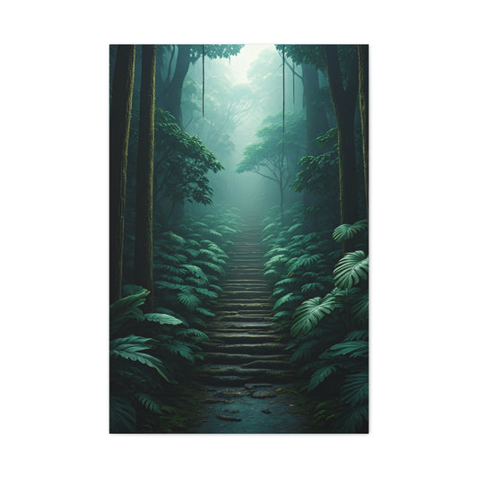
Pathway Through the Mist Wall Art & Canvas Prints
Regular price $141.23Regular price -
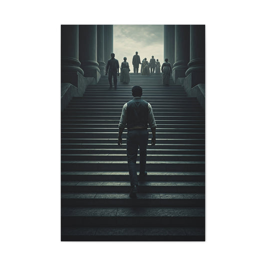
Road of Resolve Wall Art & Canvas Prints
Regular price $141.23Regular price -
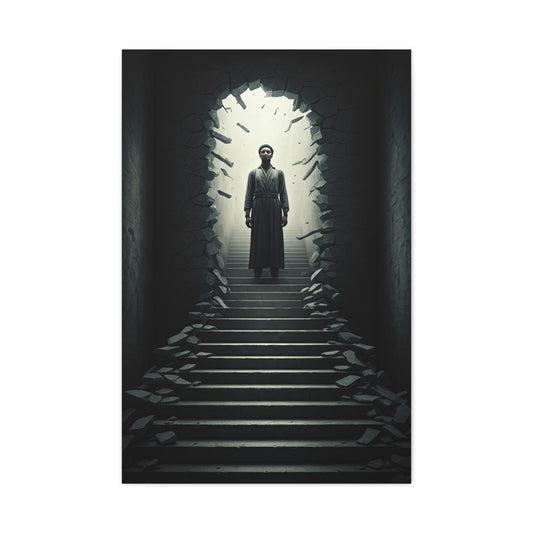
Threshold of Transformation Wall Art & Canvas Prints
Regular price $141.23Regular price -
Gaze of Wisdom Wall Art & Canvas Prints
Regular price $141.23Regular price -
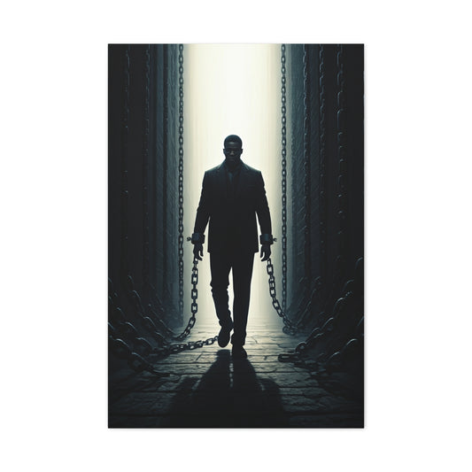
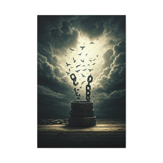
Break the Chains Wall Art & Canvas Prints
Regular price $141.23Regular price -
Ascent Toward Destiny Wall Art & Canvas Prints
Regular price $141.23Regular price -
Passage of Stillness Wall Art & Canvas Prints
Regular price $141.23Regular price -
Silent Resolve Wall Art & Canvas Prints
Regular price $141.23Regular price -
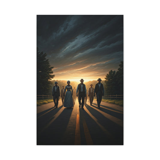
March Into Destiny Wall Art & Canvas Prints
Regular price $141.23Regular price -
Walk of Purpose Wall Art & Canvas Prints
Regular price $141.23Regular price -
Obsidian Impact Field Wall Art & Canvas Prints
Regular price $141.23Regular price -
Midnight Pulse Core Wall Art & Canvas Prints
Regular price $141.23Regular price -
Midnight Alloy Geometry Wall Art & Canvas Prints
Regular price $141.23Regular price -
Dark Diagonal Texture Abstract Wall Art & Canvas Prints
Regular price $141.23Regular price -
Molten Rift Wall Art & Canvas Prints
Regular price $141.23Regular price -
Blade of Eternal Flame Wall Art & Canvas Print
Regular price $141.23Regular price -
Shattered Memories Wall Art & Canvas Prints
Regular price $141.23Regular price -
Celestial Kitsune Guardian Wall Art & Canvas Prints
Regular price $141.23Regular price -
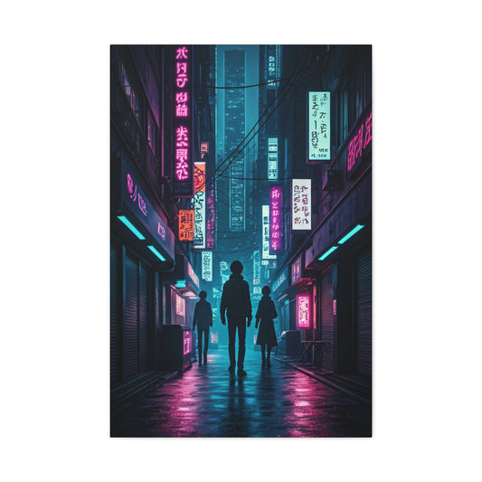
Neon Alley Wanderers Wall Art & Canvas Prints
Regular price $141.23Regular price -
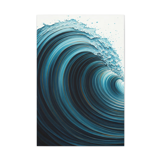
Abyssal Wave Vortex Abstract Wall Art & Canvas Prints
Regular price $141.23Regular price -
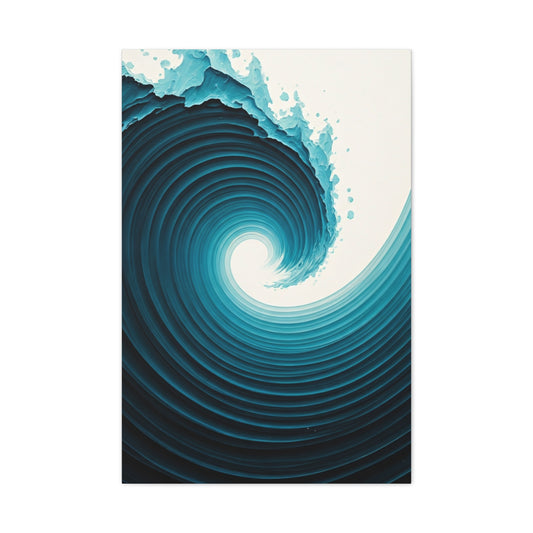
Deep Tidal Spiral Abstract Wall Art & Canvas Prints
Regular price $141.23Regular price -
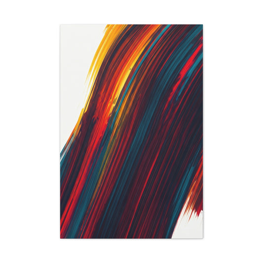
Crimson Momentum Abstract Wall Art & Canvas Prints
Regular price $141.23Regular price


Dark Wall Art: Transform Your Home This Fall
Transforming your living space with darker hues represents one of the most sophisticated design choices available to contemporary homeowners. The strategic implementation of shadowed wall colors creates an atmosphere of luxury, intimacy, and refined elegance that lighter palettes simply cannot achieve. This comprehensive exploration delves into the multifaceted world of deep-toned interior walls, examining their psychological impact, practical considerations, and the myriad ways they can revolutionize your domestic environment.
The autumn season brings with it a natural inclination toward warmer, more enveloping color schemes. As daylight hours diminish and we seek comfort within our homes, the appeal of rich, saturated wall colors becomes increasingly apparent. These deeper shades provide a cocoon-like quality that transforms any room into a sanctuary of sophistication and warmth.
Dark wall treatments extend far beyond simple aesthetic choices, representing a fundamental shift in how we perceive and interact with our living spaces. They challenge traditional notions of brightness equating to spaciousness, instead demonstrating how carefully chosen deep colors can create depth, drama, and visual interest that lighter alternatives often lack.
The versatility of shadowed wall colors allows them to complement virtually any design philosophy, from minimalist modernism to maximalist eclecticism. This adaptability stems from their ability to serve as neutral backdrops that allow other design elements to take center stage, while simultaneously adding their own layer of visual complexity and emotional resonance.
The Psychology Behind Deep-Toned Interior Spaces
The human response to color operates on both conscious and subconscious levels, influencing mood, behavior, and overall well-being in ways we are only beginning to understand. Darker wall colors tap into primal associations with safety, security, and intimacy that have been hardwired into our species over millennia of evolution.
Research in environmental psychology demonstrates that individuals tend to speak more quietly and move more deliberately in spaces dominated by deeper hues. This behavioral modification creates an atmosphere of contemplation and relaxation that can be particularly beneficial in bedrooms, studies, and other spaces designated for rest or focused activity.
The phenomenon of color temperature plays a crucial role in how we perceive darker walls. Warm-toned deep colors, such as burgundy, chocolate brown, or deep forest green, create feelings of coziness and security. Cool-toned dark colors, including navy blue, charcoal gray, or deep purple, evoke sophistication and calm introspection.
Darker walls also possess the unique ability to make artificial lighting appear more dramatic and purposeful. The interplay between shadow and illumination creates visual depth that can make even small spaces feel more expansive and interesting. This effect is particularly pronounced in the evening hours, when the contrast between lit and unlit areas becomes more pronounced.
The psychological concept of refuge theory suggests that humans are naturally drawn to spaces that provide a sense of enclosure and protection while maintaining visual access to their surroundings. Dark walls can create this refuge feeling by defining the boundaries of a space more clearly than lighter colors, which tend to recede and blur the edges of rooms.
Furthermore, the use of deeper wall colors can influence our perception of time and encourage longer periods of relaxation or concentration. The reduced visual stimulation of darker environments can be particularly beneficial for individuals who suffer from anxiety or attention disorders, providing a calming backdrop that promotes mental clarity and emotional stability.
The cultural associations we have with dark colors also play a significant role in their psychological impact. In many cultures, deep colors are associated with luxury, power, and sophistication. Incorporating these hues into our living spaces allows us to tap into these positive associations, potentially boosting confidence and self-esteem.
Creating Dramatic Focal Points Through Strategic Color Placement
The art of utilizing darker wall colors effectively requires a sophisticated understanding of spatial relationships and visual hierarchy. Rather than simply painting every surface in deep hues, successful dark wall implementation involves careful consideration of which surfaces will benefit most from this treatment and how they will interact with the room's other elements.
Accent walls represent perhaps the most accessible entry point for homeowners interested in exploring darker color palettes. By selecting a single wall for deep color treatment, typically the wall behind a bed, sofa, or dining table, you can create a powerful focal point without overwhelming the space. This approach allows for experimentation while maintaining the safety net of lighter surrounding surfaces.
The selection of which wall to darken requires careful analysis of the room's architecture, lighting conditions, and intended function. Walls that receive minimal natural light are often ideal candidates for dark treatment, as they will not appear muddy or dull during daylight hours. Conversely, walls with significant natural light exposure can handle deeper colors while maintaining their vibrancy throughout the day.
Architectural features such as fireplaces, built-in shelving, or decorative molding can be dramatically enhanced through strategic dark color application. These features often serve as natural focal points within a room, and emphasizing them with deeper hues can create stunning visual anchors that draw the eye and establish clear design hierarchies.
The concept of visual weight becomes particularly important when working with darker wall colors. Deeper hues carry more visual weight than lighter ones, meaning they can make walls appear to advance toward the viewer. This effect can be used strategically to alter the perceived proportions of a room, making long narrow spaces feel more balanced or creating intimate conversation areas within larger rooms.
Ceiling applications of dark colors represent an advanced technique that can dramatically alter a room's perceived height and character. While conventional wisdom suggests that dark ceilings will make rooms feel smaller, the reality is more nuanced. In rooms with high ceilings, dark overhead surfaces can create a more intimate, cozy atmosphere while still maintaining adequate headroom. The key lies in balancing the darkness of the ceiling with appropriate lighting and lighter wall treatments.
The transition between dark and light surfaces within a room requires careful attention to detail. Sharp contrasts can create dramatic effects, while gradual transitions through the use of trim, molding, or decorative elements can soften the visual impact and create more harmonious color relationships.
Consider also the impact of dark walls on furniture placement and room flow. Darker surfaces can make furniture appear to float, creating interesting visual effects that can be exploited to improve the perceived spaciousness of a room. This floating effect is particularly pronounced with light-colored furniture against very dark walls.
Mastering Contrast and Balance in Dark-Walled Spaces
The successful implementation of darker wall colors hinges largely on the creation of appropriate contrast and visual balance throughout the space. Without careful attention to these principles, even the most beautiful dark colors can result in spaces that feel oppressive or visually uninteresting.
Contrast in dark-walled spaces operates on multiple levels, including color contrast, texture contrast, and lighting contrast. Each of these elements must be carefully orchestrated to create a cohesive and visually appealing environment that capitalizes on the drama of deep wall colors while avoiding potential pitfalls.
Color contrast represents the most obvious consideration when working with dark walls. Light-colored furniture, artwork, and accessories naturally pop against darker backgrounds, creating visual interest and preventing the space from becoming monochromatic. However, effective contrast involves more than simply pairing light with dark; it requires an understanding of color temperature, saturation, and undertones.
Warm-toned dark walls pair beautifully with warm light colors, such as cream, warm white, or soft gold. The underlying warmth in both the wall color and accent pieces creates harmony while maintaining sufficient contrast for visual interest. Similarly, cool-toned dark walls work well with cool light colors, including crisp whites, light grays, and pale blues.
The proportion of dark to light elements within a room significantly impacts the overall balance and mood. Spaces dominated by dark surfaces require generous amounts of light-colored elements to prevent them from feeling oppressive. A general guideline suggests that dark surfaces should comprise no more than 60-70% of the visible surfaces in most residential applications.
Texture contrast becomes particularly important in dark-walled spaces, as variations in surface texture can create visual interest even when colors are similar. Smooth dark walls paired with rough-textured furniture, woven fabrics, or natural materials create dynamic interplays between different surface qualities. This textural variety prevents spaces from appearing flat or one-dimensional.
The strategic use of metallic elements can provide both color and texture contrast in dark-walled spaces. Gold, silver, copper, and bronze finishes all offer unique opportunities to introduce light-reflecting surfaces that brighten the space while complementing the sophistication of dark walls. The key lies in selecting metallic tones that harmonize with the undertones of the chosen wall color.
Lighting contrast represents perhaps the most critical element in successfully balanced dark-walled spaces. Multiple light sources at varying heights and intensities create layered illumination that prevents the space from appearing flat or gloomy. Table lamps, floor lamps, wall sconces, and overhead fixtures should work together to create pools of light that define different areas within the room.
Pattern contrast can also play a valuable role in dark-walled spaces, particularly when used in textiles, wallpaper, or decorative accessories. Bold patterns with light backgrounds can create striking focal points against dark walls, while subtle patterns in similar tones add visual texture without competing for attention.
The scale of contrasting elements must also be carefully considered. Large-scale light elements, such as oversized artwork or furniture pieces, create bold statements against dark walls, while smaller-scale contrasting elements provide visual texture and detail that reward closer inspection.
Selecting Perfect Color Palettes for Deep Wall Treatments
The process of selecting appropriate colors for dark wall treatments requires a sophisticated understanding of color theory, undertones, and the ways different hues interact with various lighting conditions throughout the day. The perfect dark color for your space depends on numerous factors, including the room's orientation, natural light exposure, intended function, and existing furnishings.
Navy blue represents one of the most versatile and sophisticated options for dark wall treatments. Its deep, rich quality provides excellent contrast for white and cream furnishings while maintaining enough warmth to feel inviting rather than cold. Navy blue works particularly well in bedrooms, dining rooms, and home offices, where its calming yet authoritative presence can enhance concentration and relaxation.
The undertones present in navy blue vary significantly between different paint formulations, with some leaning toward green undertones while others incorporate purple or gray elements. Understanding these subtleties is crucial for selecting a navy that will harmonize with your existing furnishings and the room's lighting conditions.
Charcoal gray offers another excellent option for homeowners seeking sophisticated dark walls without committing to true black. This neutral dark color provides an elegant backdrop for virtually any color scheme while maintaining enough depth to create dramatic visual impact. Charcoal gray works particularly well in modern and contemporary interiors, where its clean, sophisticated appearance complements sleek furnishings and minimalist design principles.
Deep forest green has experienced a renaissance in recent years, offering a rich, natural alternative to more traditional dark colors. This earthy hue brings elements of the natural world indoors while providing excellent contrast for both warm and cool accent colors. Forest green works particularly well in spaces with natural wood elements, leather furnishings, or botanical themes.
Burgundy and deep wine colors represent excellent choices for creating warm, luxurious atmospheres. These rich hues work particularly well in dining rooms, where their appetite-stimulating properties and association with fine dining can enhance the overall eating experience. Burgundy walls also complement brass and gold fixtures beautifully, creating opulent environments reminiscent of fine hotels or restaurants.
Black walls represent the ultimate in dramatic dark color treatments, offering maximum contrast potential and undeniable sophistication. However, successful black wall implementation requires careful attention to lighting, furnishing selection, and spatial proportions. Black works best in larger rooms with ample natural light and high ceilings, where its dramatic impact can be fully appreciated without overwhelming the space.
Deep purple and eggplant colors offer unique opportunities to create sophisticated, slightly unconventional dark wall treatments. These rich hues work particularly well in creative spaces, bedrooms, or anywhere a touch of luxury and mystery is desired. Purple undertones can range from red-based to blue-based, significantly affecting how the color interacts with different lighting conditions and accent colors.
Chocolate brown and deep taupe colors provide warm, earthy alternatives to cooler dark colors. These natural hues work particularly well in traditional, rustic, or transitional interiors, where their connection to natural materials and earth tones creates harmonious, grounded environments. Brown-based dark colors pair beautifully with cream, gold, and other warm accent colors.
The consideration of changing light conditions throughout the day represents a crucial factor in dark color selection. Colors that appear perfect under artificial lighting may look dramatically different in natural daylight, and successful color selection requires evaluation under all lighting conditions that will be present in the space.
Lighting Strategies That Complement Darker Interiors
The relationship between lighting and dark wall colors represents one of the most critical aspects of successful dark interior design. Proper illumination can transform potentially oppressive dark spaces into sophisticated, inviting environments that capitalize on the dramatic potential of deep colors while maintaining functionality and comfort.
Layered lighting approaches work best in dark-walled spaces, incorporating multiple light sources at different levels to create depth and visual interest. This technique prevents the flat, one-dimensional appearance that can result from relying solely on overhead lighting in dark environments. The goal is to create pools of light that define different areas within the room while maintaining overall illumination levels appropriate for the space's intended function.
Ambient lighting provides the foundational illumination layer in any well-designed lighting scheme. In dark-walled spaces, ambient lighting must work harder to overcome the light-absorbing properties of deep colors. This often requires more fixtures or higher wattage bulbs than would be necessary in lighter-colored rooms. Recessed ceiling fixtures, track lighting, or decorative chandeliers can all serve as effective ambient lighting sources.
Task lighting becomes particularly important in dark-walled spaces, as the reduced overall light levels can make detailed activities more challenging. Reading lamps, desk lights, under-cabinet lighting in kitchens, and vanity lighting in bathrooms all serve essential functions in maintaining the usability of dark spaces. The key lies in positioning task lighting to eliminate shadows and provide adequate illumination without creating harsh contrasts.
Accent lighting plays a crucial role in highlighting architectural features, artwork, and decorative elements against dark wall backgrounds. Picture lights, wall washers, and directional spotlights can create dramatic focal points that take advantage of the high contrast potential offered by dark walls. This type of lighting is often what transforms a simply dark room into a sophisticated, gallery-like space.
The color temperature of lighting fixtures significantly impacts how dark wall colors appear and how the overall space feels. Warm white light (2700K-3000K) tends to enhance the cozy, intimate feeling of dark walls while making the space feel more inviting. Cool white light (3500K-4100K) can make dark colors appear more dramatic and sophisticated but may feel less comfortable for relaxation areas.
Light placement strategies must account for the light-absorbing properties of dark surfaces. Fixtures positioned to bounce light off lighter surfaces, such as ceilings or light-colored furniture, can help maximize illumination efficiency. Wall sconces that direct light both up and down can create particularly effective lighting patterns in dark-walled spaces.
The use of mirrors and other reflective surfaces becomes increasingly important in dark interiors, as these elements can help distribute and amplify available light throughout the space. Strategic placement of mirrors opposite windows or light sources can significantly improve overall illumination while creating interesting visual effects.
Dimmer controls represent essential components of any dark-walled space lighting scheme, allowing for adjustment of illumination levels based on time of day, activity, and desired mood. The ability to vary lighting intensity is particularly valuable in dark spaces, where the difference between adequately lit and oppressive can be quite subtle.
Natural light management also requires special consideration in dark-walled spaces. Window treatments should maximize daylight penetration during desired hours while providing privacy and light control when needed. Sheer curtains, light-filtering blinds, or adjustable shutters can help optimize natural light utilization without compromising the dramatic impact of dark walls.
Furniture Selection and Arrangement for Dark Spaces
The selection and arrangement of furniture in dark-walled spaces requires careful consideration of scale, color, texture, and visual weight to create balanced, functional, and aesthetically pleasing environments. The dramatic backdrop provided by dark walls offers unique opportunities to showcase furniture pieces while also presenting challenges that must be thoughtfully addressed.
Light-colored furniture naturally stands out against dark wall backgrounds, creating striking visual contrasts that can make pieces appear larger and more significant than they would in lighter environments. This effect can be leveraged to highlight particularly beautiful or important furniture pieces, turning them into focal points within the room's design scheme.
White and cream-colored furniture pieces create the strongest contrast against dark walls, resulting in bold, dramatic statements that can anchor a room's design. However, this high contrast approach requires careful balance to prevent the space from appearing too stark or visually jarring. The key lies in incorporating transitional elements, such as medium-toned accessories or textiles, that bridge the gap between light and dark.
Natural wood furniture offers an excellent middle ground for dark-walled spaces, providing warmth and texture while maintaining sufficient contrast to stand out against deep backgrounds. Lighter wood tones, such as oak, maple, or birch, create pleasing contrasts, while darker woods like walnut or mahogany can blend more subtly with dark walls while adding richness and depth.
The scale of furniture pieces takes on increased importance in dark-walled spaces, as the visual weight of dark surfaces can make rooms feel smaller. Selecting appropriately scaled furniture that doesn't overwhelm the space while still providing adequate seating and storage requires careful measurement and planning. Oversized furniture in dark rooms can create oppressive feelings, while undersized pieces may appear lost against dramatic wall backgrounds.
Furniture arrangement strategies for dark-walled spaces often benefit from floating pieces away from walls rather than pushing them against dark surfaces. This approach creates visual separation between furniture and walls while allowing light to circulate around pieces, reducing the overall visual weight of the arrangement. Area rugs can help define furniture groupings and create cohesive arrangements in this floating layout approach.
Multi-functional furniture pieces become particularly valuable in dark-walled spaces, where visual clutter should be minimized to maintain the sophisticated atmosphere. Ottoman storage pieces, expandable dining tables, and modular seating systems can provide necessary functionality while maintaining clean, uncluttered lines that complement the drama of dark walls.
The finish and material selection for furniture in dark spaces significantly impacts the overall atmosphere. Glossy finishes reflect light and can help brighten dark rooms, while matte finishes create more subdued, sophisticated appearances. Mixed finish approaches, incorporating both glossy and matte elements, can create visual interest while maintaining balance.
Upholstered furniture offers opportunities to introduce color, pattern, and texture into dark-walled spaces. Light-colored upholstery creates maximum contrast, while medium tones can provide transitional elements that soften harsh contrasts. The texture of upholstery fabrics becomes more noticeable against dark backgrounds, making material selection particularly important for overall visual impact.
Metal furniture elements and accents can provide light-reflecting surfaces that brighten dark rooms while adding sophistication and elegance. Chrome, brushed nickel, brass, and copper all offer different aesthetic qualities that can complement various dark color schemes. The key lies in selecting metallic tones that harmonize with the undertones of the chosen wall color.
Storage solutions must be carefully integrated into dark-walled spaces to maintain clean, uncluttered appearances that allow the wall color to remain the dominant design element. Built-in storage, wall-mounted shelving, and concealed storage options can provide necessary functionality without competing for visual attention.
Strategic Illumination Management Through Window Coverings
Window treatments in dark-walled environments function as critical mediators between interior atmospheres and external light sources, requiring sophisticated selection and coordination approaches that balance multiple competing priorities. These elements must simultaneously address privacy requirements, light control needs, energy efficiency considerations, and aesthetic harmony while working within the unique constraints and opportunities presented by dramatic wall colors.
The fundamental challenge of window treatment coordination in dark-walled spaces lies in maximizing natural light penetration without compromising the sophisticated ambiance that draws people to these dramatic environments. Light-colored window treatments create striking visual contrast that can dramatically brighten spaces while providing clean, fresh counterpoints to deep wall tones. However, the selection process must carefully consider how different materials and colors will appear throughout varying light conditions and times of day.
Layered window treatment systems represent the most versatile and successful approach for dark-walled environments, combining multiple functional and decorative elements that can be adjusted independently to achieve optimal light control and visual appeal. These sophisticated systems typically incorporate primary light-controlling elements such as cellular shades, roller blinds, or horizontal blinds with decorative outer layers including drapery panels, valances, or decorative curtains. This layering approach provides unparalleled flexibility while creating opportunities for complex color and texture coordination.
The selection of primary light-controlling elements requires careful analysis of window orientation, surrounding landscape features, privacy requirements, and desired light quality throughout different seasons and times of day. East-facing windows require different treatment strategies than west-facing openings, as the quality and intensity of light varies dramatically throughout daily cycles. North-facing windows in dark-walled spaces may need maximum light penetration strategies, while south-facing openings might require more sophisticated light filtering and glare control.
Light-filtering materials deserve special consideration in dark-walled environments, as they can transform harsh sunlight into gentle, diffused illumination that enhances rather than competes with sophisticated interior atmospheres. Cellular shades with light-filtering properties provide excellent energy efficiency while softening daylight, creating the perfect balance between brightness and ambiance. Roller shades with varying degrees of opacity offer clean, contemporary aesthetics that complement modern dark-walled spaces while providing precise light control.
Decorative outer layers provide primary opportunities for introducing color, pattern, and texture that coordinate with other interior elements while enhancing the overall design narrative. Drapery fabrics must be selected not only for their appearance but also for their behavior in varying light conditions, as some materials become translucent when backlit while others maintain their opacity. The interplay between natural and artificial lighting conditions affects how drapery colors appear throughout different times of day, requiring consideration of both daytime and evening aesthetics.
Hardware selection for layered window treatment systems takes on heightened importance in dark-walled spaces, as these elements often become more prominent against dramatic backgrounds. Metallic finishes can introduce light-reflecting surfaces that brighten spaces while adding luxury and sophistication. The consistency of hardware finishes throughout the space contributes significantly to overall design cohesion, requiring coordination with other metallic elements including lighting fixtures, furniture hardware, and decorative accessories.
Motorized window treatment systems offer exceptional advantages in dark-walled spaces where precise light control throughout the day can dramatically impact both functionality and ambiance. These sophisticated systems allow for subtle adjustments that maximize natural light during dimmer periods while providing privacy and glare control when needed. Programming capabilities enable automatic adjustments based on time of day, seasonal changes, and personal preferences, maintaining optimal light levels without constant manual intervention.
Color coordination between window treatments and dark wall colors requires understanding of undertones, color temperature relationships, and desired contrast levels. Cool-toned dark walls often benefit from warm-toned window treatments that introduce balance and visual warmth, while warm dark wall colors might be enhanced by cooler treatment selections that provide refreshing contrast. The goal is creating complementary relationships that enhance both elements rather than competing for visual attention.
Texture coordination between window treatments and wall surfaces adds crucial visual interest and depth to dark-walled spaces where color variations might be more subtle. Smooth silk or cotton drapery creates elegant contrast against textured wall surfaces, while nubby linen or textured fabrics might complement smooth painted walls. The scale and character of textures should relate appropriately to room proportions and overall design style, creating cohesive relationships that enhance spatial sophistication.
Seasonal adjustment strategies for window treatments in dark-walled spaces recognize that light requirements and aesthetic preferences change throughout the year. Lighter, more translucent treatments might be preferred during darker winter months to maximize available natural light, while denser, more opaque options could provide better comfort and energy efficiency during bright summer periods. Layered systems facilitate these seasonal adjustments without requiring complete treatment replacement.
Floor Covering Selection and Coordination Principles
Area rugs and floor coverings in dark-walled environments serve multifaceted roles that extend far beyond simple floor protection or comfort provision. These elements function as space definers, light reflectors, color introducers, texture providers, and visual anchors that can dramatically influence the perception of room proportion, warmth, and overall aesthetic balance. The selection and coordination of floor coverings requires careful consideration of how these substantial design elements interact with dramatic wall colors to create harmonious, visually compelling results.
The fundamental challenge of floor covering selection in dark-walled spaces lies in achieving appropriate visual weight and contrast without overwhelming the sophisticated ambiance that makes these environments appealing. Light-colored rugs create striking visual anchors that can brighten spaces significantly while providing clean, fresh counterpoints to deep wall tones. However, practical considerations including maintenance requirements, traffic patterns, and lifestyle factors must be balanced against aesthetic preferences to ensure long-term satisfaction with floor covering selections.
Scale relationships between rugs and dark-walled spaces require sophisticated understanding of visual proportion and spatial dynamics. Oversized rugs that extend well beyond furniture groupings can make rooms feel larger and more cohesive while providing adequate visual weight to balance dramatic wall colors. Conversely, undersized rugs may appear lost against commanding wall backgrounds, failing to provide sufficient visual impact or functional benefit. The general principle suggests that larger scale selections typically work better in dark-walled environments, as substantial floor coverings provide necessary visual grounding.
Color coordination between floor coverings and dark walls requires analysis of undertones, desired contrast levels, and overall color story development throughout the space. Neutral-colored rugs in cream, ivory, taupe, or soft gray provide versatile foundations that complement most dark wall colors while offering opportunities for accent color introduction through other accessories. Bold-colored rugs can create dramatic focal points but require careful coordination with other elements to avoid overwhelming the space or creating visual competition.
Pattern integration through floor coverings demands careful consideration of scale, complexity, and visual impact to ensure successful coordination with dark-walled environments. Large-scale patterns often work better than small, busy designs that might appear chaotic or insignificant against dramatic backgrounds. Geometric patterns provide contemporary appeal and structured contrast to organic elements elsewhere in the room, while traditional patterns bring timeless elegance that requires careful color coordination to avoid appearing dated.
Texture variation in floor coverings adds essential tactile and visual interest to dark-walled spaces where color contrasts might be more limited or subtle. High-pile rugs create luxurious softness underfoot while adding vertical texture dimension that catches and holds light effectively. Low-pile options offer easier maintenance and more subtle texture contributions while providing smoother surface transitions between different flooring materials. Natural fiber rugs including jute, sisal, seagrass, and coir introduce organic texture qualities that provide earthy, authentic contrast to sophisticated dark walls.
Layering strategies for multiple rugs create opportunities for complex textural and color relationships while defining different functional zones within larger dark-walled spaces. A substantial neutral base rug might be layered with smaller patterned or textured accent rugs to create visual hierarchy and functional definition. This sophisticated approach requires careful attention to color coordination, scale relationships, and edge alignments to avoid creating visual confusion or awkward overlapping arrangements.
Material selection for floor coverings in dark-walled spaces must consider both aesthetic and practical performance characteristics. Wool rugs offer excellent durability, natural stain resistance, and luxurious feel while providing good light reflection properties. Cotton rugs are easily cleaned and offer crisp, fresh aesthetics but may show wear more readily in high-traffic areas. Synthetic materials provide excellent durability and stain resistance while offering consistent color and texture characteristics, though they may lack the character and light-reflecting properties of natural fibers.
Placement strategies for rugs in dark-walled spaces must account for furniture arrangements, traffic patterns, and visual composition requirements while maximizing the beneficial impact of floor coverings. Rugs that extend partially under furniture create integrated, cohesive appearances that visually connect seating groupings and establish comfortable conversation areas. Strategic placement can guide traffic flow while defining functional zones and creating visual connections between different areas of larger spaces.
Maintenance considerations for floor coverings in dark-walled environments require understanding how different materials and colors show soil, wear, and pet hair against the backdrop of dramatic wall colors. Light-colored rugs may require more frequent cleaning but provide significant brightening benefits, while medium-toned options might offer the best balance between light reflection and practical maintenance requirements. Professional cleaning schedules and appropriate protection treatments help ensure long-term beauty and performance of floor covering investments.
Seasonal rotation strategies allow for dynamic changes in floor covering appearance and functionality while maintaining coordination with permanent design elements. Lighter, more breathable materials might be preferred during warmer months, while plush, cozy options provide additional warmth and comfort during colder periods. Storage and care procedures for seasonal rug rotations help protect investments while facilitating easy changes that keep dark-walled spaces feeling fresh and current.
Sophisticated Textile Layering and Coordination Methods
The masterful coordination of multiple textile elements within dark-walled spaces requires comprehensive understanding of how different fabrics, textures, colors, and patterns interact with both dramatic wall backgrounds and each other to create cohesive, visually compelling environments. Successful textile coordination creates layers of visual and tactile interest while maintaining overall harmony and avoiding the chaotic appearance that can result from thoughtless combination of disparate elements.
Throw pillow coordination represents one of the most accessible yet impactful approaches for introducing color, pattern, and texture into dark-walled spaces. These versatile accessories allow for seasonal updates, personal expression, and experimental color combinations that might be overwhelming in larger doses. The key to successful pillow coordination lies in creating intentional relationships between colors, patterns, textures, and scales rather than random assemblages of appealing individual pieces.
Color relationship strategies for pillow selections can follow various successful approaches, from sophisticated monochromatic schemes that explore different shades and tones of single colors to dynamic complementary approaches that introduce contrasting hues for visual excitement and energy. Analogous color schemes using colors adjacent on the color wheel create harmonious, sophisticated appearances that feel naturally coordinated, while triadic schemes offer more dynamic visual interest through balanced color relationships. The dark wall color should inform all pillow color selections, serving as either a dominant element to be complemented or a neutral backdrop to be enhanced through strategic contrast.
Pattern mixing in pillow arrangements requires sophisticated understanding of scale, motif, color, and visual weight relationships to achieve polished rather than chaotic results. The fundamental principle involves combining patterns of different scales while maintaining some common color elements that create visual connections. A large-scale floral might be successfully paired with a medium geometric and a small stripe, all sharing at least one common color that relates to the wall tone or other room elements. The unifying effect of dark wall backgrounds helps disparate patterns work together more harmoniously than might be possible in lighter environments.
Texture coordination through pillow selections provides opportunities to introduce tactile interest and visual depth that become particularly important in dark-walled spaces where color variations might be more subtle or limited. Combining smooth silk pillows with nubby linen covers, soft velvet textures with crisp cotton fabrics, or sleek leather accents with cozy knit covers creates dynamic interplays that prevent spaces from appearing flat or monotonous. The scale and character of textures should relate appropriately to room proportions and furniture styles while contributing to overall design sophistication.
Blanket and throw coordination offers opportunities to introduce substantial color and texture elements while providing practical comfort and warmth. These larger textile pieces can significantly impact the visual balance of seating areas while creating opportunities for seasonal changes and personal expression. Light-colored throws create striking contrast against dark upholstery and wall colors while providing brightness to seating areas. The material selection for throws affects both visual appeal and practical performance, with cashmere providing luxury and softness, wool offering warmth and durability, and cotton blends providing easy care and crisp appearance.
Upholstery fabric coordination with other textiles requires careful consideration of how different materials will appear and perform against dramatic wall backgrounds while relating harmoniously to accent textiles throughout the space. Light-colored upholstery creates strong contrast and visual prominence against dark walls, while darker fabrics might blend more subtly unless differentiated through texture, pattern, or strategic lighting. The durability and maintenance characteristics of upholstery fabrics must align with lifestyle requirements while supporting overall design goals.
Drapery and curtain fabric coordination with other textile elements requires attention to color relationships, texture contrasts, scale compatibility, and visual weight distribution to create cohesive yet interesting combinations throughout dark-walled spaces. Window treatments often represent the largest textile elements in rooms, making their successful coordination with smaller accessories crucial for overall design success. The interplay between drapery materials and pillow selections, throw fabrics, and upholstery choices creates the foundation for sophisticated textile coordination that feels intentional rather than accidental.
Seasonal textile rotation strategies enable dynamic changes that keep dark-walled spaces feeling fresh and current while maintaining coordination with permanent design elements. Summer textiles might emphasize lighter weights, cooler colors, and more breathable materials, while winter selections could focus on warmer tones, heavier weights, and cozy textures that provide additional comfort during colder months. Storage systems and care procedures for seasonal textile rotations help protect investments while facilitating easy changes.
Maintenance coordination for multiple textile elements requires understanding how different materials and colors show wear, soil, and pet hair against dark wall backgrounds while developing cleaning schedules that maintain overall appearance quality. Some textiles may require professional cleaning while others can be maintained through home care, requiring coordination of maintenance timing to avoid having multiple elements out of service simultaneously.
Quality coordination ensures that all textile elements meet appropriate standards for their intended use and visual importance within the overall design scheme. Investment pieces such as high-quality throw pillows and premium blankets provide long-lasting beauty and comfort, while more frequently changed elements might use moderate-quality options that offer good appearance and performance at reasonable cost. The balance between quality and budget considerations should support long-term satisfaction with textile coordination results.
Artistic Display and Visual Focal Point Creation
Artwork selection, placement, and coordination in dark-walled spaces requires sophisticated understanding of how artistic elements interact with dramatic backgrounds to create compelling visual narratives while supporting overall design objectives. The relationship between artwork and dark walls can either enhance the impact of both elements through strategic coordination or create unfortunate competition that diminishes the effectiveness of each component.
Scale relationships between artwork and dark wall backgrounds demand careful consideration to ensure adequate visual presence and impact within these commanding environments. Large-scale artwork often works exceptionally well against dark walls, creating substantial focal points that can anchor entire design schemes while providing appropriate visual weight to balance dramatic backgrounds. Smaller pieces may appear lost or insignificant unless carefully grouped or strategically lit to enhance their presence and visibility.
Light-colored artwork naturally commands attention against dark wall backgrounds, creating dramatic focal points that draw the eye and establish visual hierarchy within spaces. Oil paintings with predominantly light palettes, watercolors with white or cream backgrounds, contemporary photography with bright subjects, and graphic works with light grounds all offer different qualities of contrast and visual impact. The selection process should consider not only individual artistic merit but also contribution to overall ambiance, color coordination, and spatial balance.
Dark-toned artwork requires more sophisticated consideration and often benefits from strategic lighting solutions to prevent pieces from disappearing into wall backgrounds or appearing as dark, undefined shapes. Charcoal drawings, moody oil paintings, dramatic photography, and sculptural works in dark materials can create subtle, sophisticated relationships with dark walls when properly illuminated and thoughtfully positioned. The appreciation of these nuanced relationships appeals to viewers who value understated elegance over bold contrast.
Framing strategies assume heightened importance in dark-walled spaces, as frame selection can either integrate artwork seamlessly with wall colors or create definitive contrast that emphasizes artistic presence. Light-colored frames including white, cream, silver, and natural wood tones create strong boundaries between artwork and walls while reflecting light to brighten surrounding areas. Dark frames allow pieces to blend more subtly with their surroundings, creating sophisticated tonal relationships that feel integrated rather than contrasted.
Metallic frame selections introduce light-reflecting elements that can significantly brighten dark-walled spaces while adding luxury and sophistication to artistic displays. Gold frames provide warmth that enhances many dark wall colors, while silver and chrome options offer cooler contemporary appeal. Brass frames create vintage elegance, while copper selections provide unique warmth and character. Consistency in metallic finishes throughout the space contributes to overall design cohesion and professional appearance.
Gallery wall arrangements in dark-walled spaces require careful attention to spacing relationships, scale distribution, and visual weight balance to create cohesive, professionally arranged compositions. The unifying effect of dark wall backgrounds can help diverse artwork styles and frame types work together more harmoniously, but arrangements must still follow fundamental principles of good composition and visual balance. Larger anchor pieces should establish the foundation for arrangements, while smaller works fill in around them to create visual flow and sustained interest.
Mixed media displays combining artwork, photography, mirrors, and decorative objects create complex, layered visual experiences that add personality and sophistication to dark-walled spaces. These eclectic arrangements require careful curation to maintain refinement while avoiding visual chaos or overwhelming complexity. Template systems and careful planning help ensure successful mixed media displays that feel intentional rather than haphazard.
Sculptural elements and three-dimensional artwork offer unique opportunities to introduce form, shadow play, and textural interest into dark-walled environments. Light-colored sculptures create strong contrast and visual drama, while metallic pieces reflect available light to brighten surroundings and add luxury touches. Bronze, brass, and copper sculptures provide warmth, while chrome and aluminum pieces offer contemporary coolness. Placement considerations must account for viewing angles, lighting effects, and relationships with other room elements.
Lighting coordination for artwork display in dark-walled spaces often requires dedicated solutions including picture lights, track systems, or recessed accent lighting to ensure proper visibility and impact. LED lighting systems provide excellent color rendering while minimizing heat generation that might damage sensitive artworks. The coordination between artwork lighting and general room illumination creates layered lighting approaches that enhance both functional visibility and atmospheric ambiance.
Rotation strategies for artwork collections allow for dynamic changes that keep dark-walled spaces feeling fresh and personally meaningful while protecting valuable pieces from continuous light exposure. Seasonal rotations, thematic displays, and periodic rearrangements provide opportunities for creative expression while extending the life and enjoyment of art collections. Storage systems and handling procedures protect artwork during rotation periods while facilitating easy changes.
Conclusion
The strategic incorporation of metallic accessories and reflective surfaces within dark-walled spaces provides exceptional opportunities for brightening environments while introducing luxury, sophistication, and visual interest that complement dramatic wall colors. These light-reflecting elements serve dual functions as practical brightness enhancers and elegant decorative features that can transform the character and functionality of interior spaces.
Metallic finish coordination requires understanding how different metals interact with dark wall colors and other design elements to create cohesive rather than competing visual relationships. Warm metallic finishes including brass, bronze, copper, and gold provide richness and luxury that enhance many dark wall colors, particularly those with warm undertones. Cool metallic finishes such as chrome, nickel, silver, and aluminum offer contemporary appeal and crisp contrast that can brighten spaces while supporting modern design aesthetics.
Brass accessories provide exceptional warmth and character that complement dark walls beautifully while offering versatility that works with both traditional and contemporary design approaches. Brass candlesticks, picture frames, decorative bowls, and hardware create cohesive metallic themes while reflecting light throughout spaces. The patina development of brass over time adds character and authenticity that enhances the sophisticated ambiance of dark-walled environments.
Silver and chrome accessories offer cooler metallic alternatives that provide crisp, contemporary contrast against dark walls while reflecting light effectively to brighten spaces. Silver picture frames, chrome table accessories, and stainless steel decorative objects all contribute different qualities of light reflection and visual appeal. These cooler metals work particularly well with dark walls that have cool undertones or in spaces with contemporary design objectives.
Copper accessories introduce unique warmth and character that stands apart from more common brass and silver selections while providing excellent light reflection properties. Copper vases, bowls, planters, and lighting fixtures offer distinctive color and finish qualities that coordinate beautifully with many dark wall colors. The natural aging process of copper creates evolving patina that adds depth and character over time.
Mirror placement and selection in dark-walled spaces can dramatically impact both light levels and spatial perception while serving as important decorative elements. Large mirrors reflect available light throughout rooms while creating illusions of expanded space that counteract any closing-in effects of dark walls. Antique mirrors with aged, foxed surfaces provide different light-reflecting qualities and character than contemporary pieces with clear, perfect glass.
Mirror frame coordination should align with other metallic elements throughout the space while considering overall design style and proportion requirements. Ornate gold frames create traditional elegance, while simple silver or chrome frames support contemporary aesthetics. The size and placement of mirrors requires careful consideration of what they will reflect, ensuring that reflected views enhance rather than detract from the overall space appearance.