
-
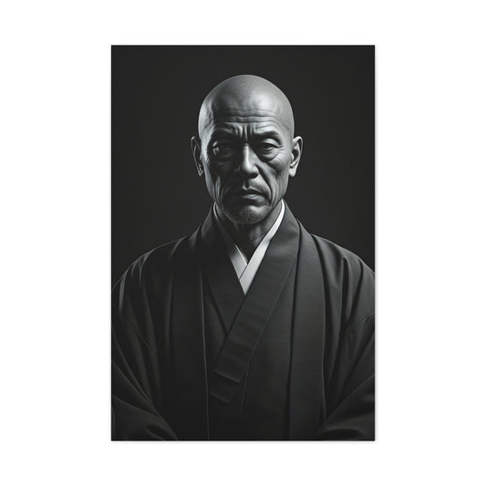
Stoic Figure in Minimalist Portrait Wall Art & Canvas Prints
Regular price $141.23Regular price -
Contemplative Wanderer Portrait Wall Art & Canvas Prints
Regular price $141.23Regular price


Decorating with Black and White Illustrations Wall Art: The Ultimate Guide to Creating Sophisticated Spaces
Transforming your living environment with monochromatic artwork represents one of the most powerful design decisions you can make. While many homeowners gravitate toward vibrant, colorful pieces, the understated elegance of black and white prints offers something entirely different—a sophisticated foundation that elevates every other element in your space.
The misconception that monochromatic art lacks personality or warmth stems from poor execution rather than inherent limitations. When carefully selected and thoughtfully positioned, black and white wall art becomes the cornerstone of refined interior design, creating visual harmony while allowing other decorative elements to shine.
This comprehensive exploration delves into the nuanced world of monochromatic wall decor, revealing how to harness its transformative power while avoiding common pitfalls that leave spaces feeling sterile or uninspired. From understanding the psychological impact of grayscale imagery to mastering the art of strategic placement, we'll uncover the secrets behind creating spaces that feel both timeless and thoroughly contemporary.
The Timeless Appeal of Monochromatic Artwork
Monochromatic wall art possesses an inherent versatility that transcends decorative trends and stylistic movements. Unlike colored artwork that must harmonize with specific palettes, black and white prints adapt seamlessly to evolving design schemes, making them invaluable investments for homeowners who appreciate longevity in their decorative choices.
The psychological impact of grayscale imagery extends far beyond mere aesthetic appeal. Research in environmental psychology demonstrates that monochromatic visual elements reduce cognitive load, allowing the mind to process spatial information more efficiently. This translates into spaces that feel inherently calming and organized, even when other design elements might otherwise create visual tension.
Historical precedent supports the enduring appeal of black and white artwork. From Ansel Adams' breathtaking landscape photography to the stark modernist prints of the Bauhaus movement, monochromatic art has consistently represented the pinnacle of artistic sophistication. This legacy continues today, with contemporary artists and designers recognizing the unique power of working within a constrained palette.
The emotional resonance of black and white imagery often surpasses that of colored pieces. Without the distraction of chromatic relationships, viewers engage more deeply with composition, subject matter, and artistic technique. A monochromatic portrait captures the essence of its subject with remarkable clarity, while abstract black and white pieces reveal intricate details that might otherwise remain hidden beneath layers of color.
Furthermore, monochromatic artwork serves as a unifying element in eclectic spaces. When rooms contain furniture and accessories from different periods or styles, black and white prints provide visual coherence without imposing a rigid aesthetic framework. They act as neutral anchors that allow diverse elements to coexist harmoniously.
The sophistication factor cannot be overlooked. Choosing black and white art demonstrates design confidence and artistic appreciation. It signals an understanding that visual impact doesn't require chromatic complexity—that sometimes the most powerful statements emerge from elegant restraint.
Strategic Placement for Maximum Visual Impact
The positioning of monochromatic artwork requires careful consideration of light sources, room proportions, and existing design elements. Unlike colored pieces that might compete for attention, black and white prints can command focal points without overwhelming adjacent elements, making strategic placement both more flexible and more crucial to overall success.
Natural light dramatically affects the perception of black and white artwork. Pieces positioned near windows benefit from changing light conditions throughout the day, revealing subtle details and tonal variations that artificial lighting might obscure. Morning light tends to emphasize whites and lighter grays, while afternoon shadows deepen blacks and create more dramatic contrasts.
Room proportions play a significant role in determining optimal placement strategies. High-ceilinged spaces accommodate large-scale monochromatic pieces exceptionally well, as the expansive wall surface prevents even substantial artwork from feeling overwhelming. Conversely, intimate spaces benefit from smaller prints or carefully curated collections that create visual interest without dominating the environment.
Consider the relationship between artwork and furniture when planning placement. A substantial black and white print positioned above a low-profile sofa creates an illusion of height while anchoring the seating area. Similarly, placing monochromatic pieces at eye level in dining areas encourages contemplation during meals, fostering a sense of calm refinement.
Traffic patterns within rooms also influence ideal placement decisions. Hallways and transitional spaces benefit from bold black and white statements that create moments of visual pause. These areas often connect rooms with different color schemes, making monochromatic art particularly valuable for maintaining design continuity.
The concept of visual weight becomes especially important with black and white pieces. Dark, high-contrast images carry more visual weight than lighter, more subtle compositions. Balance this weight carefully across the room to avoid creating lopsided visual arrangements that feel uncomfortable or unstable.
Lighting design must complement monochromatic artwork rather than compete with it. Avoid placing extremely bright light sources directly adjacent to black and white prints, as this can wash out subtle tonal variations. Instead, use directional lighting to enhance contrast and create depth within the grayscale range.
Mastering Scale and Proportion for Dramatic Effect
The relationship between artwork size and room dimensions becomes particularly crucial when working with monochromatic pieces. Black and white prints possess an inherent boldness that allows them to command attention even in substantial sizes, but this power must be wielded judiciously to achieve sophisticated rather than overwhelming results.
Oversized monochromatic prints create immediate focal points that establish room hierarchy and direct visual flow. A large black and white landscape positioned behind a dining table transforms the entire eating experience, creating an immersive environment that encourages lingering conversations. The absence of competing colors allows viewers to appreciate subtle compositional details that might otherwise go unnoticed.
Conversely, intimate-scale black and white pieces invite closer inspection and create zones of contemplation within larger spaces. A collection of small monochromatic photographs clustered on a narrow wall creates visual rhythm and personal narrative without overwhelming adjacent furniture or architectural features.
The golden ratio principles apply beautifully to monochromatic art placement. When selecting sizes for black and white pieces, consider proportions that feel naturally balanced rather than arbitrarily chosen. A print that measures roughly two-thirds the width of the furniture beneath it often achieves visual harmony that feels both intentional and effortless.
Vertical versus horizontal orientations significantly impact spatial perception. Tall, narrow black and white prints emphasize ceiling height and create feelings of grandeur, while wide, horizontal pieces enhance the sense of spaciousness and flow. Understanding these effects allows you to use monochromatic art as an architectural tool for subtly reshaping spatial relationships.
Grouping multiple black and white pieces requires careful attention to spacing and visual weight distribution. Avoid uniform spacing that creates rigid, institutional feelings. Instead, vary gaps between pieces while maintaining overall balance. Allow breathing room around each print so individual compositions can be appreciated while contributing to the larger visual narrative.
The backdrop against which monochromatic art appears dramatically affects its perceived impact. Light walls make black elements appear more prominent, while darker walls emphasize white and lighter gray tones. Consider this relationship when selecting both artwork and wall colors to achieve your desired level of contrast and drama.
Understanding Texture and Subject Matter Dynamics
The textural qualities of black and white artwork extend far beyond the physical surface of the print itself. Smooth, high-gloss photographs create entirely different atmospheric effects than rough, matte-finished charcoal drawings or textured canvas prints. Understanding these distinctions allows you to orchestrate specific moods and feelings within your living spaces.
Photographic black and white prints typically exhibit sharp detail and smooth tonal transitions that emphasize technical precision and contemporary sensibilities. These pieces work exceptionally well in modern, minimalist environments where clean lines and geometric forms predominate. The clarity and definition inherent in quality photography complement sleek surfaces and streamlined furniture profiles.
Hand-drawn or painted monochromatic pieces introduce organic irregularities that soften space and add human warmth. Charcoal sketches, ink drawings, and watercolor washes in grayscale bring tactile qualities that invite closer inspection. These pieces work beautifully in spaces that mix vintage and contemporary elements or in rooms where comfort takes precedence over formal sophistication.
Abstract monochromatic compositions challenge viewers to engage with pure form and movement rather than recognizable subjects. These pieces can energize static spaces and create conversational focal points that spark imagination and interpretation. The absence of literal subject matter allows abstract black and white art to complement diverse decorative themes without creating narrative conflicts.
Botanical subjects rendered in black and white offer natural beauty without seasonal limitations. While colored floral art might clash with changing seasonal decor, monochromatic botanical prints remain appropriate year-round. They bring organic shapes and natural patterns into interior spaces while maintaining the sophisticated restraint that characterizes exceptional grayscale design.
Architectural subjects in black and white celebrate structural beauty and geometric relationships. Whether depicting iconic buildings, bridge details, or abstract structural elements, these pieces complement contemporary interior architecture while adding layers of visual interest. They work particularly well in homes with strong architectural features that deserve visual echo and enhancement.
Portrait photography in black and white possesses timeless appeal that transcends fashion and cultural trends. Monochromatic portraits focus attention on expression, character, and emotion rather than temporal details like clothing or styling. This makes them particularly suitable for formal spaces where longevity and classical appeal matter more than contemporary relevance.
Sophisticated Framing Strategies
Frame selection for black and white artwork requires nuanced understanding of how different materials and finishes interact with monochromatic imagery. The frame becomes part of the overall composition, influencing how viewers perceive both the artwork and its relationship to surrounding design elements.
Traditional black frames create strong, definitive boundaries that emphasize the graphic qualities of monochromatic prints. This approach works exceptionally well with high-contrast photography or bold graphic designs where the stark separation between art and wall enhances dramatic impact. However, black frames require careful balance to avoid creating visual heaviness that overwhelms surrounding elements.
White and light-colored frames provide gentle transition zones between artwork and wall surfaces, creating softer integration that feels less imposing. This approach works beautifully with subtle grayscale pieces or in spaces where the goal is visual harmony rather than dramatic contrast. Light frames also help smaller black and white pieces maintain presence without appearing lost on expansive wall surfaces.
Natural wood frames introduce warmth and organic texture that counterbalances the potential coolness of monochromatic imagery. The grain patterns and color variations in wood create visual bridges between stark black and white artwork and the warmer elements typically found in lived-in spaces. This combination feels particularly appropriate in transitional and traditional decorating styles.
Metal frames in silver, bronze, or gunmetal tones offer contemporary sophistication that complements the modern sensibilities often associated with black and white photography. These frames work exceptionally well with architectural subjects or abstract compositions where the sleek material qualities reinforce the artistic message.
The decision between matted and unmatted presentation significantly affects the final aesthetic impact. Matting creates additional breathing space around artwork and provides opportunities to introduce subtle color accents or textural variations. However, monochromatic pieces often possess sufficient visual strength to succeed without matting, particularly when frame selection provides adequate visual separation from wall surfaces.
Consider the relationship between frame width and artwork scale. Substantial pieces often benefit from proportionally wider frames that provide adequate visual weight, while delicate subjects might be overwhelmed by heavy framing. The goal is achieving balance where frame and artwork feel like intentional partners rather than competing elements.
Creating Warmth in Monochromatic Spaces
The challenge of maintaining emotional warmth while embracing monochromatic artwork requires thoughtful orchestration of surrounding elements. Successful spaces demonstrate that coldness stems from poor material choices and inadequate layering rather than from the absence of color itself.
Textile selections dramatically influence the perceived temperature of rooms featuring black and white art. Rich fabrics like velvet, wool, and linen introduce tactile warmth that counterbalances visual coolness. Layering different textile weights and textures creates complexity that prevents monochromatic spaces from feeling flat or sterile.
Lighting design becomes paramount in monochromatic environments. Warm light sources transform the perception of black and white artwork, emphasizing subtle tonal variations and creating inviting atmospheric conditions. Multiple light sources at different levels prevent harsh shadows while adding depth and dimension to both artwork and surrounding spaces.
Natural elements serve as essential counterpoints to the artificial precision of monochromatic prints. Living plants introduce organic shapes and subtle color variations that breathe life into otherwise stark environments. Wood furniture, stone accessories, and natural fiber rugs provide textural variety that enriches the sensory experience of monochromatic spaces.
The strategic incorporation of metallic accents adds subtle luminosity without disrupting the essential monochromatic harmony. Brass table lamps, copper vessels, or silver-framed mirrors introduce reflective surfaces that bounce light around rooms while maintaining sophisticated restraint. These elements provide visual interest without competing with black and white artwork for attention.
Personal objects and meaningful accessories prevent monochromatic spaces from feeling impersonal or hotel-like. Books, ceramics, and collected treasures add layers of personality that transform gallery-like precision into lived-in comfort. The key lies in selecting accessories that complement rather than clash with the sophisticated simplicity of black and white art.
Seasonal adjustments help monochromatic spaces feel dynamic and responsive to changing conditions. While the core black and white artwork remains constant, surrounding elements can shift subtly to reflect different times of year. Heavier textiles and warmer lighting during winter months, lighter fabrics and increased natural light during summer seasons.
Harmonious Color Integration Principles
The relationship between monochromatic artwork and colored design elements requires sophisticated understanding of visual balance and proportion. Black and white pieces don't eliminate color from spaces—they provide stable foundations that allow colors to appear more intentional and impactful.
Accent colors gain increased significance when surrounded by monochromatic elements. A single red throw pillow achieves greater visual impact against a backdrop of black and white art than it would in a room filled with competing colors. This principle allows homeowners to introduce bold color choices without risking visual chaos or design instability.
The concept of color temperature becomes particularly relevant when integrating warm and cool elements around black and white artwork. Cool grays in monochromatic pieces harmonize naturally with blue and green accents, while warmer grays complement yellow, orange, and red elements. Understanding these relationships prevents accidental color conflicts that diminish overall design effectiveness.
Metallic finishes serve as transitional elements that bridge the gap between strict monochrome and full color integration. Gold accents warm monochromatic spaces while maintaining sophisticated restraint, while silver and chrome elements enhance contemporary, minimalist aesthetics. These metallic choices allow subtle color introduction without disrupting the essential character of black and white artwork.
Pattern mixing becomes more manageable when monochromatic art provides visual stability. Bold geometric patterns, organic florals, and abstract designs can coexist successfully when anchored by the calming presence of black and white prints. The key lies in maintaining consistent color relationships while allowing pattern scales and types to vary freely.
Seasonal color integration allows monochromatic spaces to feel fresh and responsive without requiring major redesign efforts. Spring pastels, summer brights, autumn earth tones, and winter jewel tones can all complement black and white artwork when introduced through easily changeable elements like throw pillows, blankets, and small accessories.
The proportional relationship between monochromatic and colored elements affects overall space perception. Rooms dominated by black and white elements feel serene and sophisticated, while spaces with equal proportions of monochrome and color achieve dynamic balance. Understanding these relationships allows intentional mood creation through strategic color distribution.
Diverse Stylistic Expressions
Monochromatic artwork transcends specific decorating styles, adapting successfully to traditional, contemporary, industrial, and eclectic aesthetic frameworks. This versatility stems from black and white's fundamental neutrality, which allows other design elements to establish stylistic direction while artwork provides supporting sophistication.
Traditional interiors benefit enormously from carefully selected black and white pieces that reinforce classical proportions and timeless elegance. Architectural subjects, classical sculptures, and formal portraiture complement antique furniture and traditional color schemes while adding contemporary relevance. The contrast between old-world furnishings and crisp monochromatic prints creates intriguing temporal dialogues that enrich visual narratives.
Contemporary spaces embrace monochromatic artwork as natural extensions of minimalist principles. Clean-lined black and white photography, geometric abstractions, and architectural studies reinforce modern aesthetic values while providing focal points that prevent minimalist spaces from feeling empty or cold. The precision and clarity inherent in quality monochromatic prints align perfectly with contemporary design's emphasis on purposeful simplicity.
Industrial aesthetics find perfect partners in gritty, high-contrast black and white photography that celebrates urban environments and mechanical subjects. Images of factory interiors, bridge structures, and urban landscapes complement exposed brick, steel fixtures, and concrete surfaces while maintaining the raw authenticity that defines industrial style. The monochromatic treatment prevents these powerful subjects from overwhelming refined living spaces.
Scandinavian design principles align naturally with monochromatic artwork, as both emphasize simplicity, functionality, and connection to natural elements. Black and white botanical subjects, minimalist landscapes, and clean architectural studies complement light woods, neutral textiles, and emphasis on natural lighting that characterizes Nordic aesthetic sensibilities.
Eclectic spaces benefit from monochromatic artwork's unifying properties. When rooms contain furniture and accessories from multiple periods and styles, black and white prints provide visual coherence without imposing rigid aesthetic constraints. They serve as neutral mediators that allow diverse elements to coexist while maintaining overall design harmony.
Bohemian and maximalist approaches might seem incompatible with monochromatic restraint, but thoughtful integration proves otherwise. Black and white artwork provides visual rest areas within busy, pattern-rich environments, preventing sensory overload while maintaining the abundant, layered feeling that characterizes these styles. The key lies in selecting subjects and compositions that complement rather than compete with surrounding visual complexity.
Curatorial Approaches to Gallery Wall Creation
Developing cohesive collections of black and white artwork requires understanding how individual pieces interact to create larger visual narratives. Successful gallery walls demonstrate sophisticated curatorial thinking that transforms ordinary wall space into compelling artistic statements.
Thematic coherence provides one approach to organizing monochromatic collections. Grouping pieces by subject matter—landscapes, portraits, architectural studies, or abstract compositions—creates focused visual stories that reward careful examination. This approach works particularly well in formal spaces where the goal is creating sophisticated, museum-like atmospheres.
Compositional relationships offer alternative organizational strategies that emphasize visual rhythm over subject matter consistency. Mixing vertical and horizontal orientations, varying sizes and proportions, and alternating dense and sparse compositions creates dynamic arrangements that maintain interest across extended viewing periods. This approach suits contemporary spaces where visual energy matters more than narrative coherence.
The balance between uniformity and variety determines whether gallery walls feel intentionally curated or accidentally assembled. Consistent framing creates visual unity that allows diverse subjects to coexist successfully, while varied frame choices can create chaos unless carefully managed. Most successful monochromatic gallery walls find middle ground, maintaining some consistent elements while allowing controlled variation.
Spacing relationships between individual pieces significantly affect overall impact. Tight groupings create intensity and intimacy, while generous spacing emphasizes individual pieces and creates more formal, museum-like presentations. Consider room scale and viewing distances when determining optimal spacing—larger rooms accommodate tighter groupings, while intimate spaces often benefit from more generous spacing that prevents visual crowding.
Asymmetrical arrangements often feel more dynamic and contemporary than rigidly symmetrical compositions. However, asymmetry requires careful attention to visual weight distribution to prevent arrangements from feeling unstable. Dark, high-contrast pieces carry more visual weight than light, subtle compositions, requiring thoughtful positioning to achieve overall balance.
The relationship between gallery walls and surrounding furniture affects both practical function and aesthetic success. Ensure adequate clearance above seating areas to prevent artwork from feeling cramped or threatening. Consider how furniture profiles interact with artwork arrangements—curved furniture softens angular gallery wall compositions, while geometric furniture can emphasize structured, grid-like artwork arrangements.
Growth planning allows gallery walls to evolve over time without requiring complete reorganization. Leave strategic spaces for future additions, or design modular arrangements that accommodate new pieces without disrupting existing relationships. This approach prevents gallery walls from feeling static while maintaining their carefully orchestrated visual impact.
Material Quality and Printing Considerations
The physical characteristics of black and white prints significantly influence their aesthetic impact and longevity. Understanding paper types, printing processes, and surface treatments enables informed decisions that ensure artwork maintains its intended appearance over extended periods while complementing surrounding design elements.
Paper selection affects both visual presentation and tactile qualities that subtly influence room atmosphere. Smooth, glossy papers emphasize sharp detail and high contrast, creating crisp, contemporary presentations that work well in modern environments. These surfaces reflect light efficiently, making them suitable for spaces with abundant natural illumination where glare concerns are minimal.
Matte and semi-matte papers provide softer, more diffused presentations that reduce reflective glare while maintaining detail clarity. These surfaces work exceptionally well in rooms with multiple light sources or where artwork will be viewed from various angles. The subtle texture inherent in matte papers adds tactile interest that complements contemporary and traditional decorating approaches.
Textured papers and canvas surfaces introduce additional sensory dimensions that enhance the perceived value and artistic integrity of monochromatic prints. Rough watercolor papers emphasize the handmade qualities of drawn or painted subjects, while smooth canvas surfaces provide professional presentation that bridges the gap between photography and traditional painting.
Print permanence becomes particularly important with monochromatic artwork, as fading or color shifts can destroy the carefully balanced tonal relationships that define successful black and white pieces. Archival printing processes and fade-resistant inks ensure that investments in quality monochromatic art retain their aesthetic impact over decades rather than years.
Frame quality significantly affects long-term artwork preservation and presentation. Acid-free matting prevents chemical reactions that can damage prints over time, while UV-filtering glazing protects against light-induced fading. These technical considerations become invisible when properly implemented but dramatically affect artwork longevity and continued aesthetic success.
Size limitations imposed by printing processes affect artwork selection and room planning. Large-format black and white pieces require specialized printing equipment and higher-quality source materials to maintain detail clarity and tonal accuracy. Understanding these limitations helps establish realistic expectations and budget considerations when planning monochromatic artwork purchases.
Custom printing options allow personalization that transforms monochromatic artwork from generic decoration into meaningful personal expression. Converting colored photography to high-quality black and white, printing family photographs in archival processes, or commissioning original monochromatic artwork creates unique pieces that reflect individual taste while maintaining sophisticated aesthetic appeal.
Professional Display Methodologies
Proper mounting and hanging procedures ensure that black and white artwork achieves its full aesthetic potential while remaining secure and level over extended periods. Professional display standards adapted for residential use prevent common mistakes that diminish visual impact or threaten artwork safety.
Wall preparation significantly affects final presentation quality. Smooth, evenly painted surfaces provide optimal backdrops for monochromatic artwork, while textured walls can create distracting visual interference. Consider wall condition and finish quality when planning artwork placement, addressing surface imperfections before hanging valuable pieces.
Hardware selection must balance security requirements with aesthetic considerations. Heavy artwork requires robust hanging systems that distribute weight across multiple wall points, while lighter pieces can utilize simpler hardware that remains virtually invisible. Matching hardware finishes to frame materials creates cohesive presentations that feel professionally executed.
Height placement follows established principles that ensure comfortable viewing while maximizing visual impact. Center artwork at eye level for average viewers, typically 57-60 inches from floor to artwork center. Adjust this standard for specific situations—higher placement over furniture, lower positioning for children's spaces, or modified heights that complement architectural features.
Lighting integration requires planning during the initial installation phase rather than as an afterthought. Picture lights, track lighting, or strategically positioned table lamps can dramatically enhance monochromatic artwork appreciation while creating ambient lighting that benefits entire rooms. Avoid lighting solutions that create harsh shadows or uneven illumination across artwork surfaces.
Security considerations become important for valuable monochromatic pieces, particularly in ground-floor or accessible locations. Specialized hanging hardware, alarm system integration, or insurance documentation may be appropriate for significant artwork investments. Balance security requirements with aesthetic goals to maintain sophisticated presentations while protecting valuable collections.
Seasonal adjustments accommodate changing light conditions and room usage patterns without requiring complete rehangings. Subtle repositioning, lighting modifications, or temporary additions can refresh monochromatic displays while maintaining their essential character. This flexibility prevents static presentations while preserving carefully orchestrated visual relationships.
Maintenance protocols preserve both artwork quality and presentation standards over extended periods. Regular cleaning, condition monitoring, and preventive conservation measures ensure that monochromatic pieces continue contributing to sophisticated interior environments rather than becoming neglected decorative afterthoughts.
Neurobiological Foundations of Monochromatic Perception
The human visual cortex processes monochromatic imagery through distinctly different neural pathways compared to polychromatic environments, creating profound implications for cognitive function and emotional well-being. Research in neuroscience reveals that when exposed to single-color visual schemes, particularly black and white compositions, the brain redirects substantial computational resources typically allocated for chromatic analysis toward enhanced spatial processing and form recognition.
Within the primary visual cortex, specialized neurons respond differently to monochromatic stimuli. The absence of color saturation allows these neurons to focus intensively on luminance gradients, texture variations, and compositional relationships. This redistribution of neural activity creates a phenomenon known as cognitive resource reallocation, where mental energy previously dedicated to color processing becomes available for higher-order thinking processes.
The parvocellular pathway, primarily responsible for color vision and fine detail detection, operates at reduced capacity in monochromatic environments. Simultaneously, the magnocellular pathway, which processes motion, depth, and spatial relationships, experiences enhanced activation. This neurological shift explains why individuals often report improved spatial awareness and depth perception when surrounded by carefully curated black and white visual elements.
Neuroplasticity research demonstrates that prolonged exposure to monochromatic environments can create lasting changes in visual processing efficiency. The brain adapts by strengthening neural connections associated with contrast detection and form analysis while temporarily reducing the complexity of color-processing networks. These adaptations contribute to the sustained cognitive benefits observed in monochromatic spaces.
The reticular activating system, responsible for filtering sensory information and maintaining alertness, responds favorably to the simplified visual input characteristic of monochromatic designs. This response manifests as improved concentration capabilities and reduced mental fatigue, particularly during extended periods of focused activity.
Electroencephalography studies reveal distinct brainwave patterns in individuals exposed to monochromatic versus polychromatic environments. Alpha wave production, associated with relaxed awareness and creative thinking, increases significantly in spaces dominated by black and white visual elements. Beta wave activity, linked to analytical thinking and problem-solving, also shows enhancement when environmental color complexity is reduced.
The phenomenon of visual habituation occurs more gradually in monochromatic settings, allowing individuals to maintain sustained attention without experiencing the sensory overload common in highly saturated color environments. This delayed habituation contributes to the enduring appeal and effectiveness of monochromatic design schemes in both residential and professional settings.
Psychological Mechanisms and Emotional Regulation
The psychological impact of monochromatic environments operates through multiple interconnected mechanisms that influence mood regulation, stress response, and emotional stability. These effects stem from fundamental principles of visual psychology and the deep connections between environmental aesthetics and human emotional processing.
Cognitive load theory provides crucial insights into why monochromatic environments promote psychological well-being. When the visual cortex encounters simplified color schemes, the reduction in processing demands creates a cascading effect throughout the nervous system. This decreased cognitive burden allows the prefrontal cortex to allocate more resources to executive functions such as emotional regulation, decision-making, and stress management.
The concept of visual coherence plays a significant role in psychological comfort. Monochromatic schemes create unified visual fields that promote a sense of order and predictability. This environmental consistency triggers parasympathetic nervous system activation, characterized by reduced heart rate, lowered blood pressure, and decreased production of stress hormones such as cortisol and adrenaline.
Attention restoration theory explains how monochromatic environments facilitate psychological recovery from mental fatigue. The absence of competing chromatic elements reduces the need for directed attention, allowing the mind to engage in what researchers term "soft fascination." This state promotes mental restoration and emotional equilibrium, particularly beneficial for individuals experiencing high levels of occupational or academic stress.
Gestalt psychology principles illuminate why monochromatic compositions create profound psychological satisfaction. The visual unity achieved through consistent color schemes satisfies the human preference for perceptual wholeness and harmony. This satisfaction operates at a subconscious level, contributing to feelings of contentment and psychological balance without requiring conscious recognition of the environmental factors involved.
The phenomenon of emotional contagion applies strongly to visual environments. Monochromatic spaces tend to evoke contemplative, sophisticated emotional states that can influence occupants' psychological dispositions. The calm elegance associated with black and white compositions can induce similar emotional qualities in individuals spending time within these environments.
Psychological anchoring effects occur when monochromatic environments establish emotional baselines that influence subsequent experiences and decision-making processes. Individuals in carefully designed monochromatic spaces often report enhanced emotional stability and improved ability to process complex feelings and thoughts.
The absence of chromatic stimulation allows for deeper engagement with subtle emotional nuances that might otherwise be overshadowed by visual complexity. This enhanced emotional awareness can contribute to improved self-understanding and interpersonal sensitivity, making monochromatic environments particularly valuable for personal reflection and meaningful conversations.
Architectural Influence on Human Behavior
The architectural implementation of monochromatic design principles creates measurable changes in human behavior patterns, social interactions, and spatial utilization. These behavioral modifications extend beyond aesthetic appreciation to encompass fundamental alterations in how individuals navigate, perceive, and utilize interior spaces.
Spatial navigation improves markedly in monochromatic environments due to enhanced contrast sensitivity and form recognition. Without chromatic distractions, occupants develop heightened awareness of architectural details, spatial relationships, and environmental boundaries. This increased spatial acuity contributes to improved wayfinding abilities and reduced navigation-related stress in complex interior layouts.
Social dynamics shift predictably in monochromatic spaces, with research indicating increased preference for meaningful conversation over casual chatter. The sophisticated aesthetic created by black and white design schemes appears to prime individuals for more thoughtful, contemplative interactions. This behavioral change makes monochromatic environments particularly effective for professional meetings, intimate dinners, and educational settings where deep engagement is desired.
Dwell time patterns change significantly in monochromatic architectural spaces. Visitors tend to spend longer periods examining individual artworks or architectural features when color complexity is reduced. This extended engagement time suggests that monochromatic environments promote deeper aesthetic appreciation and more thorough spatial exploration.
Movement patterns within monochromatic spaces tend toward deliberate, measured pacing rather than hurried traversal. The calming visual environment appears to discourage rushed behavior while encouraging mindful movement through architectural spaces. This behavioral modification can contribute to reduced accident rates and improved safety in both residential and commercial environments.
Privacy preferences evolve in response to monochromatic design implementation. Individuals often report feeling more comfortable engaging in personal activities such as reading, writing, or quiet contemplation in spaces dominated by black and white visual elements. This increased comfort with solitary activities may stem from the introspective qualities associated with monochromatic aesthetics.
Territorial behavior patterns shift toward increased respect for shared spaces in monochromatic environments. The sophisticated, gallery-like atmosphere created by carefully curated black and white compositions appears to promote more conscientious behavior regarding noise levels, personal belongings, and environmental maintenance.
Working behavior modifications include improved sustained attention capabilities and reduced procrastination tendencies in monochromatic environments. The absence of chromatic distractions allows individuals to maintain focus on tasks for extended periods while experiencing less visual fatigue than would occur in more complex color environments.
Physiological Responses and Measurable Health Benefits
Scientific measurement of physiological responses to monochromatic environments reveals compelling evidence for tangible health benefits extending beyond subjective comfort preferences. These measurable improvements encompass cardiovascular function, stress hormone regulation, sleep quality enhancement, and immune system performance.
Cardiovascular benefits manifest through measurable reductions in resting heart rate and blood pressure when individuals spend extended periods in monochromatic environments. The visual calm associated with simplified color schemes triggers parasympathetic nervous system dominance, promoting cardiovascular relaxation and improved circulation efficiency.
Hormonal regulation improvements occur through reduced cortisol production and enhanced melatonin synthesis in monochromatic settings. The absence of overstimulating chromatic input allows the endocrine system to maintain more balanced hormone levels throughout daily cycles. This hormonal optimization contributes to improved energy levels, better mood stability, and enhanced immune function.
Respiratory patterns show measurable improvement in monochromatic environments, with individuals demonstrating deeper, more regular breathing cycles. The relaxation response triggered by visual simplicity extends to respiratory muscle tension, promoting more efficient oxygen exchange and reduced breathing-related anxiety.
Sleep architecture benefits include increased rapid eye movement sleep duration and improved sleep continuity in bedrooms featuring monochromatic design schemes. The reduced visual stimulation before sleep onset allows the nervous system to transition more smoothly into restorative sleep phases, contributing to better morning alertness and cognitive performance.
Stress biomarker analysis reveals significant reductions in inflammatory markers such as interleukin-6 and tumor necrosis factor-alpha in individuals regularly exposed to monochromatic environments. These reductions suggest that visual simplicity may contribute to decreased systemic inflammation and improved overall health outcomes.
Cognitive performance testing demonstrates enhanced working memory capacity and improved sustained attention abilities in monochromatic settings. These improvements appear to result from reduced cognitive load imposed by simplified visual processing demands, allowing mental resources to focus on primary tasks rather than environmental color analysis.
Muscle tension measurements indicate decreased overall muscular stress in monochromatic environments, particularly in the neck, shoulders, and facial muscles. This physical relaxation response appears linked to reduced visual strain and the calming psychological effects of simplified color schemes.
Creative Expression and Artistic Enhancement
Monochromatic environments serve as powerful catalysts for creative expression, providing optimal conditions for artistic endeavors while simultaneously inspiring innovative approaches to creative problem-solving. The relationship between environmental color simplification and creative output demonstrates measurable improvements across various artistic disciplines.
Artistic focus enhancement occurs when creators work within monochromatic spaces due to reduced visual competition for attention. The absence of chromatic distractions allows artists to concentrate more fully on compositional elements, textural relationships, and emotional content within their work. This heightened focus often results in more sophisticated and emotionally resonant creative outputs.
Visual sensitivity increases dramatically in monochromatic environments as artists develop enhanced appreciation for subtle tonal variations, texture contrasts, and form relationships. This heightened sensitivity translates into improved observational skills that benefit artistic practice across all mediums, from traditional drawing and painting to digital design and photography.
Creative risk-taking behavior tends to increase in monochromatic settings, possibly due to the sophisticated, gallery-like atmosphere that encourages experimental approaches to artistic expression. Artists working in simplified color environments often report greater willingness to explore unconventional techniques and challenge established creative boundaries.
Emotional depth in artistic expression frequently increases when creators work within monochromatic environments. The absence of color-based emotional associations allows artists to explore more nuanced emotional territories through compositional choices, lighting effects, and textural variations. This exploration often results in more psychologically complex and emotionally engaging creative works.
Conceptual thinking abilities appear enhanced in monochromatic creative spaces, with artists reporting improved ability to develop abstract ideas and translate complex concepts into visual form. The reduced environmental complexity appears to support higher-order thinking processes essential for sophisticated artistic development.
Collaborative creative processes benefit from monochromatic environmental design through improved communication and shared aesthetic focus among creative team members. The unified visual atmosphere promotes cohesive creative vision and reduces potential conflicts arising from differing color preferences or aesthetic sensibilities.
Artistic productivity measurements reveal increased output and improved work quality when creative activities occur within thoughtfully designed monochromatic spaces. The combination of reduced distractions, enhanced focus, and improved emotional regulation contributes to more efficient and effective creative work sessions.
Spatial Dynamics and Environmental Psychology
The manipulation of spatial perception through monochromatic design creates profound alterations in how individuals experience and interact with their physical environments. These perceptual modifications extend beyond aesthetic appreciation to encompass fundamental changes in spatial cognition and environmental behavior.
Spatial memory formation improves significantly in monochromatic environments due to enhanced focus on architectural features and spatial relationships. Without chromatic landmarks, individuals develop stronger reliance on form-based navigation cues, resulting in more robust spatial memory formation and improved environmental familiarity development.
Depth perception enhancement occurs through increased sensitivity to luminance gradients and contrast relationships in monochromatic spaces. The absence of color-based depth cues forces the visual system to rely more heavily on monocular depth indicators such as perspective, overlap, and shadow relationships, often resulting in improved three-dimensional spatial awareness.
Environmental legibility increases when monochromatic design principles are properly implemented, as occupants develop clearer understanding of spatial hierarchies and functional zones. The visual consistency achieved through unified color schemes helps establish clear spatial narratives that support intuitive navigation and space utilization.
Territorial perception shifts in monochromatic environments, with individuals often experiencing altered sense of personal space boundaries. The sophisticated aesthetic associated with black and white design can create feelings of expanded personal territory and increased environmental control, contributing to improved psychological comfort and reduced crowding stress.
Acoustic perception changes in monochromatic spaces due to reduced visual stimulation directing increased attention toward auditory environmental cues. This sensory redistribution often results in enhanced appreciation for ambient sounds, music, and conversation, making monochromatic environments particularly suitable for activities requiring auditory focus.
Light sensitivity adaptations occur over time in monochromatic environments as occupants develop increased appreciation for subtle illumination variations. This enhanced light sensitivity can contribute to improved circadian rhythm regulation and better adaptation to natural light cycles throughout the day.
Microenvironmental awareness increases as individuals become more attuned to subtle environmental changes when visual complexity is reduced. This heightened sensitivity extends to temperature variations, air quality differences, and other environmental factors that might otherwise be overshadowed by chromatic visual stimulation.
Cognitive Performance and Mental Clarity
Extensive research into cognitive function within monochromatic environments reveals significant enhancements across multiple domains of mental performance. These improvements stem from fundamental principles of cognitive load theory and the brain's efficient allocation of processing resources when environmental complexity is strategically reduced.
Working memory capacity shows consistent improvement in monochromatic settings, with individuals demonstrating enhanced ability to maintain and manipulate information during complex mental tasks. The reduced cognitive demand for color processing allows working memory systems to operate more efficiently, particularly during activities requiring sustained mental effort such as problem-solving, mathematical calculations, and analytical reasoning.
Executive attention networks function more effectively in visually simplified environments, leading to improved task-switching abilities and reduced interference from irrelevant stimuli. The prefrontal cortex, responsible for executive control, benefits from the decreased sensory input complexity associated with monochromatic design, resulting in enhanced cognitive flexibility and improved decision-making capabilities.
Processing speed improvements occur across various cognitive tasks when individuals work within monochromatic environments. The streamlined visual input allows neural networks to operate more efficiently, reducing the time required for information processing and response generation. This enhancement is particularly pronounced during tasks requiring rapid visual discrimination or pattern recognition.
Sustained attention capabilities show marked improvement in monochromatic settings, with individuals demonstrating increased ability to maintain focus on primary tasks for extended periods. The absence of chromatic distractions reduces the occurrence of involuntary attention shifts, allowing for deeper engagement with cognitive challenges and improved task completion rates.
Mental flexibility exercises reveal enhanced performance when conducted in monochromatic environments, suggesting that simplified visual conditions promote more adaptive thinking patterns. The reduced environmental complexity appears to support cognitive restructuring processes essential for creative problem-solving and innovative thinking approaches.
Metacognitive awareness increases in monochromatic settings as individuals develop enhanced understanding of their own thinking processes. The calm, contemplative atmosphere associated with black and white design schemes appears to promote self-reflection and improved insight into personal cognitive strengths and limitations.
Cognitive fatigue resistance improves significantly when mental work occurs within monochromatic environments. The reduced processing demands associated with simplified color schemes help preserve cognitive resources throughout extended work sessions, resulting in maintained performance quality and reduced mental exhaustion.
Conclusion
Mastering the art of decorating with black and white wall art represents a sophisticated design skill that transforms ordinary spaces into refined, timeless environments. The journey from color-dependent decoration to monochromatic confidence requires understanding the unique properties and possibilities that define exceptional grayscale design.
The versatility of black and white artwork provides design flexibility that few other decorative elements can match. These pieces adapt to changing color schemes, evolving personal tastes, and shifting lifestyle requirements while maintaining their essential aesthetic contribution. This adaptability makes monochromatic art particularly valuable for homeowners who appreciate both stability and evolution in their living environments.
The psychological benefits of living with thoughtfully selected black and white artwork extend beyond immediate aesthetic satisfaction. The visual calm, enhanced focus, and sophisticated atmosphere created by quality monochromatic pieces contribute to overall well-being and daily enjoyment of living spaces.
Professional execution of monochromatic artwork display requires attention to numerous technical and aesthetic details, from paper quality and printing processes to framing choices and lighting design. However, these investments in quality and proper presentation pay dividends through increased satisfaction and artwork longevity.
The confidence required to choose black and white over colored artwork reflects design maturity and appreciation for subtlety over obviousness. Spaces featuring exceptional monochromatic art demonstrate that sophistication emerges from thoughtful restraint rather than chromatic complexity.
Ultimately, the decision to embrace black and white wall art represents a commitment to timeless design principles that transcend temporary trends and seasonal fashions. These pieces become foundational elements that support and enhance every other design decision while maintaining their own quiet authority and enduring appeal.