
-
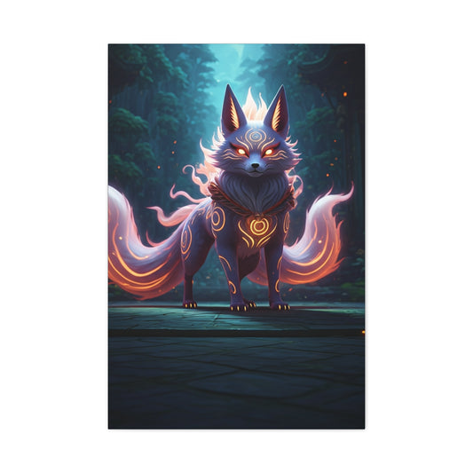
Celestial Kitsune Guardian Wall Art & Canvas Prints
Regular price $141.23Regular price -
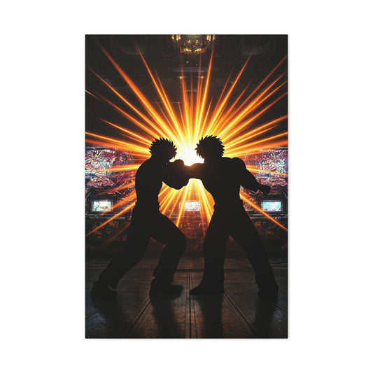
Clash of Rivals Wall Art & Canvas Prints
Regular price $141.23Regular price -
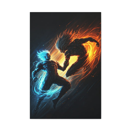
Elemental Clash Wall Art & Canvas Prints
Regular price $141.23Regular price -
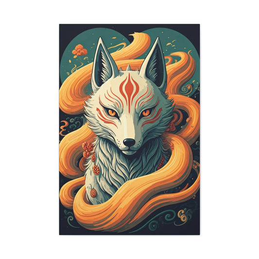
Sacred Kitsune Guardian Wall Art & Canvas Prints
Regular price $141.23Regular price -
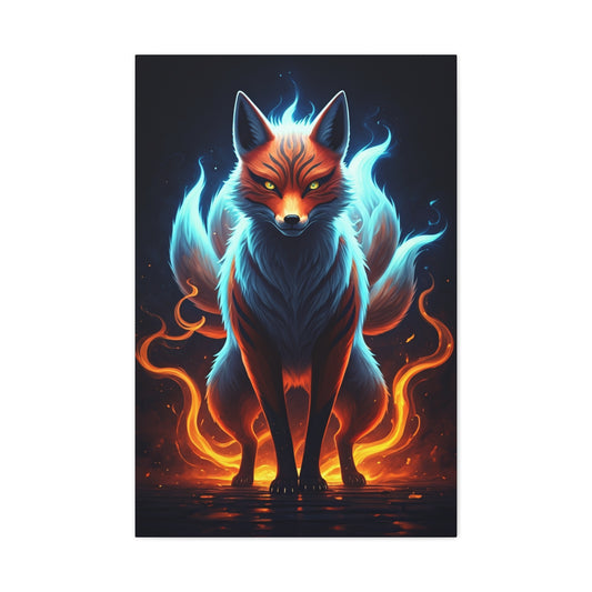
Spirit Flame Fox Wall Art & Canvas Prints
Regular price $141.23Regular price


Transform Your Space: The Ultimate Guide to Crafting Anime Wall Art
Creating personalized anime wall decorations has become an increasingly popular way for enthusiasts to express their passion while maintaining budget consciousness. The art of designing custom anime posters allows fans to showcase their favorite characters, memorable scenes, and inspiring quotes in ways that commercial products simply cannot match. This comprehensive exploration delves into every aspect of creating stunning anime-inspired wall art that reflects individual taste and creativity.
The journey of transforming blank walls into vibrant anime galleries represents more than mere decoration—it embodies personal expression, artistic growth, and community connection. Through careful planning, creative vision, and practical execution, anyone can develop the skills necessary to produce professional-quality anime artwork that rivals expensive commercial alternatives. The process encompasses everything from initial concept development to final display, offering countless opportunities for creative exploration and skill refinement.
Understanding the fundamentals of anime poster creation opens doors to endless possibilities. Whether drawn to the ethereal beauty of Studio Ghibli films, the intense action sequences of shonen manga, or the emotional depth of slice-of-life series, each artistic preference can be translated into compelling visual displays. The key lies in recognizing that effective anime wall art transcends simple image reproduction—it captures the essence, emotion, and cultural significance that makes anime such a powerful medium.
Essential Materials and Tools for Anime Poster Creation
The foundation of successful anime poster creation rests upon selecting appropriate materials and tools that balance quality, affordability, and ease of use. High-quality printers capable of producing vibrant colors and sharp details form the cornerstone of any anime art project. Inkjet printers excel at reproducing the subtle color gradations and smooth transitions characteristic of anime artwork, while laser printers offer superior text clarity for quote-based designs.
Paper selection significantly impacts the final appearance and longevity of anime posters. Glossy photo paper enhances color saturation and provides protection against fading, making it ideal for character portraits and action scenes. Matte paper offers a more subdued, artistic appearance that complements minimalist designs and line art. Heavyweight papers resist curling and provide a premium feel that elevates the perceived value of homemade artwork.
Digital tools serve as the creative engine behind modern anime poster design. Free platforms offer surprisingly sophisticated features for collage creation, text manipulation, and color adjustment. Professional software provides advanced capabilities for those seeking to push creative boundaries, including layer management, vector graphics, and complex filtering effects. The choice between free and premium tools often depends on project complexity and long-term artistic goals.
Cutting implements play a crucial role in achieving clean, professional edges that distinguish quality work from amateur attempts. Precision craft knives create smooth, straight cuts through multiple paper types, while decorative scissors add unique edge treatments that complement specific aesthetic themes. Rotary cutters excel for large-format projects and repetitive cutting tasks, ensuring consistency across multiple pieces.
Adhesive solutions must balance holding power with reversibility, particularly for renters or those who frequently update their displays. Removable mounting strips protect wall surfaces while providing secure attachment for lightweight posters. Double-sided tape offers invisible mounting for smooth applications, while decorative tapes add visual interest as part of the overall design scheme.
Display frames transform simple prints into gallery-worthy presentations that command attention and respect. Budget-friendly options include plastic frames from discount retailers, which can be enhanced with decorative elements or paint treatments. Mid-range wooden frames offer natural warmth that complements many anime art styles, particularly those featuring outdoor scenes or character portraits. Premium metal frames provide sleek, modern appearances that work exceptionally well with minimalist designs and contemporary room aesthetics.
Optional enhancement materials expand creative possibilities exponentially. Canvas boards enable mixed-media projects that combine printed elements with hand-painted details, creating unique hybrid artworks that cannot be purchased commercially. Acrylic paints allow for color matching and custom accent work, while metallic markers add shimmer effects that catch light beautifully. Protective sealers ensure longevity and prevent damage from humidity, UV exposure, and handling.
Character Portrait Techniques and Methods
Character portraits represent one of the most popular forms of anime wall art, requiring careful attention to facial proportions, expression capture, and color fidelity. The process begins with selecting high-resolution source images that showcase characters in their most iconic or emotionally resonant poses. Official artwork typically provides the highest quality starting points, featuring professional coloring, lighting, and composition that translate well to poster format.
Image enhancement techniques can dramatically improve the visual impact of character portraits. Color saturation adjustments bring vibrancy to potentially dull source images, while contrast manipulation helps define facial features and clothing details. Brightness corrections ensure that important character elements remain visible when printed, accounting for the typical reduction in luminosity that occurs during the printing process.
Background manipulation opens numerous creative avenues for personalizing character portraits. Simple background removal allows characters to stand alone against solid colors or gradient effects, creating clean, modern appearances that work well in minimalist room designs. Alternatively, custom background creation using complementary colors, abstract patterns, or thematic elements from the character's series can add depth and visual interest without overwhelming the main subject.
Composition techniques borrowed from traditional portraiture enhance the professional appearance of anime character art. The rule of thirds applies to anime portraits just as effectively as photographic subjects, creating more dynamic and visually appealing arrangements. Strategic cropping can eliminate distracting elements while focusing attention on the most compelling aspects of character design.
Multiple character arrangements require careful consideration of size relationships, color harmony, and visual balance. Group portraits work best when characters share similar art styles or come from related series, maintaining visual coherence across the composition. Layering techniques can create depth and hierarchy, with primary characters prominently featured while supporting characters provide context and background interest.
Printing considerations for character portraits involve optimizing resolution settings, color profiles, and paper choices to achieve the most accurate reproduction possible. Test prints using small sections help identify potential issues before committing to full-size productions. Color calibration between screen display and printer output often requires iterative adjustment to achieve desired results.
Finishing touches elevate amateur character portraits to professional-quality artwork. Careful trimming ensures clean edges that look intentional rather than hastily cut. Matting techniques using contrasting or complementary papers create visual separation between artwork and frames while adding perceived value. UV-protective sprays help prevent fading and color shift over time, preserving the artwork's original appearance for years.
Quote and Typography Design Principles
Typography-based anime posters harness the emotional power of memorable dialogue while creating visually striking wall art that resonates with viewers familiar with the source material. The selection of impactful quotes forms the foundation of successful typography projects, requiring consideration of both emotional resonance and visual presentation potential. Inspirational speeches from protagonists often work well, as do philosophical observations from wise mentors or antagonists.
Font selection dramatically influences the mood and effectiveness of quote-based designs. Sans-serif fonts convey modern, clean aesthetics that work well with contemporary anime series and minimalist room designs. Serif fonts add gravitas and tradition, making them suitable for quotes from historical anime or serious dramatic moments. Script fonts can evoke emotion and personality but require careful application to maintain readability.
Japanese typography integration adds authenticity and visual interest to anime quote posters. Hiragana and katakana characters provide flowing, organic shapes that complement curved design elements, while kanji offers bold, geometric forms that work well as accent elements or secondary text. Even viewers unfamiliar with Japanese writing systems can appreciate the aesthetic qualities of well-integrated Japanese typography.
Color psychology plays a vital role in typography design, with different hues evoking specific emotional responses that should align with quote content. Warm colors like red and orange convey passion, determination, and energy, making them suitable for action-oriented quotes from battle anime. Cool colors like blue and purple suggest contemplation, wisdom, and mystery, working well with philosophical or romantic quotes.
Layout composition techniques determine how effectively typography communicates its message. Hierarchical arrangements use size, weight, and positioning to guide reader attention through quote content in logical sequences. Asymmetrical layouts create dynamic tension that maintains viewer interest, while symmetrical arrangements provide stability and formal elegance.
Background treatments for typography posters require careful balance between visual interest and text readability. Gradient backgrounds add depth without overwhelming text content, while texture overlays can evoke specific series aesthetics or emotional tones. Character silhouettes used as background elements create thematic connection while maintaining focus on typography.
Contrast management ensures that text remains clearly legible under various lighting conditions. High contrast combinations like white text on dark backgrounds provide maximum readability but can appear stark. Medium contrast approaches using complementary colors offer more nuanced appearances while maintaining adequate legibility. Testing designs under different lighting conditions helps identify potential readability issues before printing.
Scene Recreation and Artistic Interpretation
Recreating iconic anime scenes as wall art requires understanding composition, color theory, and visual storytelling techniques that made the original scenes memorable. The process begins with identifying scenes that possess strong visual elements independent of animation context—moments that communicate emotion, action, or atmosphere through purely visual means rather than relying on dialogue or movement.
Scene selection criteria should prioritize visual clarity, emotional impact, and reproduction feasibility. Wide shots showcasing detailed backgrounds often work better than close-ups that depend on subtle facial expressions for impact. Action scenes with clear compositional lines and dramatic lighting translate well to static poster format, while quiet character moments may require additional design elements to maintain visual interest.
Composition analysis of original scenes reveals the underlying design principles that make them effective. Leading lines guide viewer attention through the image, while color relationships create mood and emphasize important elements. Understanding these principles allows for faithful recreation while adapting to poster format requirements and personal artistic preferences.
Color palette extraction from source material ensures visual consistency while allowing for creative interpretation. Limiting palettes to three to five main colors creates cohesive designs that work well in room environments. Analogous color schemes provide harmony and tranquility, while complementary combinations create dynamic tension and visual excitement.
Artistic interpretation techniques allow creators to put personal stamps on familiar scenes while maintaining recognizable elements that connect with other fans. Stylistic choices might include emphasizing certain colors, simplifying background details, or adding design elements that reflect personal aesthetic preferences. The goal involves balancing faithful recreation with individual creative expression.
Digital manipulation tools enable precise control over scene recreation, allowing for adjustment of elements that may not work well in poster format. Background extension techniques can adapt scenes originally designed for widescreen format to poster proportions. Element isolation allows for repositioning or resizing of characters and objects to improve overall composition.
Layering techniques create depth and visual interest in scene recreations. Foreground elements can be enhanced or emphasized to create stronger three-dimensional illusions, while background layers can be simplified or abstracted to reduce visual clutter. Strategic use of opacity and blending modes creates sophisticated visual effects that enhance rather than overwhelm the original scene content.
Creative Decoration and Enhancement Strategies
Enhancement strategies transform basic anime posters into dynamic, engaging wall installations that capture attention and create immersive viewing experiences. The integration of lighting elements represents one of the most effective enhancement approaches, with LED strips and fairy lights adding ambiance and highlighting specific artwork areas. Colored lighting can reinforce thematic elements or create mood changes throughout the day.
Three-dimensional enhancement techniques add physical depth and tactile interest to traditionally flat poster displays. Foam core mounting creates subtle shadow effects that separate artwork from wall surfaces, while layered mounting using materials of varying thickness creates dramatic depth effects. Strategic placement of small objects or figures related to the artwork can extend the visual narrative beyond the poster boundaries.
Interactive elements encourage viewer engagement and create memorable experiences that extend beyond passive observation. QR codes linked to series soundtracks or related content can be discretely integrated into poster designs, allowing viewers to access audio elements that complement visual presentations. Augmented reality markers can trigger digital effects when viewed through smartphone cameras, adding modern appeal to traditional wall art.
Seasonal rotation strategies keep anime displays fresh and relevant throughout the year. Summer collections might emphasize beach episodes and outdoor adventure scenes, while winter displays could focus on cozy indoor moments or snow-covered landscapes. Holiday-themed arrangements can incorporate series that celebrate specific cultural events or create entirely new thematic connections.
Gallery wall concepts combine multiple anime posters into cohesive installations that tell larger stories or explore thematic connections across different series. Chronological arrangements can trace character development or story progression, while comparative displays might explore similar themes across different anime universes. Color-coordinated arrangements create visual harmony even when combining artwork from disparate sources.
Texture incorporation adds tactile dimension and visual interest that distinguishes homemade artwork from commercial prints. Fabric elements can be attached to create clothing textures or environmental details, while sand or other granular materials can simulate specific scene elements. These techniques require careful application to avoid overwhelming the original artwork while adding meaningful enhancement.
Scale variation within poster collections creates visual rhythm and prevents monotonous displays. Large centerpiece posters anchor arrangements while smaller supporting pieces provide detail and context. Extreme size contrasts can create dramatic focal points that draw attention from across rooms, while gradual size progressions create flowing, organic arrangements that guide viewer attention naturally.
Advanced Printing and Paper Selection Techniques
Professional-quality anime poster production requires understanding the complex relationships between printer settings, paper characteristics, and final output quality. Color management systems ensure accurate reproduction of anime artwork's distinctive color palettes, which often feature highly saturated hues and subtle gradations that challenge standard printing processes. Proper color profiling prevents the disappointment of prints that fail to match screen displays.
Paper weight considerations extend beyond mere durability to encompass how weight affects color reproduction, texture, and overall presentation quality. Lightweight papers may curl or wave when exposed to humidity, while excessively heavy papers can stress mounting systems and create handling difficulties. The optimal weight range typically falls between 200-300 GSM for most anime poster applications, providing excellent print quality without excessive thickness.
Surface texture dramatically influences how light interacts with printed anime artwork, affecting both color appearance and viewing experience. Glossy surfaces maximize color saturation and create vibrant, eye-catching displays that work particularly well for action scenes and colorful character portraits. Semi-gloss options provide compromise solutions that offer good color reproduction while reducing glare and fingerprint visibility.
Matte surfaces complement minimalist designs and sophisticated color schemes, creating subtle, refined appearances that integrate well with modern interior design aesthetics. The reduced reflectivity of matte papers makes them ideal for locations with challenging lighting conditions or for viewers who prefer understated elegance over bold visual impact.
Specialty paper options open unique creative possibilities for anime poster production. Metallic papers add shimmer effects that enhance magical or supernatural themes common in fantasy anime series. Textured papers can simulate traditional art media, creating the appearance of watercolor paintings or pencil sketches. These specialty options typically command higher prices but can justify the expense through their distinctive visual impact.
Printer maintenance directly affects anime poster quality, with clogged nozzles, misaligned printheads, and depleted ink cartridges all contributing to substandard results. Regular maintenance schedules should include nozzle cleaning, head alignment checks, and test print evaluations. Using high-quality ink cartridges or compatible alternatives ensures consistent color reproduction and prevents premature fading.
Print settings optimization requires experimentation with different quality levels, color modes, and paper type selections to achieve optimal results for specific projects. High-quality settings naturally produce better results but consume more ink and require longer printing times. Understanding when to use different settings helps balance quality with practical considerations like time and material costs.
Thematic Collection Development and Curation
Developing cohesive anime poster collections requires strategic thinking about visual relationships, thematic connections, and long-term display goals. Successful collections transcend random accumulations of favorite characters to become curated explorations of specific themes, art styles, or narrative elements that create meaningful viewing experiences for both creators and visitors.
Genre-based collections offer natural organizational frameworks that help viewers understand relationships between different pieces while showcasing the creator's range of interests. Horror anime collections might emphasize dark color palettes, dramatic lighting effects, and psychological tension, creating atmospheric displays that transform room ambiance. Romance collections could focus on soft colors, intimate character moments, and emotional expressions that create warm, inviting environments.
Color harmony considerations ensure that diverse anime artwork can coexist within unified display schemes. Monochromatic approaches using various shades of single colors create sophisticated, gallery-like appearances that work particularly well in formal settings. Complementary color schemes create dynamic tension and visual excitement while maintaining overall coherence through strategic color relationships.
Artistic style consistency helps create professional-looking collections even when combining artwork from different anime series. Focusing on similar art styles—such as realistic character designs, chibi illustrations, or watercolor aesthetics—creates visual continuity that unifies diverse source material. This approach allows collectors to explore various series while maintaining cohesive display aesthetics.
Scale progression techniques create visual rhythm and guide viewer attention through poster collections in intentional ways. Gradually increasing sizes can build toward dramatic focal points, while alternating large and small pieces creates dynamic energy that maintains viewer interest. Strategic placement of the largest, most impactful pieces at eye level ensures maximum visual impact while supporting pieces fill surrounding areas.
Narrative sequencing transforms poster collections into visual storytelling experiences that communicate character development, plot progression, or thematic evolution. Chronological arrangements following character growth throughout series create compelling visual narratives, while thematic progressions might explore concepts like friendship, determination, or sacrifice across multiple anime universes.
Seasonal rotation strategies keep collections fresh and relevant while accommodating limited display space. Quarterly changes can reflect seasonal themes from various anime series, while monthly rotations allow for more frequent exploration of different artistic approaches. Creating storage systems for non-displayed artwork ensures proper preservation while facilitating easy rotation schedules.
Creative Display and Mounting Solutions
Innovative display techniques elevate anime poster collections beyond traditional wall mounting to create immersive, three-dimensional experiences that transform entire rooms into anime-inspired environments. Suspended display systems using fishing line or thin cables create floating effects that add visual interest while maximizing wall space utilization. This approach works particularly well for lightweight posters and creates dynamic shadows that change throughout the day.
Modular mounting systems provide flexibility for frequent collection updates while maintaining professional appearances. Magnetic mounting solutions work exceptionally well on metal surfaces or when combined with magnetic paint treatments, allowing for instant poster swapping without wall damage. Grid systems using thin rails or wire networks create gallery-style displays that accommodate various poster sizes and arrangements.
Backlighting techniques dramatically enhance the visual impact of anime posters while creating ambient lighting that transforms room atmospheres. LED strip lights placed behind translucent mounting materials create even illumination that makes colors appear more vibrant and creates subtle halo effects. Color-changing LED systems can be programmed to shift hues throughout the day or in response to music, creating dynamic environments that reflect the energy of favorite anime series.
Corner installations maximize space utilization in small rooms while creating focal points that draw attention without overwhelming limited square footage. Wrap-around arrangements that continue from one wall to adjacent surfaces create immersive environments that surround viewers with anime imagery. These installations work particularly well for creating themed corners dedicated to specific series or characters.
Ceiling mounting expands display possibilities into often-overlooked spaces while creating unique viewing perspectives. Overhead installations work well for action scenes or flying characters, creating the illusion of movement and adding dimensional interest to room environments. Angled mounting systems can direct ceiling displays toward seating areas, ensuring comfortable viewing while maximizing impact.
Integration with existing furniture and room elements creates seamless blends between anime artwork and functional living spaces. Bookshelf displays can incorporate posters as backing elements behind anime-related collectibles, creating layered visual experiences. Desk areas can feature smaller poster installations that provide inspiration during work or study sessions without creating overwhelming distractions.
Protective measures ensure long-term preservation of displayed artwork while maintaining visual accessibility. UV-filtering films applied to windows or lighting sources prevent gradual color fading, while humidity control measures protect paper-based artwork from warping or discoloration. Strategic positioning away from direct sunlight and heat sources extends poster lifespan significantly.
Digital Design and Image Manipulation Mastery
Digital design mastery transforms basic anime images into sophisticated poster designs that rival professional graphic design work. Understanding layer management principles enables complex compositions that combine multiple source images, text elements, and design graphics into cohesive final products. Proper layer organization facilitates future editing and allows for easy modification of individual elements without affecting other composition aspects.
Color correction techniques address common issues that occur when adapting anime artwork for poster printing. Source images may contain color casts, exposure problems, or saturation issues that become more apparent when enlarged for poster format. Histogram analysis reveals color distribution problems, while selective color adjustments allow for precise correction of specific hue ranges without affecting other color areas.
Resolution enhancement methods enable the use of lower-quality source images when high-resolution alternatives are unavailable. Intelligent upscaling algorithms can increase image dimensions while minimizing quality loss, though results vary significantly based on source image characteristics. Vector tracing techniques can convert raster images into scalable graphics that maintain quality at any size, though this approach requires more time and skill investment.
Text integration techniques ensure that typography elements complement rather than compete with visual artwork elements. Proper text placement considers visual flow, color contrast, and thematic appropriateness while maintaining readability under various viewing conditions. Shadow effects, outline treatments, and background panels can improve text legibility without detracting from overall design aesthetics.
Special effects application adds visual interest and can help integrate disparate elements into unified compositions. Blur effects create depth of field illusions that direct attention toward focal points, while lighting effects can enhance dramatic moments or create atmospheric moods. Particle effects might simulate magical elements or environmental conditions relevant to specific anime series.
Batch processing techniques streamline production when creating multiple posters with similar design elements or formatting requirements. Template creation allows for consistent styling across poster series while accommodating different content elements. Automation features in professional software can apply consistent treatments to multiple images simultaneously, significantly reducing production time for large projects.
File management strategies ensure that digital assets remain organized and accessible throughout the creative process and for future projects. Naming conventions that include series names, character identifiers, and version numbers facilitate quick location of specific files. Regular backup procedures protect valuable design work from hardware failures or accidental deletion.
Cost-Effective Production and Budget Management
Effective budget management enables anime fans to create extensive poster collections without financial strain, requiring strategic approaches to material sourcing, production planning, and resource allocation. Understanding the true costs associated with different production methods helps creators make informed decisions that balance quality aspirations with financial realities.
Bulk purchasing strategies significantly reduce per-unit costs for frequently used materials like photo paper, ink cartridges, and mounting supplies. Coordinating purchases with local anime clubs or online communities can achieve quantity discounts that benefit all participants while building relationships within the fan community. Seasonal sales and promotional periods often provide opportunities for substantial savings on quality materials.
Alternative sourcing methods can dramatically reduce material costs without sacrificing quality. Office supply stores often carry photo papers and printing supplies at lower prices than specialty photography retailers. Generic ink cartridges from reputable manufacturers typically cost significantly less than brand-name alternatives while providing comparable print quality for anime poster applications.
DIY material preparation extends budgets by creating custom solutions for common poster production needs. Homemade mounting solutions using cardboard backing and protective films can replace expensive commercial alternatives while providing comparable functionality. Custom frame construction using basic woodworking skills and inexpensive lumber can create unique display solutions at fraction of commercial frame costs.
Production planning minimizes waste and maximizes material utilization through careful project sequencing and resource allocation. Grouping similar projects allows for efficient use of paper sizes and ink colors while maintaining production momentum. Strategic timing of printing sessions can take advantage of optimal ink cartridge levels and minimize partial-page waste.
Quality versus cost analysis helps creators make informed decisions about when to invest in premium materials and when economical alternatives suffice. Character portrait projects showcasing favorite series might justify premium paper and ink investments, while experimental or temporary installations can utilize budget materials without compromising creative goals.
Long-term cost calculations reveal the economic advantages of DIY poster creation compared to commercial alternatives. Initial equipment and material investments typically pay for themselves within several poster projects, while ongoing material costs remain substantially lower than purchasing equivalent commercial products. The ability to create custom designs unavailable commercially adds significant value that cannot be quantified purely in monetary terms.
Community Sharing and Collaboration Opportunities
The anime poster creation community offers numerous opportunities for skill sharing, resource exchange, and collaborative projects that enhance individual creative capabilities while building lasting friendships within the fan community. Online forums and social media groups dedicated to anime crafting provide platforms for sharing techniques, troubleshooting problems, and celebrating successful projects.
Resource sharing initiatives enable community members to access expensive tools or materials that might be prohibitive for individual purchase. Printer sharing arrangements can provide access to high-quality commercial printing equipment, while tool lending libraries allow community members to experiment with specialized equipment before making purchase decisions. These collaborative approaches strengthen community bonds while expanding creative possibilities for all participants.
Skill exchange programs pair experienced creators with beginners, facilitating knowledge transfer while providing mentorship opportunities that benefit both parties. Experienced creators gain fresh perspectives and renewed enthusiasm, while beginners receive personalized guidance that accelerates their learning curves. These relationships often evolve into lasting friendships based on shared passions and mutual respect.
Collaborative project opportunities enable ambitious undertakings that exceed individual capabilities or resources. Group installations for convention displays or community centers can showcase collective talents while creating impressive large-scale presentations. Themed challenges that encourage multiple creators to interpret similar subjects foster creativity while building community engagement.
Template and resource sharing accelerates project development while ensuring that community members can benefit from each other's design work. Open-source template libraries allow creators to build upon existing designs rather than starting from scratch, while technique tutorials enable skill development that benefits the entire community. These sharing practices create positive feedback loops that strengthen the overall community capability.
Documentation and archival efforts preserve community knowledge while making it accessible to future members. Project galleries showcase successful techniques and inspire new creative directions, while troubleshooting databases help solve common problems quickly. These resources become increasingly valuable as communities grow and evolve over time.
Recognition and showcase opportunities provide motivation and validation for community members while inspiring others to pursue their own creative projects. Featured artist programs, monthly challenges, and achievement recognition systems create positive reinforcement that encourages continued participation and skill development. These initiatives help maintain community energy and enthusiasm over extended periods.
Understanding the fundamental principles behind successful anime poster creation empowers fans to express their passions through personalized artwork that reflects individual taste while honoring the artistic traditions of anime culture. The journey from blank walls to vibrant anime galleries represents more than simple decoration—it embodies personal growth, creative expression, and community connection that enriches both living spaces and daily experiences.
Discover Your Creative Pathway Through Anime Wall Art
Embarking on the journey of crafting anime‑inspired wall art opens an expansive realm of imaginative ingenuity. Whether your aesthetic leans toward minimalist restraint, exuberant maximalism, or an entirely novel fusion, this guide ushers you into a world where the only limits are curiosity and daring. As you explore motifs, select vibrant scenes, and experiment with layout symmetries, you cultivate not just visual allure but a profound intimacy with the narratives and personas that define your favorite series. The act of designing, printing, and presenting these pieces thus becomes an exercise in personal storytelling as much as artistry.
Engagement with this creative process nurtures both technical finesse and emotional resonance. Rather than expecting flawless results from the outset, embracing trial, reinterpretation, and iteration enriches your practice. Each attempt, whether triumph or apparent misstep, refines your eye for composition, color balance, and thematic cohesion. Over time you accumulate latent proficiency in typography placement, hue harmonization, and spatial dynamics — skills that blossom quietly, often beyond the confines of poster creation, lending themselves to illustration, layout design, or mixed‑media ventures.
The Alchemy of Enthusiasm and Experiment
What distinguishes standout anime wall art is seldom meticulous precision; instead, it radiates authenticity, the fervor of a fan whose affection for a character or storyline permeates every stroke and layout decision. Enthusiasm functions as the secret pigment: it animates your design intuitively, guiding choices of framing, focal points, and embellishments. When you are captivated by the emotions and arcs of a series, your creative energy flows organically—leading to compositions that feel alive, resonant, and deeply personal.
This aliveness carries through even when equipment or materials are modest. A do‑it‑yourself printer can faithfully render textures from still frames; home‑studio lighting can coax subtle shadows and highlights. Learning artistry isn’t about elite gear—it’s about harnessing what you have and leaning into curiosity: exploring filters, testing color separations, applying unexpected gradients or even physical textures like hand‑torn edges, layered over translucent vellum overlays. These idiosyncratic touches anchor your connection with the medium and distinguish your output.
Expanding Tools, Reducing Barriers
In recent times, creative implements grow ever more accessible, both digitally and materially. Illustration platforms now include streamlined brush sets, dynamic layering systems, and intuitive masking tools. Printing processes progress toward sharper fidelity and richer gamut, and affordable large‑format printers and professional‑grade paper stocks become attainable for enthusiasts. Meanwhile online forums and image troves furnish tutorials, templates, and peer‑guided exercises that encourage experimentation and mutual inspiration.
These emergent resources herald a renaissance of amateur poster‑making. There is nothing to hold back those who possess a spark of imaginative yearning—from configuring custom color palettes to remixing tones for thematic contrast, from plotting narrative panels through comic‑style layouts to weaving symbolic motifs into backgrounds. As these tools proliferate, barriers dissolve—the only threshold left is one of creative impulse.
Fostering Deeper Connection Through Creation
When you dissect a frame from a poignant moment, choose a meaningful pause in dialogue, or isolate a character’s expression for emphasis, you’re not merely affixing an image to paper; you’re distilling emotion, embedding layers of narrative. Choosing hues that echo mood—perhaps dawn‑light pastels for a serene scene, bold crimson for a climactic surge, or melancholic blue for introspection—becomes a meditative act. In configuring diverse elements—the edge vignette, digital grain, selective highlight—you cultivate observation of artistic granularity resident in the original animation.
This mindful approach deepens appreciation. Returning to the source material later, you notice contrasts, gesture subtleties, or background cues you’d previously overlooked. In that sense, your own creative process becomes a lens through which the series resonates more luminously. The wall art isn’t a terminal point—it becomes a conduit for seeing anew.
Personal Spaces as Storytelling Arenas
Transforming your living environment with personalized anime art doesn’t just adorn walls—it narrates identity. A cluster of prints can chart an emotional arc; a solitary piece can evoke tranquility, vigor, or reverie. Choosing where to place each work—near a reading nook, desk, or beside ambient lighting—affects how it interacts with daily rituals and moods. It becomes a companion rather than a decoration.
Moreover, sharing your results—whether by gifting art to fellow enthusiasts or showcasing in online galleries—fosters connection. Such exchanges form communities rooted not just in fandom but in creative reciprocity. Witnessing someone’s eyes light up at seeing a beloved moment reframed with your eye lets you know your art resonates beyond pixels and print.
The Transformative Power of Material Selection in Wall Art Presentation
Creating a compelling wall art piece involves much more than the digital design phase. The true alchemy begins when the conceptual image transforms into a tangible artifact through thoughtful print and material choices. Every decision, from the texture of the paper to the method of mounting, contributes to the final aura the artwork emits. Selecting appropriate mediums enables an elevation from mere visual to immersive sensory experience, engaging viewers not only through sight but through subtle tactile and atmospheric cues.
Paper choices alone influence the way light interacts with the surface, which in turn shapes perception. For example, a matte finish absorbs ambient light, softening reflections and imbuing the image with understated elegance, while a satin or semi-gloss paper catches light just enough to highlight contrasts without overwhelming glare. The choice of a cotton rag paper introduces a delicate texture that invites close inspection, enhancing the hand-crafted aura of the piece.
Manipulating Light and Shadow Through Material Layers
Beyond basic paper textures, the incorporation of translucent films or laminates can add a nuanced interplay of light and shadow. Laminates not only protect but also introduce subtle gleams that shift with the viewer’s movement and the room’s lighting conditions. Such layers add complexity, suggesting depth and dynamism even in static images.
Integrating backlighting elements, such as LED strips behind mounted panels, furthers this effect, transforming wall art into an ambient light source. This technique breathes life into the artwork, casting soft halos or gentle glows that alter the mood of the surrounding environment. When paired with strategic material layering, these lighting effects can amplify thematic elements—for example, evoking ethereal atmospheres in dreamlike compositions or underscoring tension in dramatic scenes.
The Role of Frames and Mounting in Enhancing Aesthetic Cohesion
Framing and mounting are more than protective measures; they frame the narrative itself. Minimalist frames crafted from natural woods, metals with subtle patinas, or sleek black finishes can either harmonize with the artwork’s color story or provide intentional contrast to draw attention. The choice of frame should resonate with the overall design scheme of the room, creating a dialogue between art and environment.
Mounting techniques, such as fixing prints onto rigid foam boards, offer a modern, floating effect that adds dimensionality and lightness. This approach can make the artwork appear as if it hovers slightly off the wall, inviting tactile curiosity and providing a contemporary edge. The physical depth introduced by such mounts interacts with ambient lighting to generate shadows that further enhance visual interest.
Weight and Texture: Conveying Tone Through Materiality
The physical qualities of the print material—weight, grain, finish—serve as silent storytellers that convey tone and mood. Heavier stocks evoke a sense of gravitas and permanence, suitable for artwork demanding dramatic resonance or emotional weight. Conversely, lighter, translucent papers may suggest delicacy and transience, perfectly complementing ethereal or whimsical subject matter.
Texture adds another layer of emotional texture. Rough or heavily grained surfaces can amplify rustic or vintage aesthetics, while smooth, polished finishes communicate modernity and refinement. The nuanced choice of paper grain or coating thus aligns the tactile experience with the artwork’s visual message, enriching the viewer’s multisensory encounter.
Experimenting with Mixed Media for Unique Visual Impact
Stepping beyond traditional print materials, combining various substrates and finishes introduces extraordinary possibilities for customization and expression. Incorporating elements like metallic foils, embossing, or even hand-applied paints can enhance the visual narrative with reflective or textural highlights.
These mixed media approaches can transform a simple print into a statement piece that challenges perceptions and invites repeated viewing. For example, metallic accents can evoke glamour and opulence, while matte layered textures might evoke mystery or softness. Each addition must be carefully calibrated to avoid overwhelming the composition, ensuring that every material contributes purposefully to the artwork’s overall voice.
Achieving Harmony Between Artwork and Interior Design
The successful presentation of wall art hinges on the harmonious relationship between the piece and its architectural or interior context. Material selections must consider surrounding elements such as wall color, lighting, furniture, and decorative accents. For instance, a glossy finish may complement sleek modern interiors but feel out of place amid rustic or textured surroundings.
Conversely, organic materials like wood or fabric mounts can bridge the gap between the artwork and its environment, fostering cohesion. Thoughtful color coordination between frames or mats and room palettes enhances this unity, ensuring the artwork feels integrated rather than superimposed. This holistic approach to material alchemy ensures that the art’s presence elevates the entire space.
Mastery Through Iteration and Sensory Engagement
Achieving excellence in material and print selection is an evolving craft developed through experimentation and mindful observation. Digital mock-ups provide invaluable preliminary insights, but they cannot fully predict the tactile and ambient qualities that physical materials impart. Each project offers opportunities to refine understanding of how different surfaces, weights, and finishes translate conceptually into spatial experience.
Engaging with samples, conducting lighting tests, and soliciting feedback sharpens discernment and cultivates intuitive choices. Over time, artists and curators develop a vocabulary of materials that align with various emotional and thematic tones, enabling confident decisions that transform images into evocative objects. This iterative process enhances not only the quality of individual pieces but deepens appreciation for the subtle nuances that materials contribute to visual storytelling.
Conclusion
Each new project serves as a laboratory. You explore cropping decisions, overlay labeling, typographic interplay, or dynamic juxtaposition of figure and background. Occasional misjudgments—overcrowded layout, clashing tints—teach restraint and re‑balance. Revisiting past works years later offers insight: perhaps what once seemed bold now feels overstated, teaching subtlety; or a thin brush could be replaced by a heavier stroke to better echo a scene’s gravitas.
This iterative process doesn’t expire with a single poster. It blossoms into a suite of skills—color theory, spatial reasoning, mood translation—that amplify not only your decorative endeavors but cross into sketching, customizing merch, or even crafting personal gifts. In that sense, anime‑inspired wall art becomes less a niche hobby and more a seedbed for broader visual sensibility.
Looking forward, the horizon of DIY anime wall art remains luminous. With every generational leap in software, printing, accessible tools, and communal resources, more creative whispers find voice, and creative dreams enlarge. Whether your approach is subtle tonal reinterpretation or exuberant maximalist collages, your art allows you to speak—not in words, but in color, composition, and emotional resonance.
By framing your favorite memories, characters, and scenes onto your walls, you tether personal narratives to physical reminders—quiet flags of meaning that invite reflection with every glance. These artistic imprints become part of your daily environment, offering solace, inspiration, or sparks of joy.
And so continues the creative odyssey: every brush, every layout choice, every printing test becomes a fragment of a larger tapestry—one woven from fandom, passion, experimentation, and the delight of creating something that, quite literally, reflects who you are and what stirs your heart.